Photographing the arts: how do I edit my images?
In my previous essay on photographing the arts, I was talking about selecting images from a shoot; now, we're on to the conversion and correction of the files themselves, taking a RAW file and turning it into a beautiful, finished image.
RAW files are the original camera files, which contain far more image data than an in-camera .jpg, so as a result there's a lot you can do in the RAW conversion process - and, there are a lot of choices that need to be made for each image that gets worked on. Sometimes, it's possible to take settings and copy them from one image to the rest, and get consistent results that way - but that's rare in the performing arts, as the light usually changes from scene to scene, or from one part of the stage to another. Having been a lighting designer, I know how hard it is to get an even, smooth spread of light across a stage, if that's what the aim is - but often, it's not!
Also, the colour of the light changes, especially in situations where there is a mix of lighting sources - tungsten theatre fittings plus LED sources, moving lights, or a followspot, for example. Those all have a different idea of what white light looks like, and unless they've been gelled specifically to match each other, which you normally wouldn't do in a theatre setting, they can look very strange together in an image. And, again, they'll change from scene to scene, or on different parts of the same stage, so it's often not just a matter of choosing a white balance and applying it to the whole show.
The latest versions of Photoshop & Lightroom also have amazing power in terms of camera correction, lens correction for distortion and fringing, contrast changes, and saving both shadows and highlights - though of course there are still limits to these.
Here's an example - this image from Belvoir Theatre's production of Angels In America is from a fantasy / dream scene, set in Antarctica. On the left is how it looked straight from the camera: blue (because the white balance was set for tungsten lights, and inside my blimp during the shoot, and this scene is entirely lit by moving lights), also a bit dark, and a bit noisy in the shadows. On the right is how it looked with some work in the RAW conversion: lighter, whiter, cleaner and clearer. [Click to embiggen the images.]
So you can see, a lot is possible; and there's a lot more improvement happening in the small details - sharpening the edges, reducing noise in the shadows, correcting the lens fringing, and more - that would be obvious in a larger print.
If I only had the .jpg file from the camera to work with, I probably would have deleted this one; but because I know how much more can be done with the file, I knew it was worth keeping. As I say, the scene is set in Antarctica - clearly the visual intention is white, and this rendition of the RAW file makes a lot more sense when seen outside the context of the overall show, as an individual image. I've kept it slightly on the blue side, so it still contrasts with other warmer scenes in the show, when they're seen as a group of images.
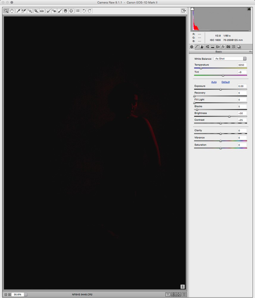
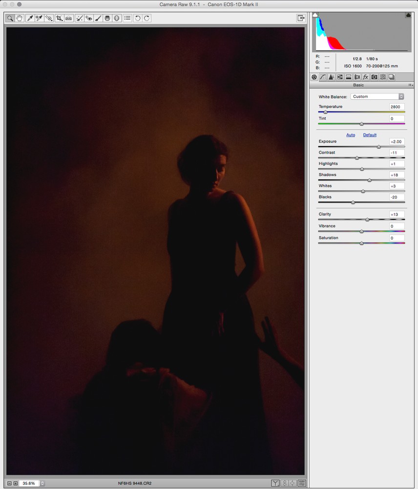
There is always a balancing act in deciding how to process images, especially with exposure. When a scene takes place on a darkened stage, do I brighten it in camera or afterwards, to make a more usable image of that moment? Or do I concentrate more on the overall arc of the show, the dynamic range of the lighting design, and let dark scenes have dark images - even if it means they may not get used?
Sometimes, a scene that happens in near-darkness is, graphically or visually, at the heart of the work - so it becomes more important that an image from that moment be able to stand on its own, without the context that a series of images would give it, to show that it's a quieter part of the play.
In the end, I have to make a choice on that, one image at a time. I can't say that there's a single, consistent answer, either - it's got to be based on what I know of the show, its overall tone and feel, and what I know of the client's needs for the images.
(To put it bluntly - done wrong, it could just look like the photographer wasn't very good, and nobody wants that!)
Of course, the other massive advantage of working with RAW files is that there's no reason I can't make more than one interpretation of a photograph; so if it's going to be a 'hero' image, and something needs tweaking, I can always just pull up the original file and make another version. (Time permitting, of course - I can't necessarily do that for 300+ files, but for one or two, certainly!)
When an image I make is out there promoting a show, it's not just the client's name on it, it's my name as well. So why wouldn't I want to do that little bit more - and make us both look good?
Keep an eye on this page for more updates to my series on photographing the arts, or to catch up on previous instalments - and follow me on Twitter or Facebook to hear about them immediately.


