Photographing the arts: invisibility by design
There’s an inherent irony to photographing performance, I think - and, at times, to designing for the stage, especially for drama.
The ideal is, sometimes, not to be noticed; for your work, however complex or difficult it may have been to complete, to just be accepted as part of the production; not showy, or calling attention to itself, and jolting the audience out of the experience. If someone thinks, in the middle of a dramatic moment, ‘wow, what a great lighting cue that was!’ then it possibly wasn’t - because they noticed it. A truly great cue would be subtle, almost subliminal; and it would have the emotional impact that moment required, without necessarily being detected by the audience.
And so it is with photography - the ideal is for the camera, and the photographer, to be invisible - both to the performers on stage during a rehearsal, and equally to the person viewing the photos later - for the images to be a transparent portal into the production, in a sense.
So, ironically, the better I am at not being noticed in the construction or design elements of an image, the more successful that image usually is.
This was in the back of my mind while working on Darlinghurst Theatre Company’s latest show, Rainbow’s End, created with Moogahlin Performing Arts as part of their tenth anniversary. (Congratulations, by the way!)
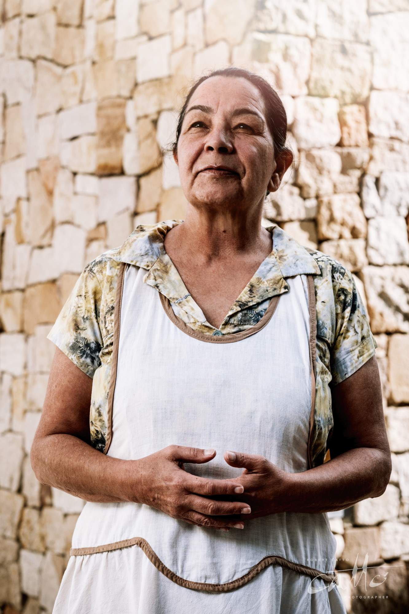
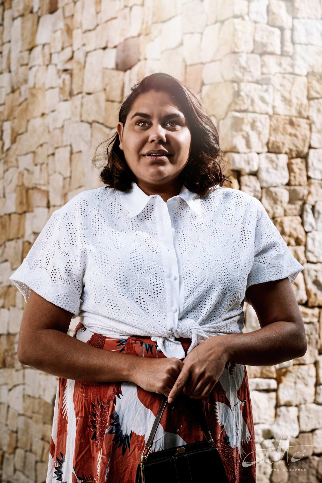
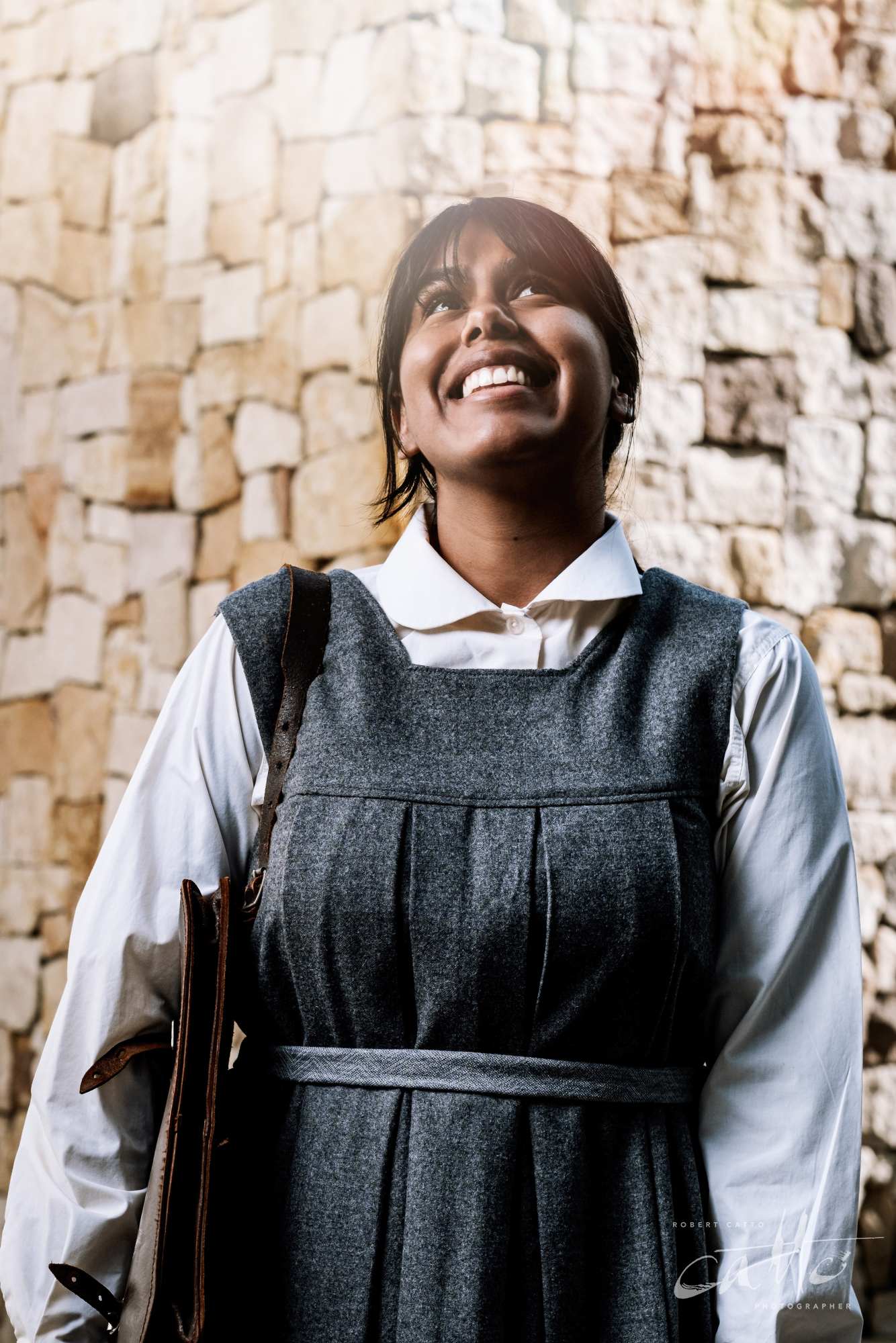
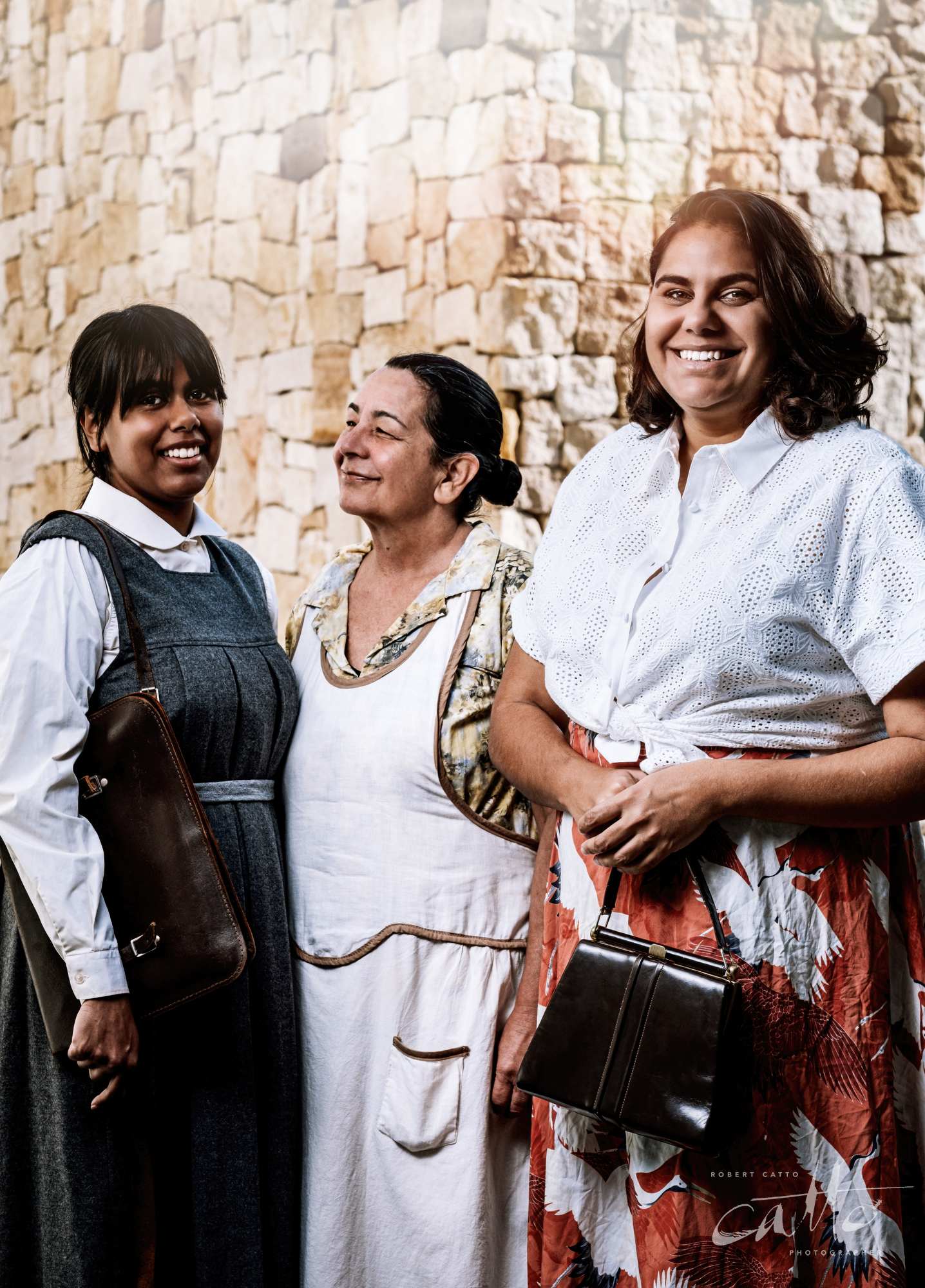
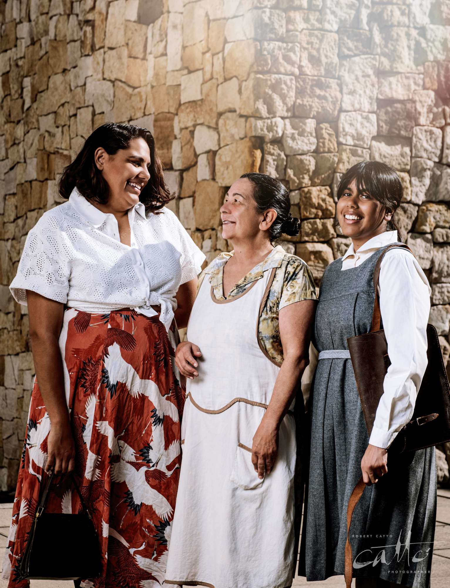
We were doing a promotional portrait shoot ahead of the show, and we’d found a location nearby that could be abstract enough to not look like it was in the city, for a play that’s set on the Goulburn River flats, in 1954.
So looking at the results of that shoot, here are a few things I’m aiming for you not to consciously notice:
in discussing the images with the producer beforehand, the note I got was that the playwright refers to the three women as ‘the true heroes of their times’; so I positioned the camera at waist level, so we’d be looking slightly up towards them in the portraits, elevating them in stature;
the actors are (mostly) standing in the shade; so I’ve set up a light on the left of the image, to throw some soft fill light onto them from the other direction to the sunshine on the wall in the background;
the stone wall is just over 2m wide; so I’ve used a long lens, cropped out the storefronts on either side, and thrown the background out of focus a little;
this is a digital image from 2019, and that gives it a particular, modern look & feel; so I’ve used a simulation of a 1950s Kodachrome film stock, which emphasises a different range of colours than digital cameras do, and also added some lens flare at the top of the images;
some of the costumes & props are actually from the 1950s; so I’ve done some minor touchups to them so they look a little more new than they are (and cropped out the actors’ shoes and socks, which were their own).
Of course, the main thing I don't want you to look at the image, and see all these things! So I’ve varied each of them, just slightly - the lens flare is different in each image, the lighting has changed slightly each time, and the actors aren’t in the same position in front of the wall in the individual images.
So - hopefully - all of these add up to a series of images that don't call attention to the photography, but give a sense of the era and feel of the play, with those hints directing the viewer.
When photographing a production, hiding the effort involved can be harder. Because a rehearsal is in progress, and generally won’t be repeated, I’m constantly on the move trying to find a new angle of view on the stage, a different way of lining up the actors in a single frame, and framing the image differently with an eye towards how they’re going to be used in the future.
Plus of course in the editing, I’m controlling the colour saturation in the images, correcting perspective and straightening the horizon line, and correcting the colour balance, contrast and brightness of the images as well - while trying to make each of them look like the production did on stage, of course…
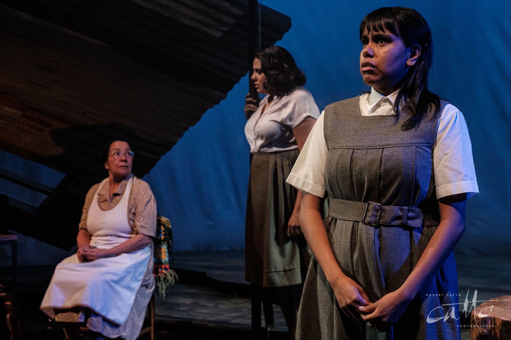
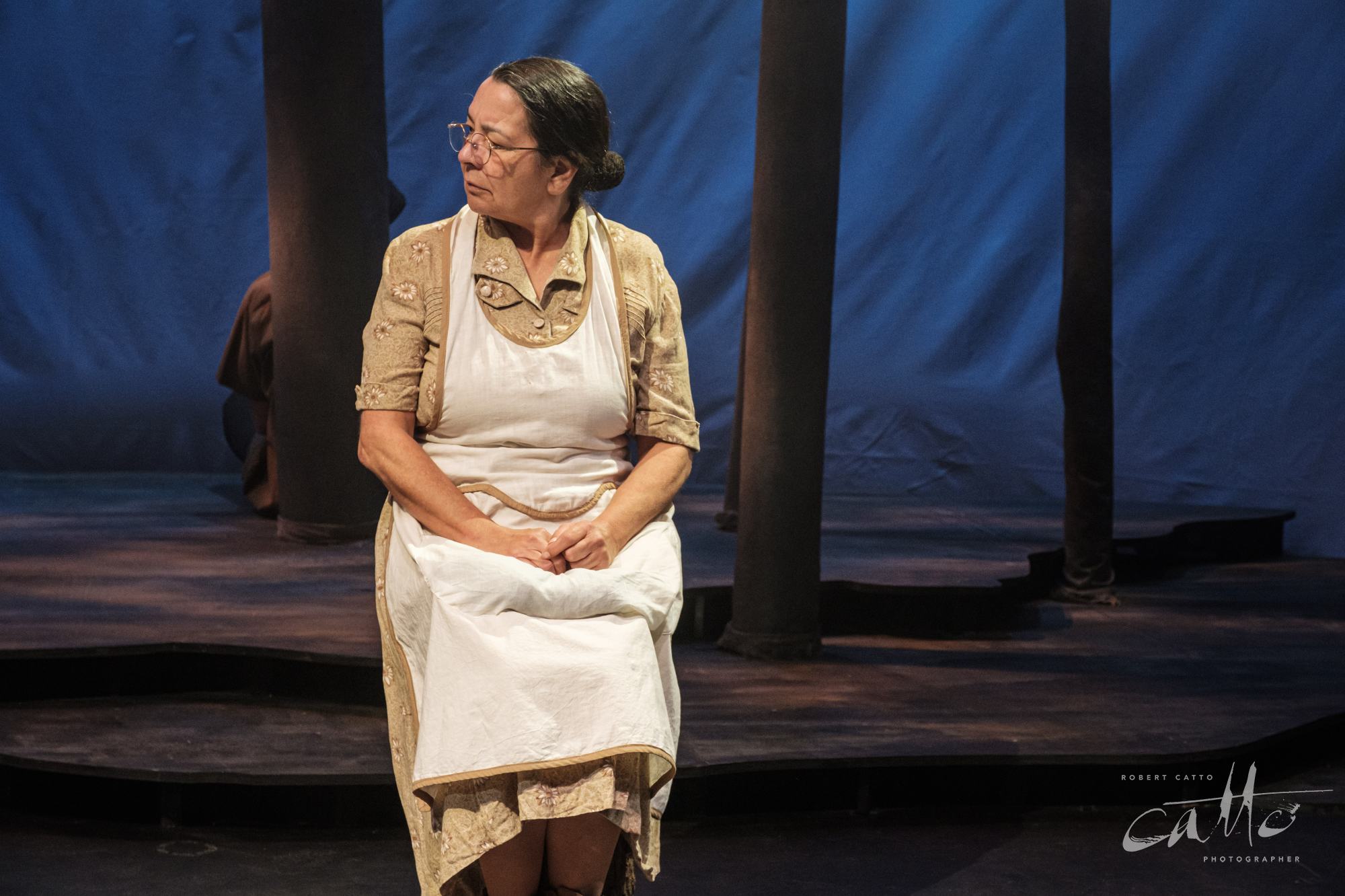
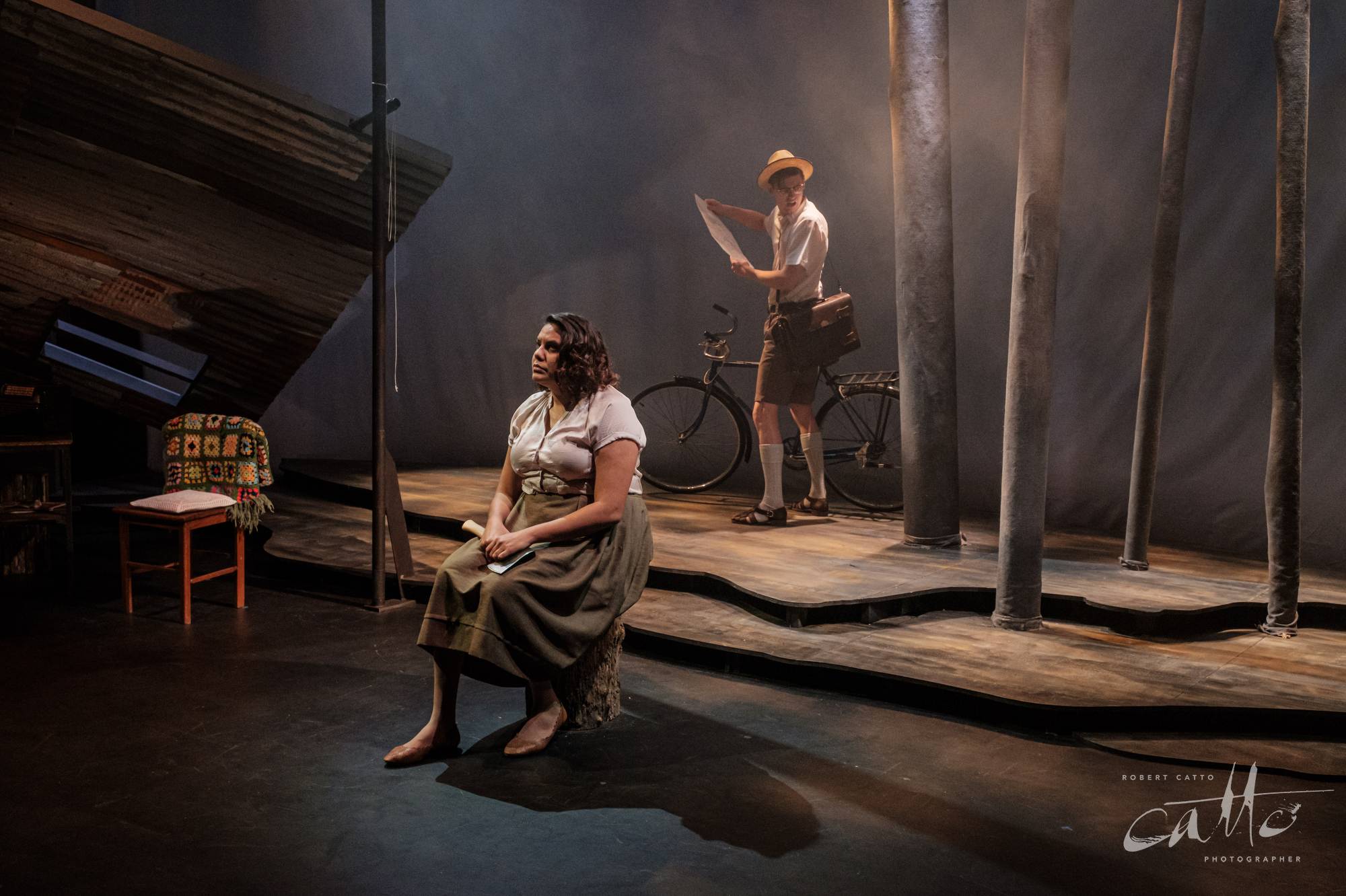
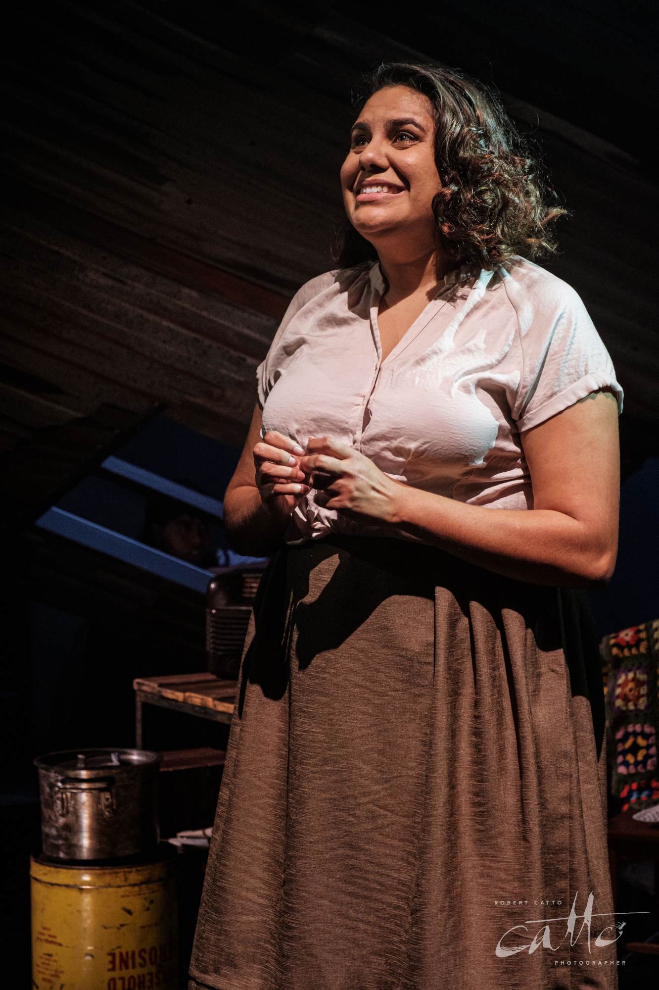
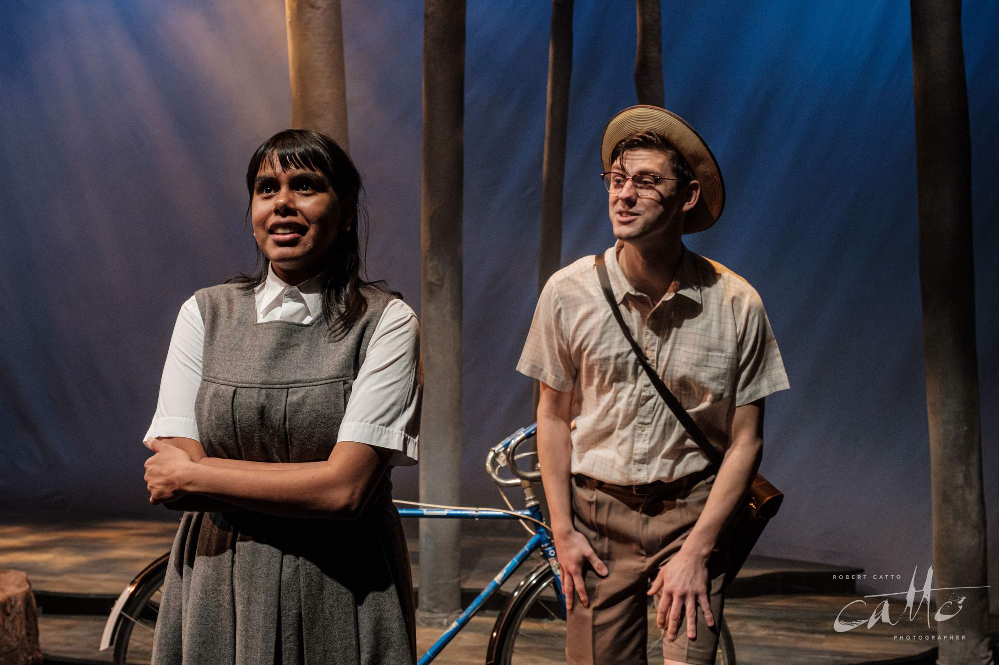
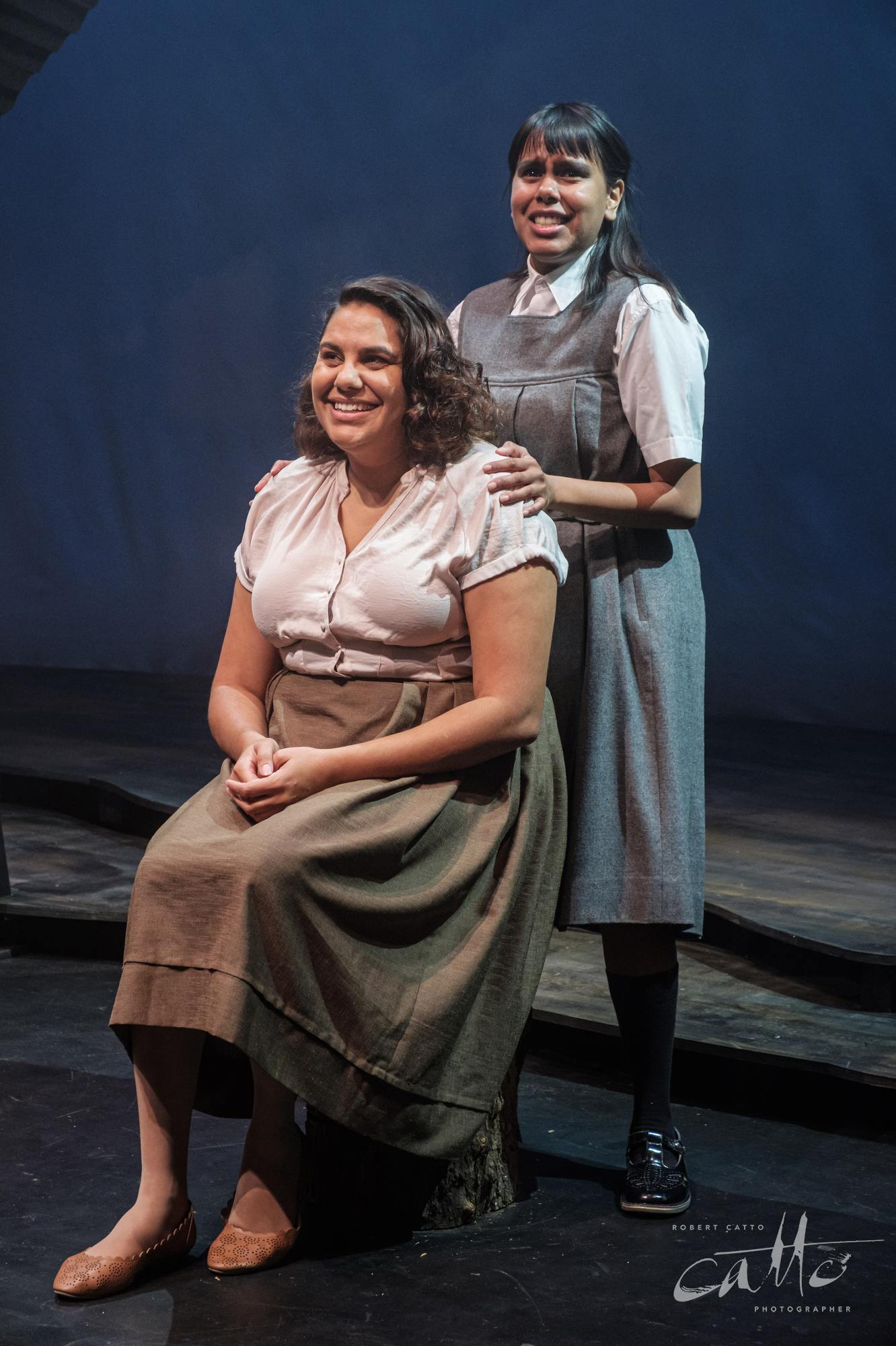
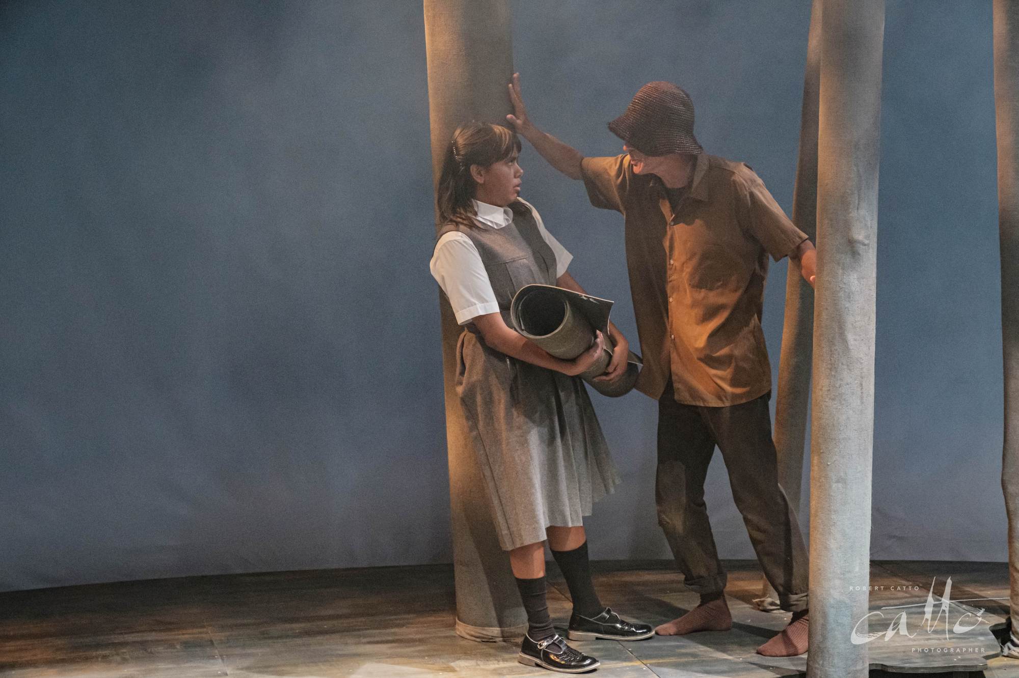
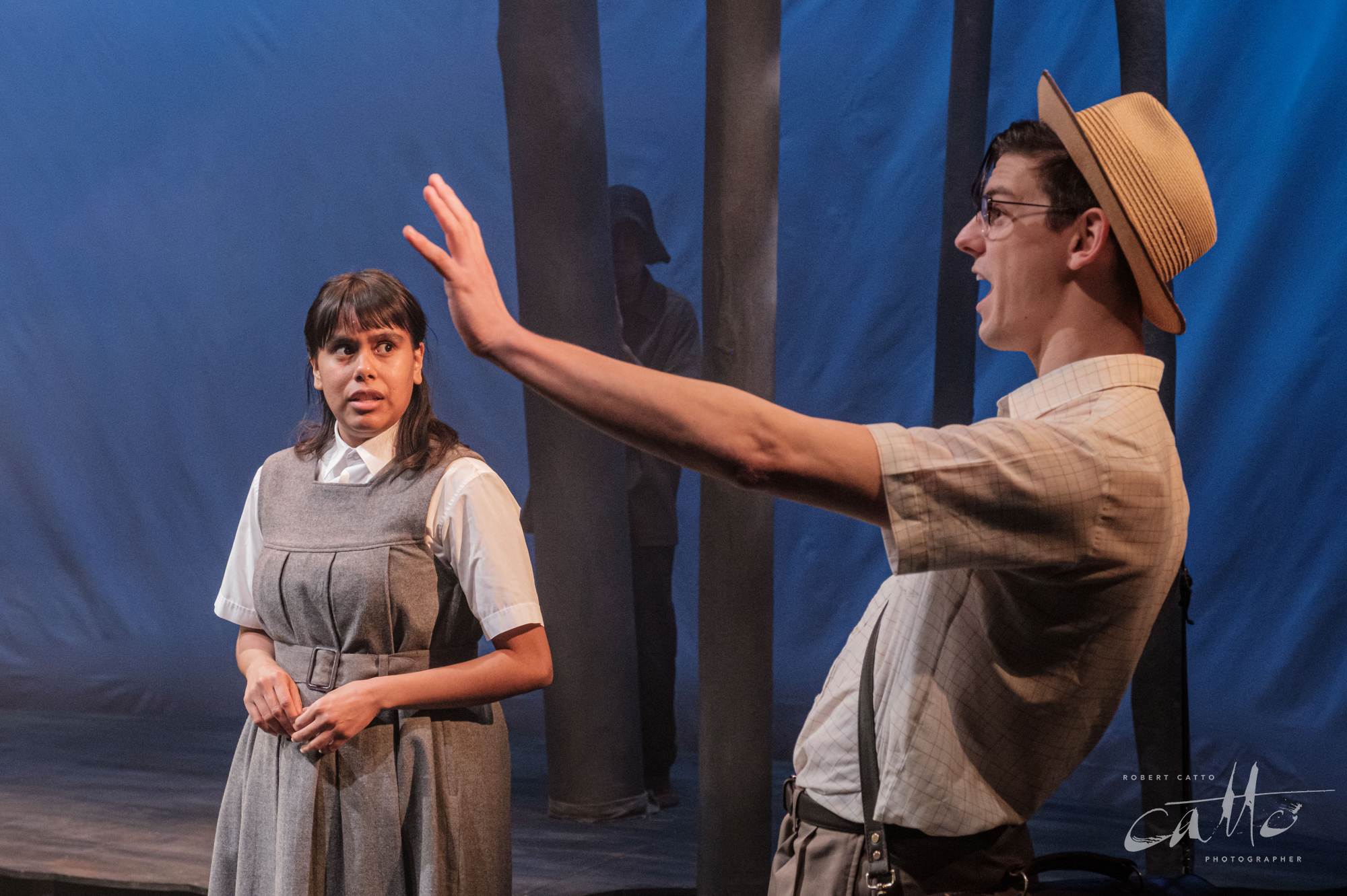
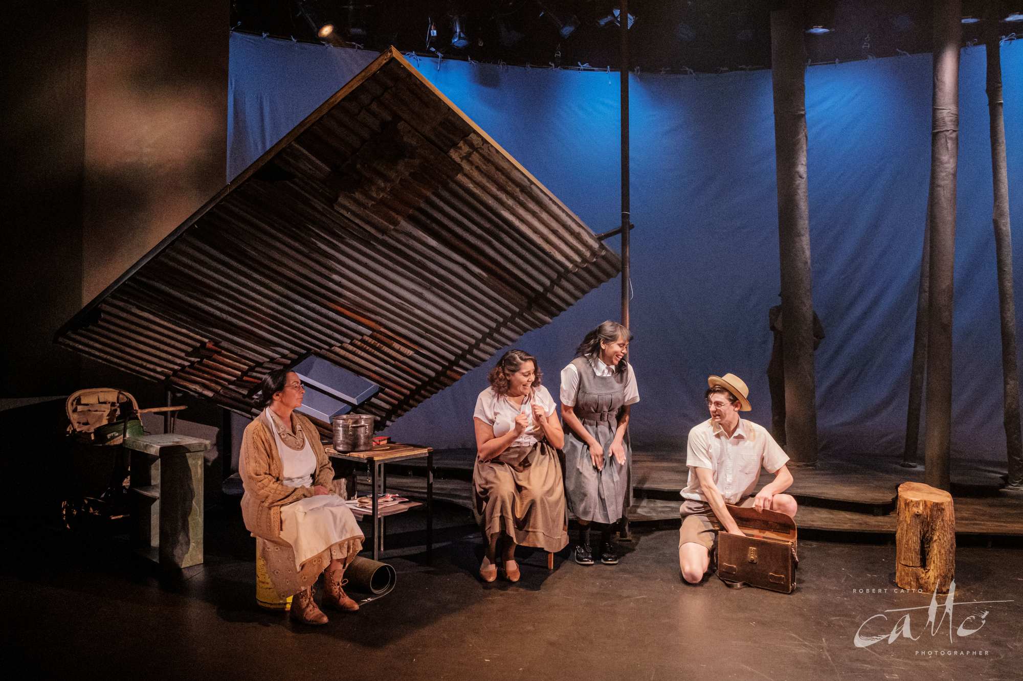
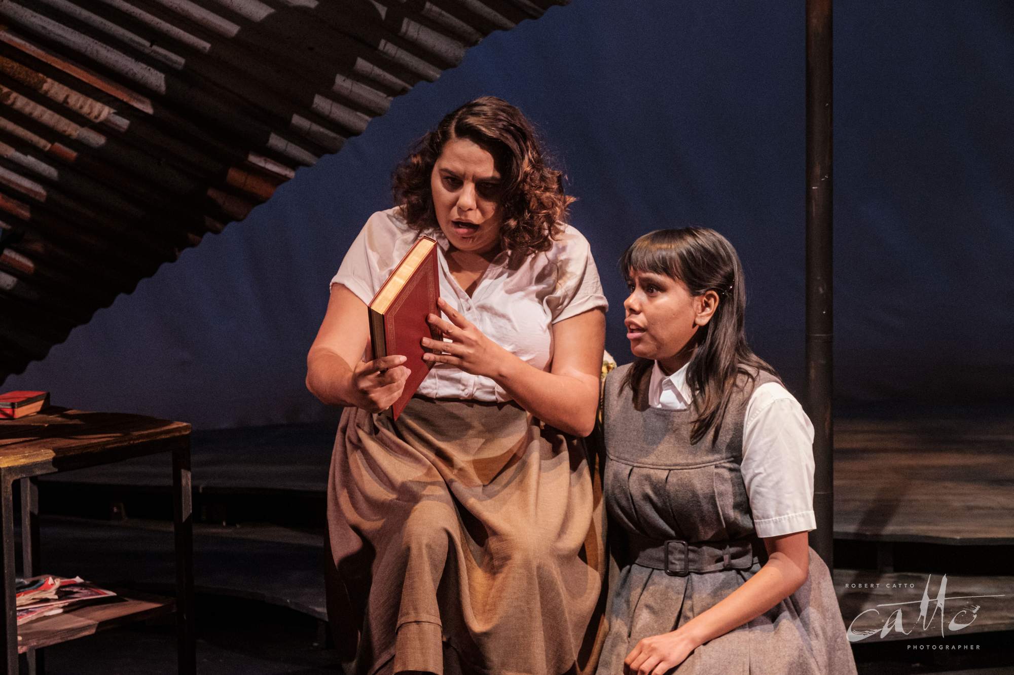
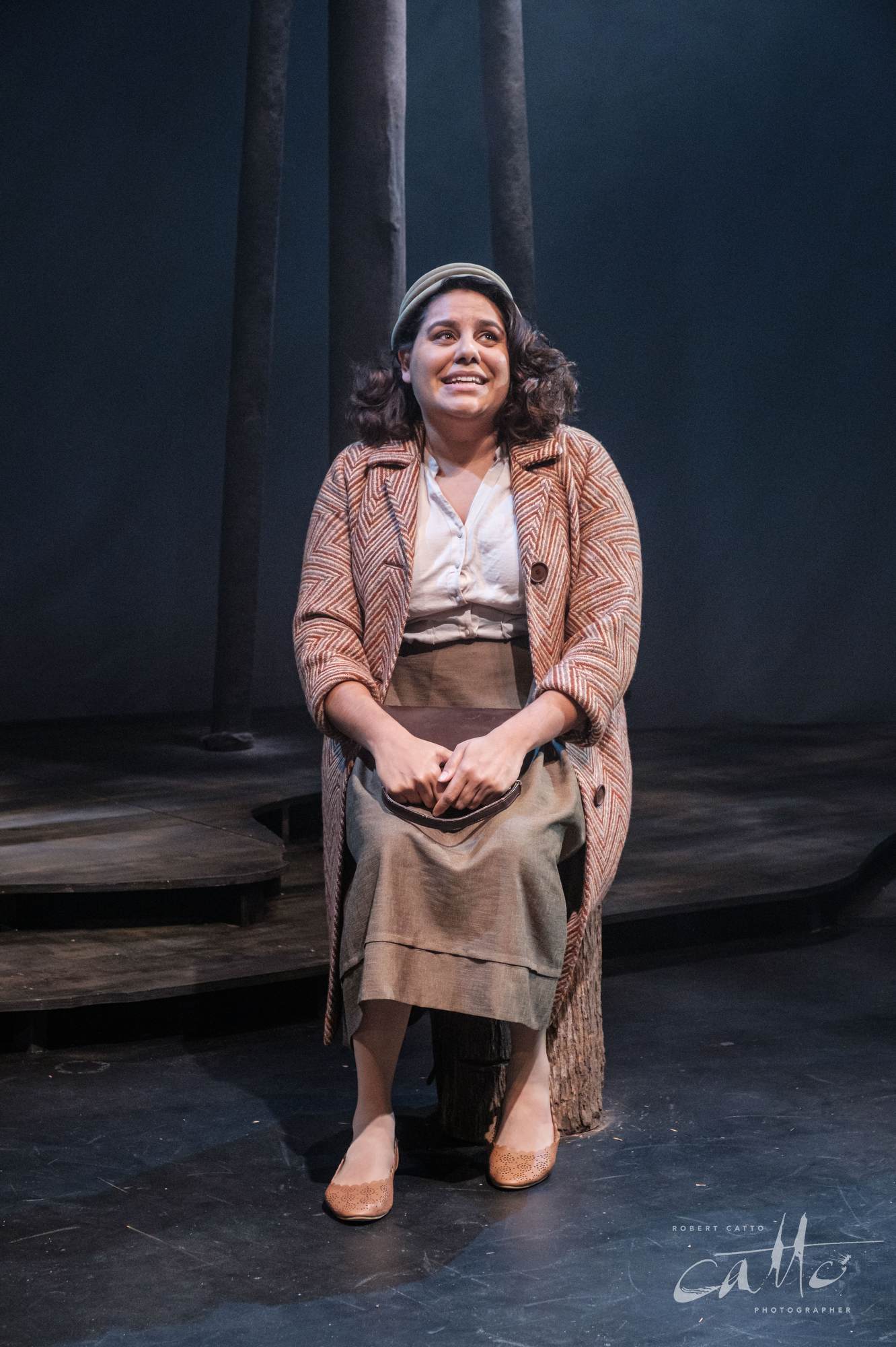
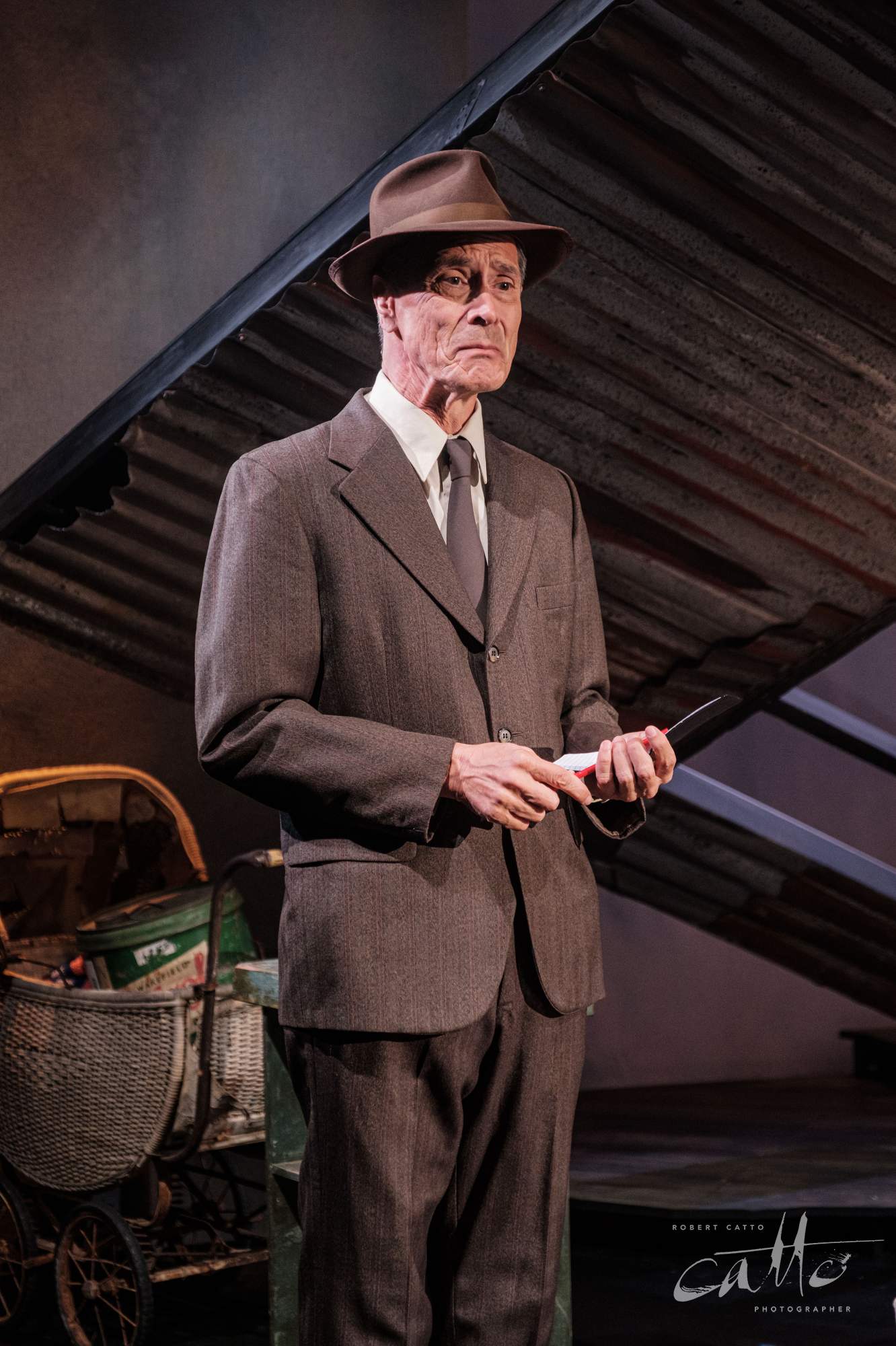
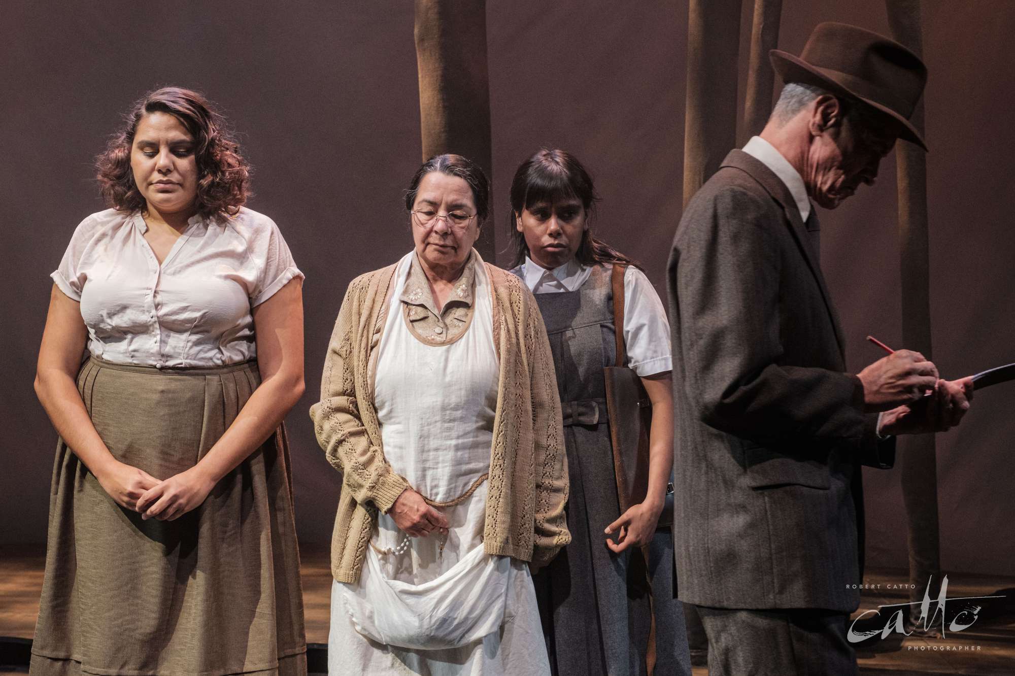
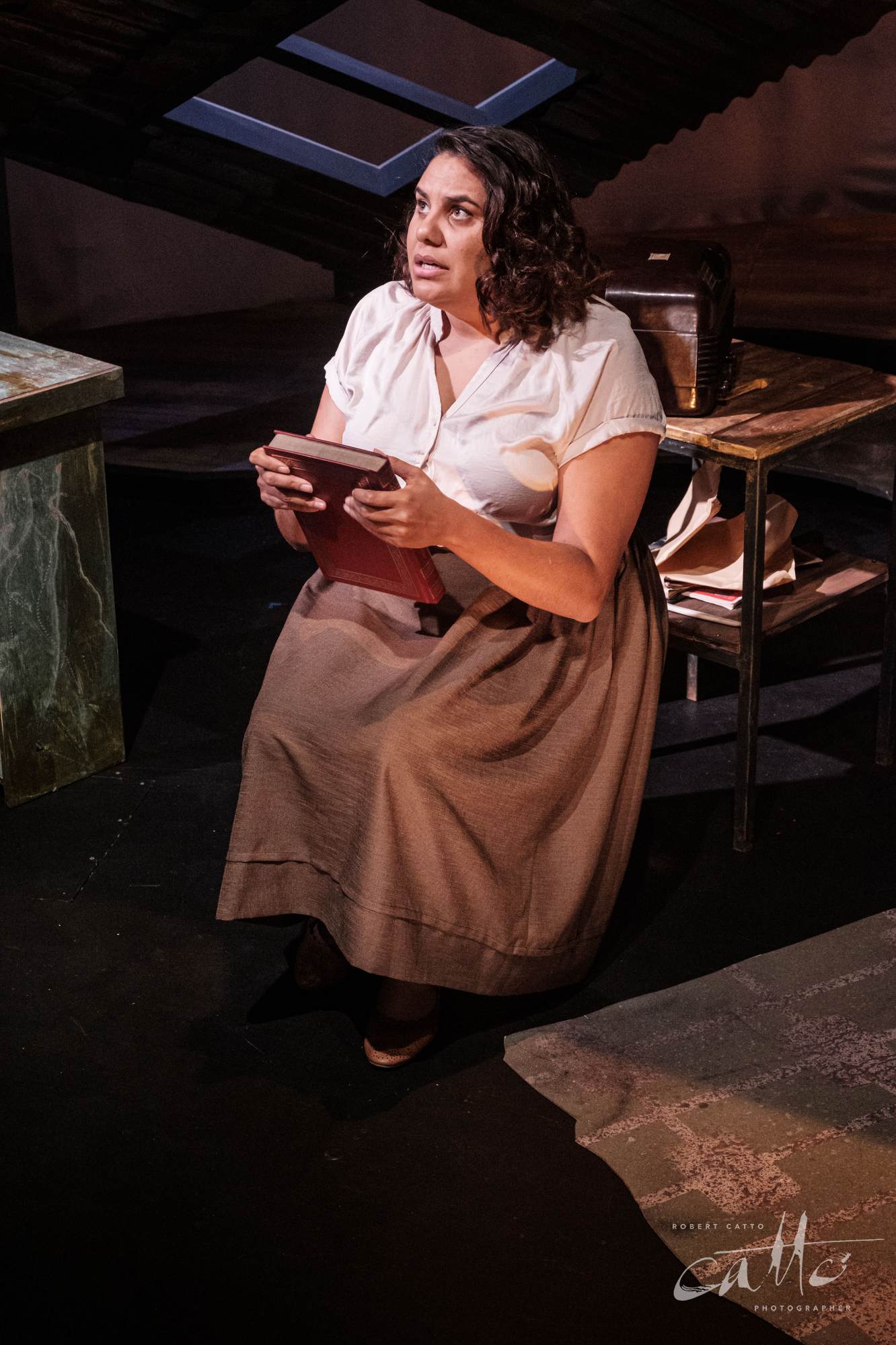
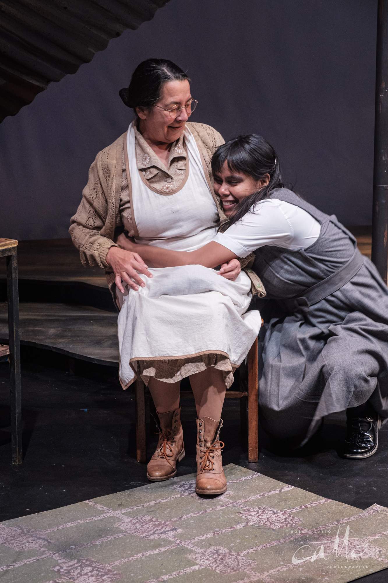
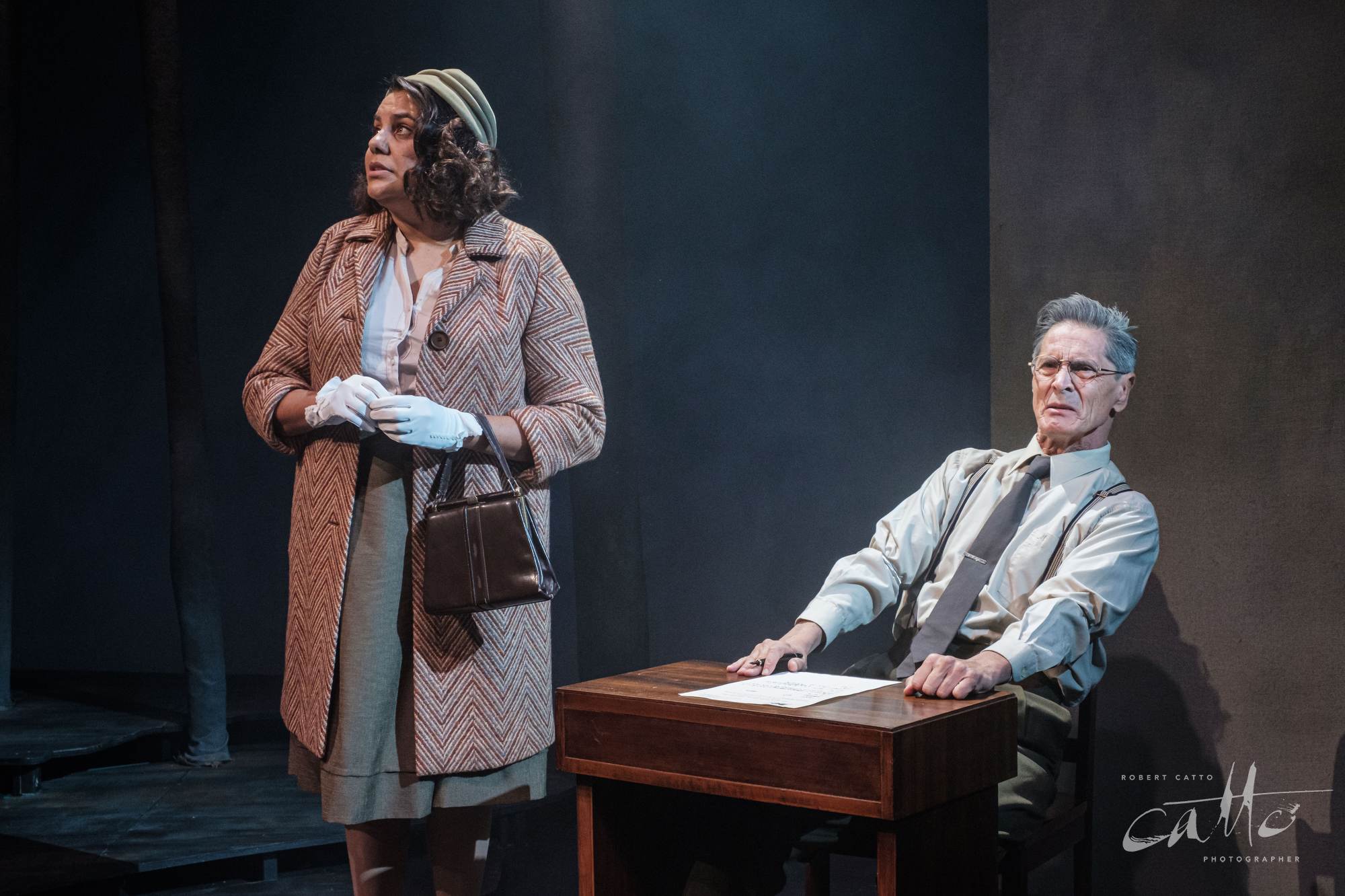
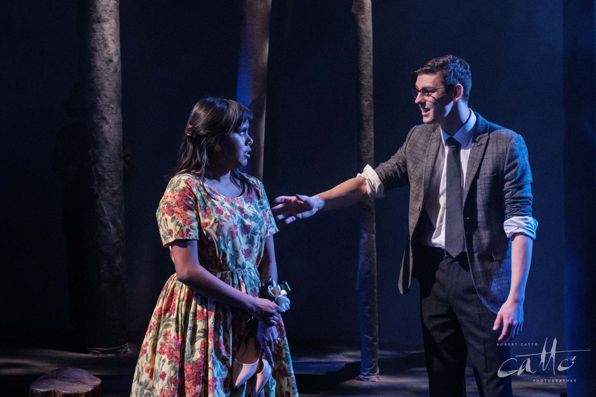
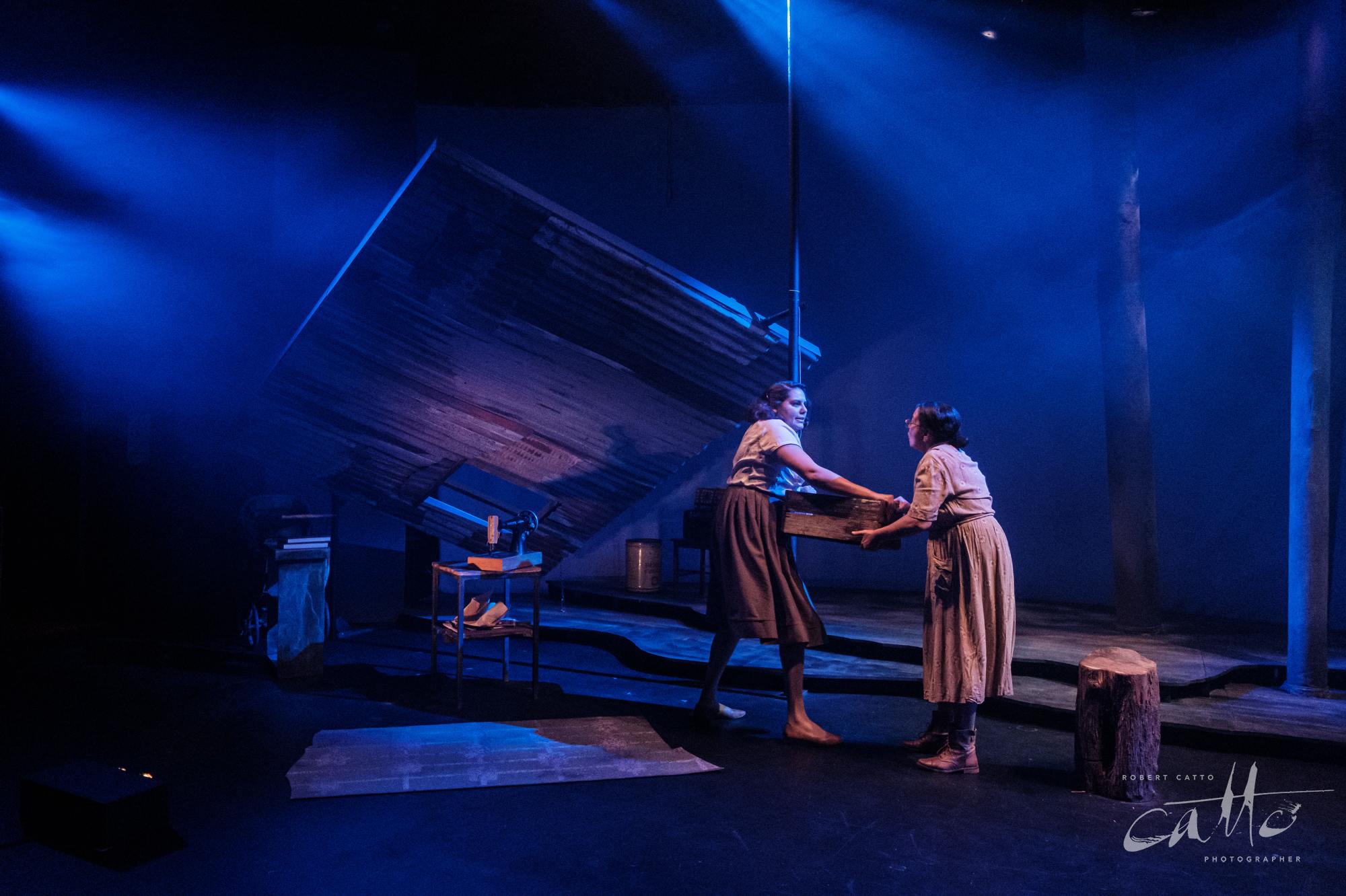
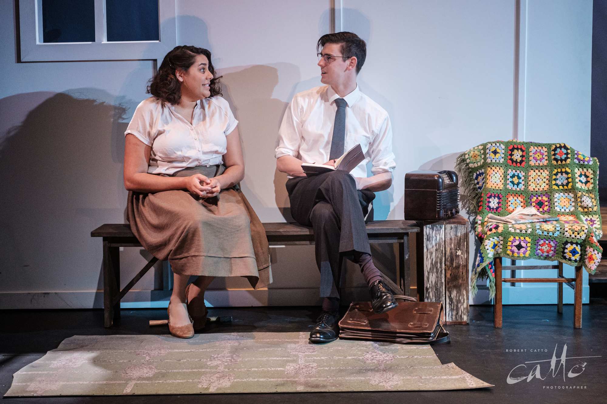
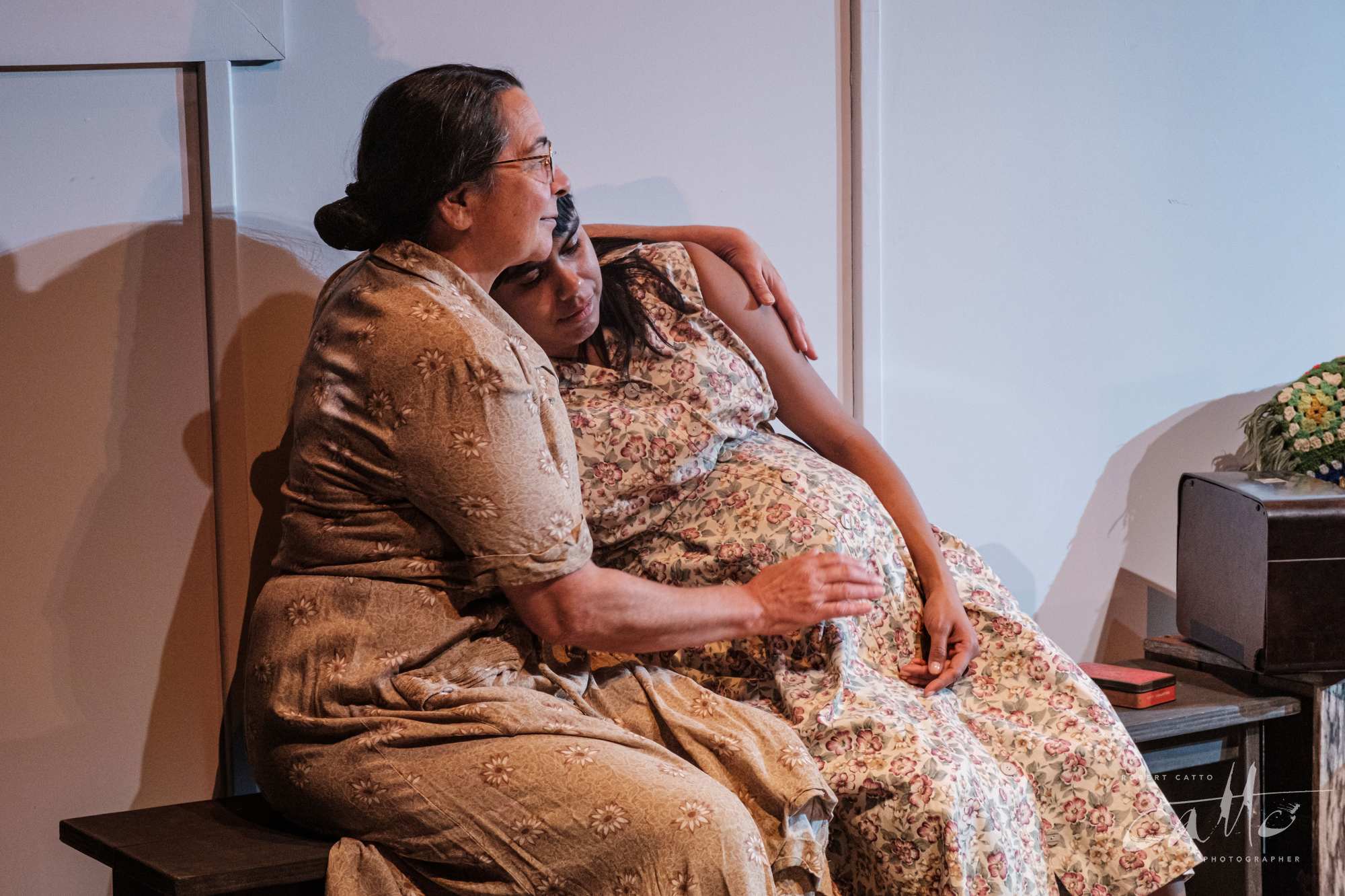
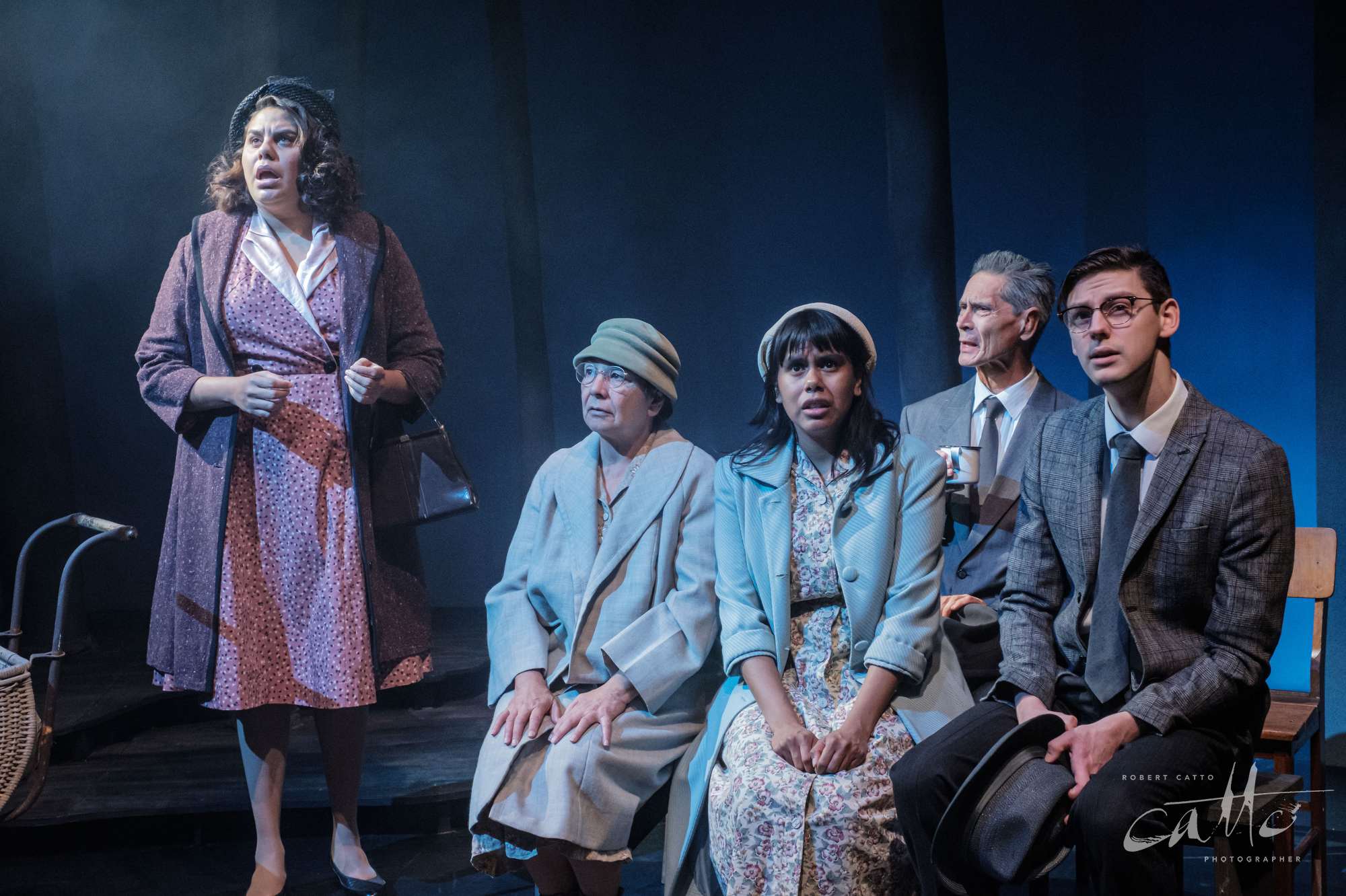
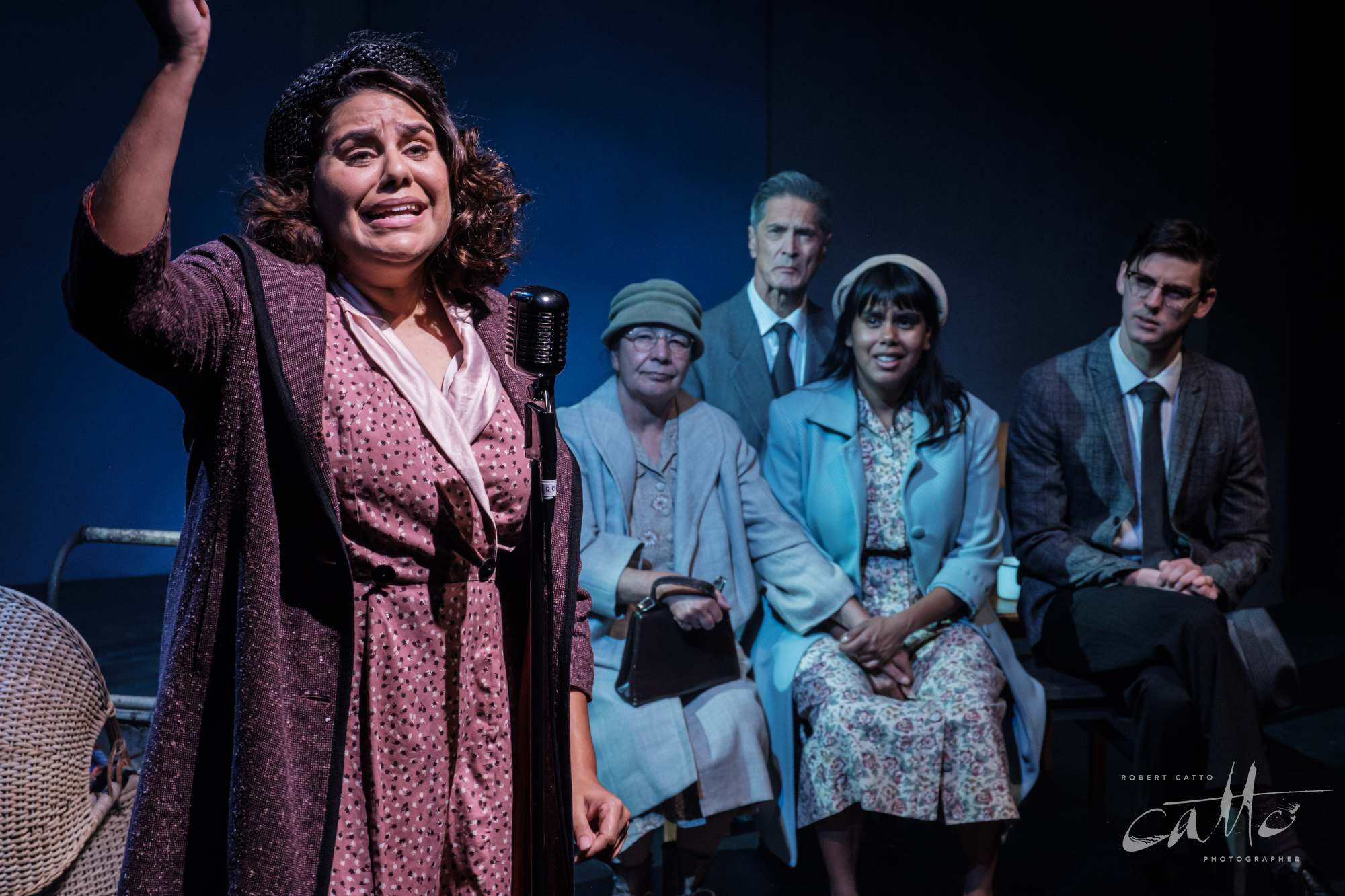
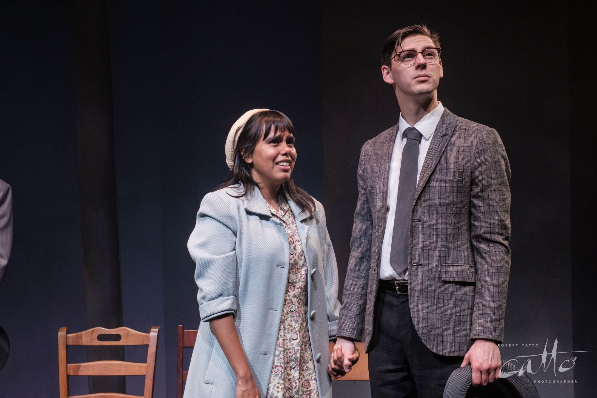
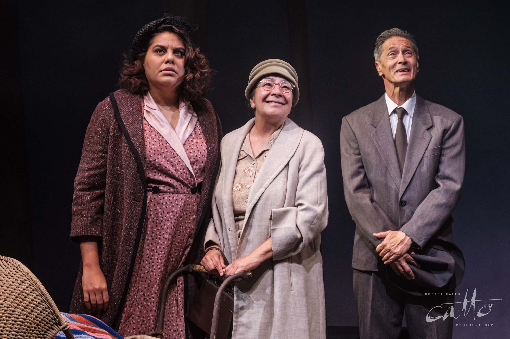
Throughout all the decisions I’m making on the fly during the shoot, what I’m doing is choosing how to direct your attention when you look at the images.
Where I stand, what lens I use, how much of the surroundings I include or leave out of each image, how much is in focus, how many people are in the frame - every image is crafted from a multitude of choices made, but none of those are really meant to draw attention to themselves; the end result should just feel like you’re in the audience, looking at the show, and choosing a part of the stage to look at for that moment.
All that said - the flip side of this is that photographers should always be credited with their work! The more effortless an image seems, the more effort, experience, instinct, and work it usually took to create.
So, just at the moment we manage to make ourselves invisible, when you’re looking at the image and seeing only the actors, the costumes, the direction, the set design, the lighting…that’s when the photographer’s name should quietly appear, below or beside the image - in the same way that a playwright’s name appears on a script, or a director or designer’s name shows up in the programme when you see the show.
You’re looking at our work - even when a lot of the work we’ve done may be hidden!
Rainbow’s End was at the Eternity Playhouse until 1 Sept 2019.
Playwright: Jane Harrison
Director: Liza-Mare Syron
Stage Manager: Julia Orlando
Lighting Designer: Karen Norris
Production Designer: Melanie Liertz
With Frederick Copperwaite, Phoebe Grainer, Lily Shearer, Lincoln Vickery and Dalara Williams.

