Photographing the arts: on shadows, strobes, & saturation
I wouldn’t describe myself as a massive fan of horror films, but I’ve seen my share. So when I was contacted about photographing Alice In Slasherland for Last One Standing, I was certainly interested - the idea of doing horror-comedy on stage is something that doesn’t get explored that often; apart from Evil Dead: The Musical I’d seen in Toronto years ago, I couldn’t think of another example off the top of my head.
Of course, theatre lighting is an interesting challenge at the best of times for a photographer; add in saturated colours, strobe lighting during action sequences, and fast movement in low light…well, it’s tricky!
For one thing, strobe lighting isn’t something you can anticipate, really; it goes off so quickly, and trying to synchronise that with a camera shutter that’s also capturing a fraction of a second leads to this - a series of nine black images for every one that even has light in it - and good luck getting that one to be well exposed, and in focus if the subject is moving at all! So you keep trying, and hoping something will land in your camera.
The other trick in a lot of theatre these days is dealing with colour - as lighting has moved towards LED sources which have the ability to change colour, rather than tungsten lights with gel in front of the lens, things have changed for photographers as well. When an LED produces a primary colour (and I’m just trying to describe this, I’m not breaking it down scientifically), that’s usually the ONLY colour you get from that light; and most cameras’ light meters will then overexpose the image, trying to gather enough brightness in the other two (red/green/blue) colour channels their sensors gather.
So an image with only red light in it will be super-saturated in that one colour, which often leads to a loss of highlight detail in the image, leaving the brightest parts looking bleached-out and featureless - unless the photographer compensates for that, either on the fly during the shoot (hard), or later while editing & converting the images (still hard, and adds time, but gives better results).
Editing image files has become this three-way battle, then - trying to choose a white balance for each & every image, while bringing out the detail and exposure in the image, and also reining in the saturation from the light sources - while keeping grain / noise to a minimum, of course. (Okay, it’s a four-way battle.) Though to be honest, a play based on a horror or b-movie genre is probably the one time grainy images are exactly the right look!
This show was a perfect example of all of these in one - Ben Brockman’s lighting is exactly what it should be for a horror - moody, shadowy, angular, atmospheric, colourful - basically, everything that’s tough to photograph, rolled into one…
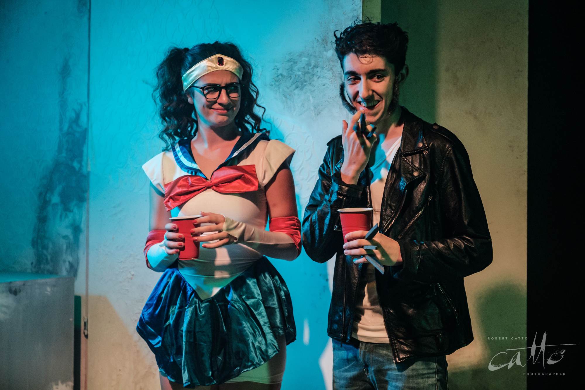
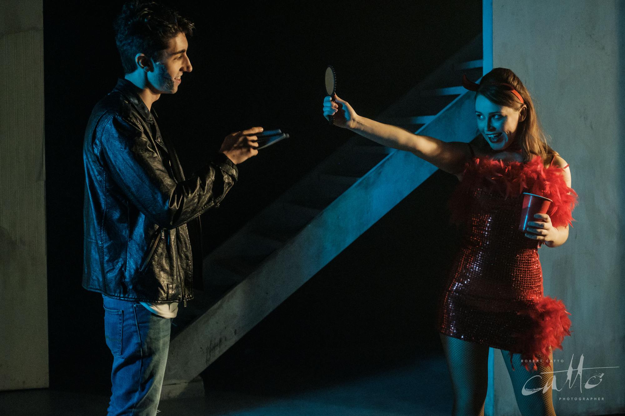
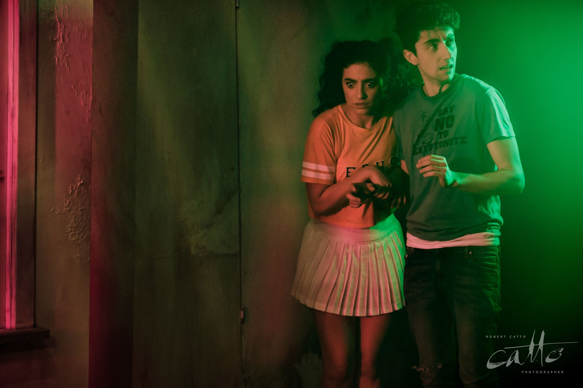
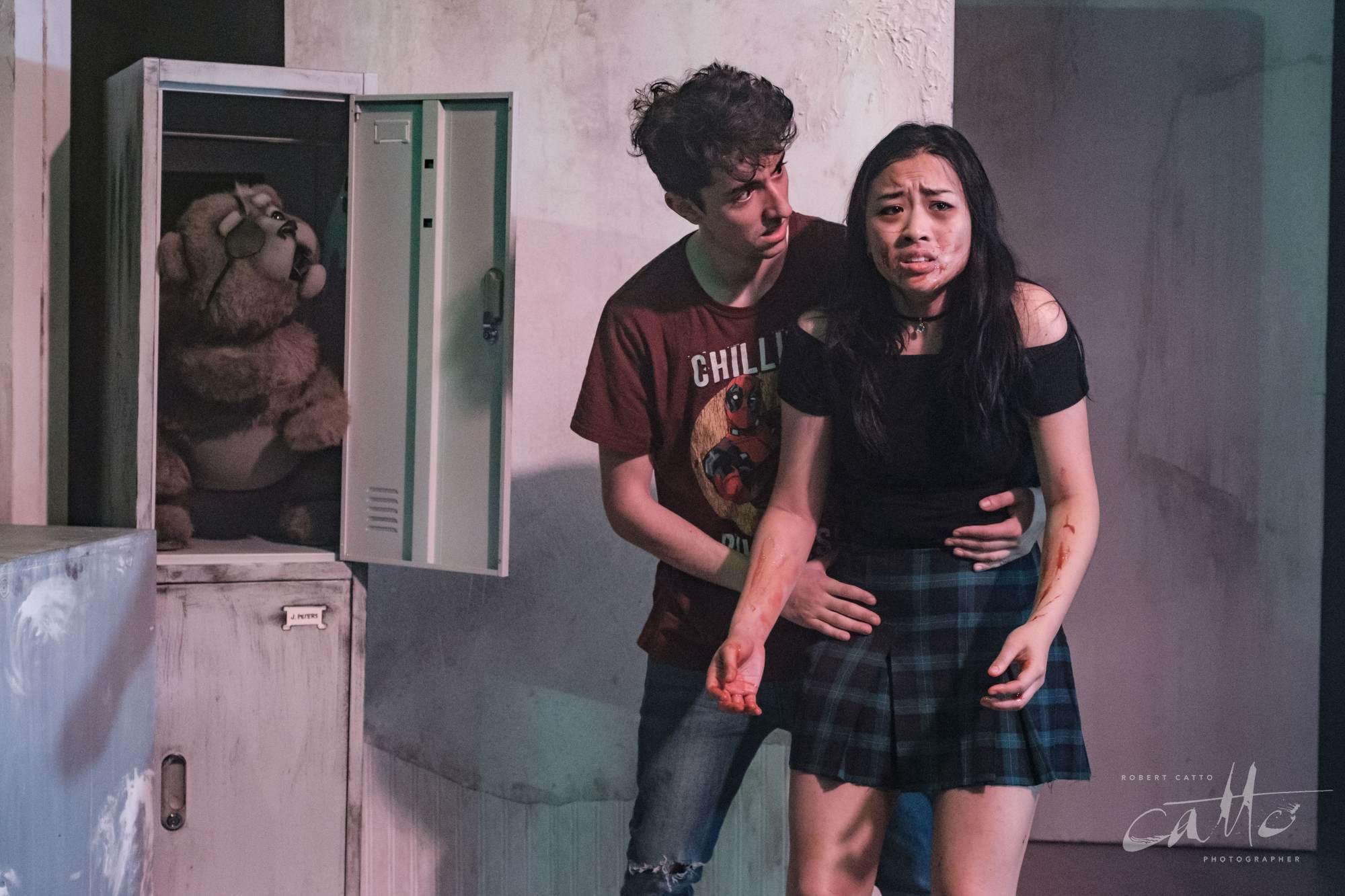

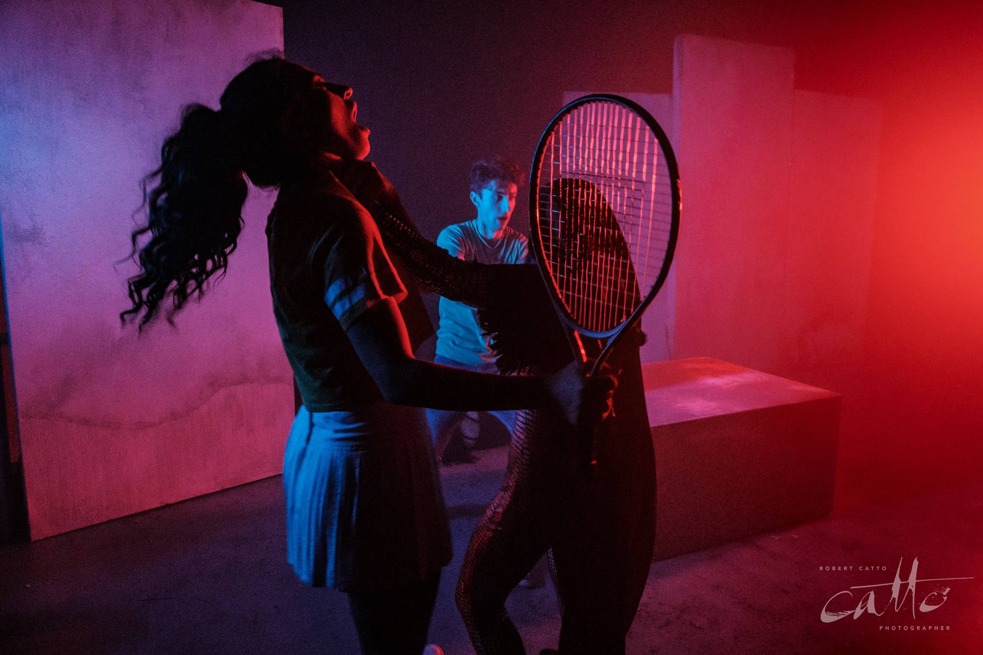
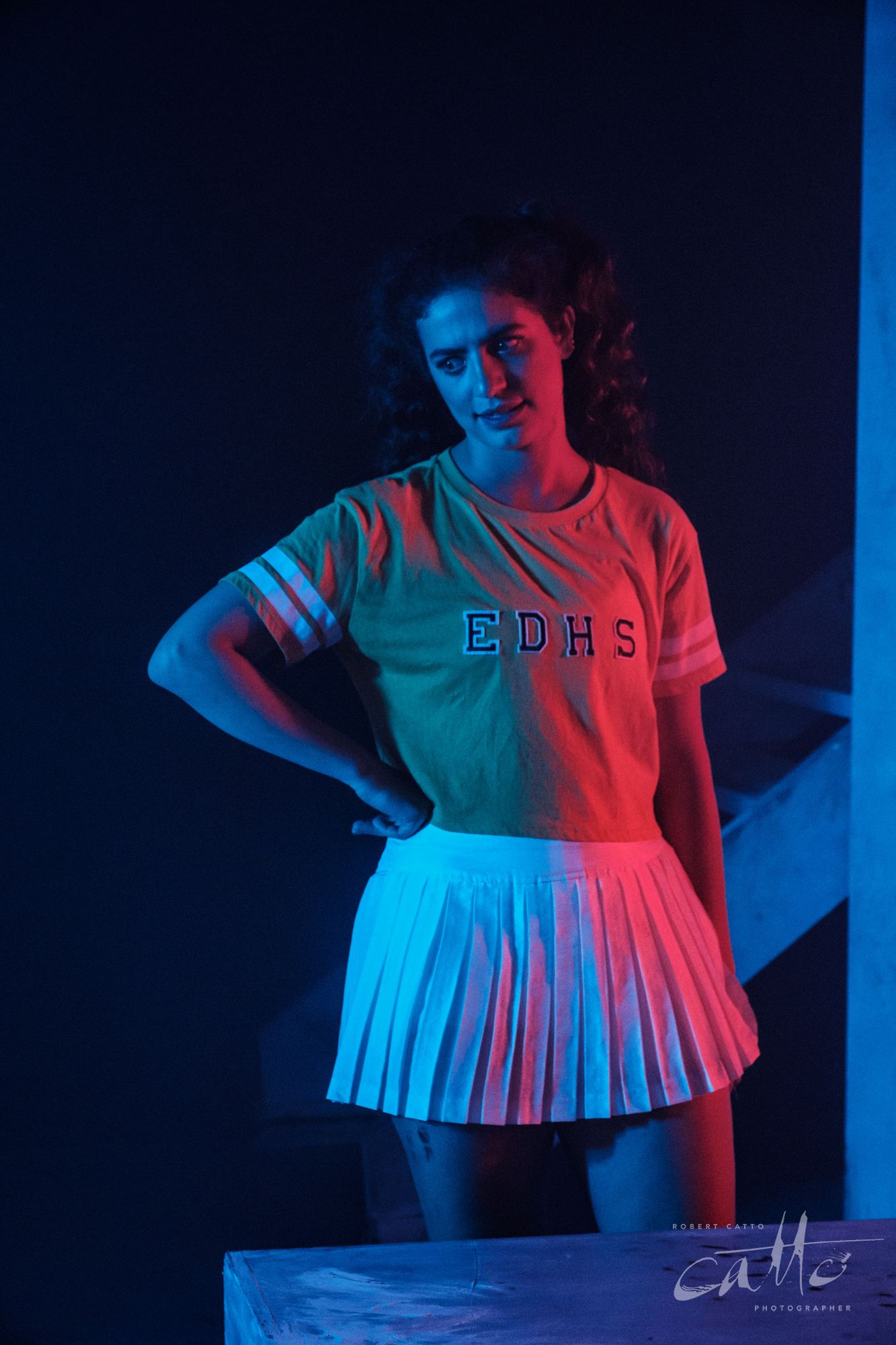
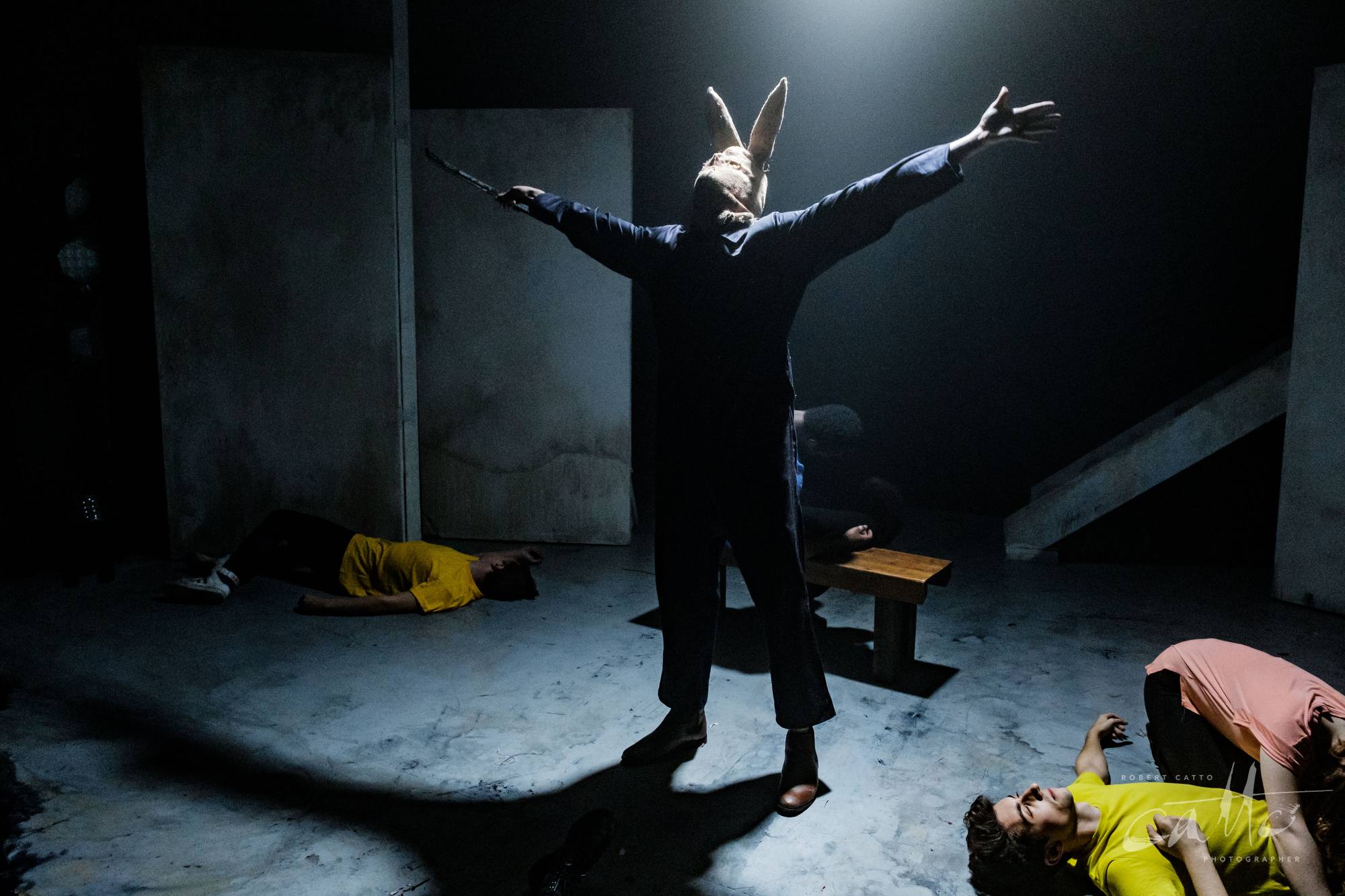
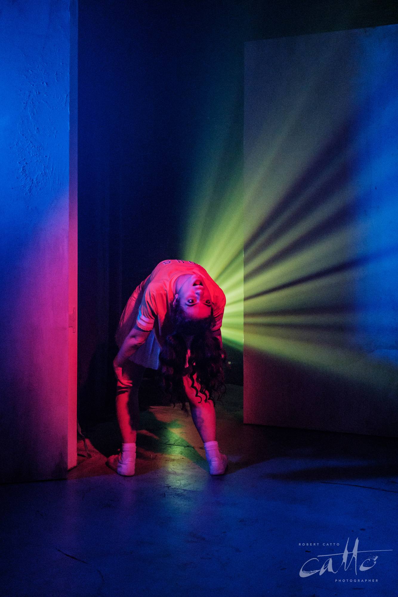
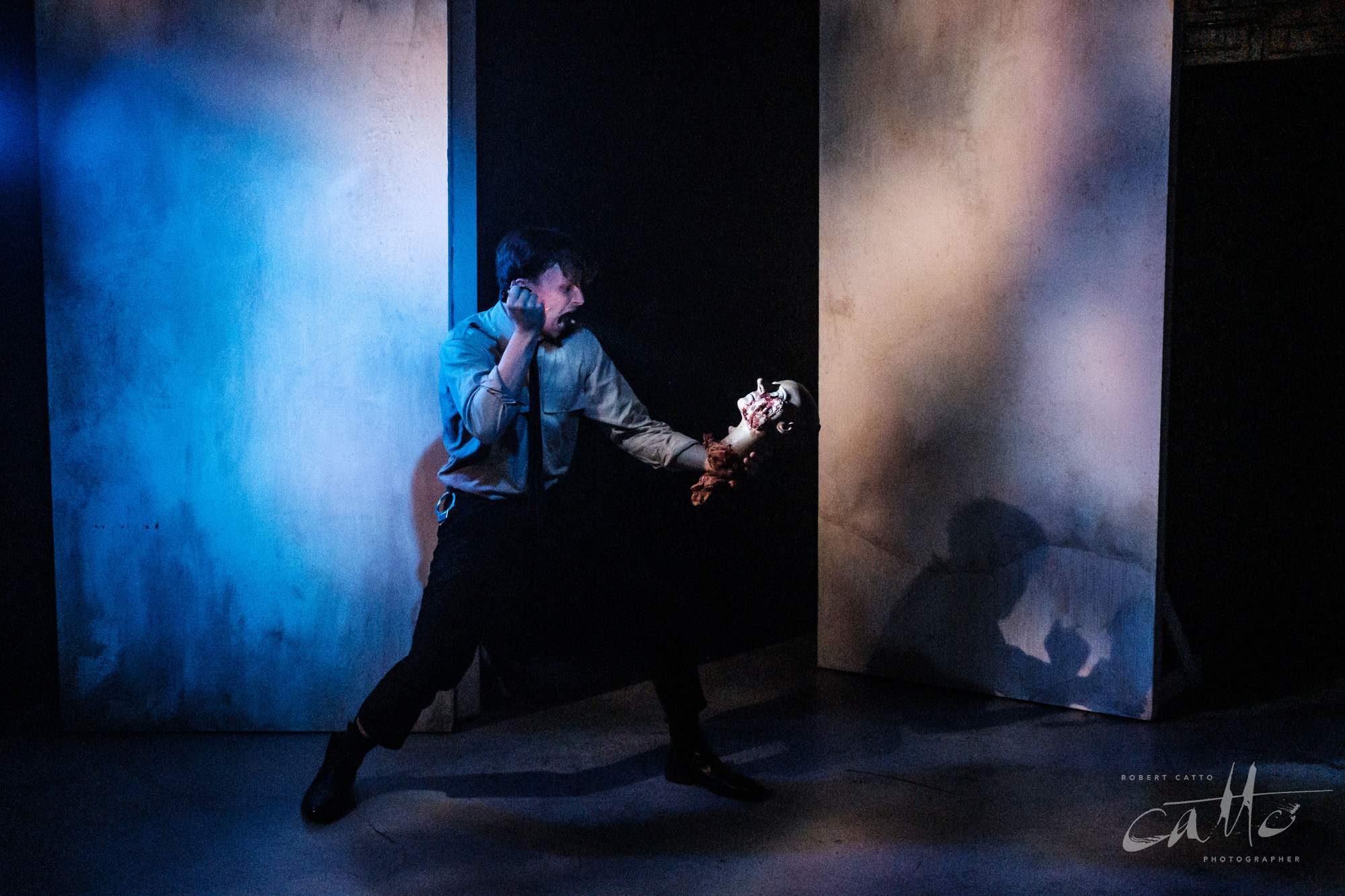
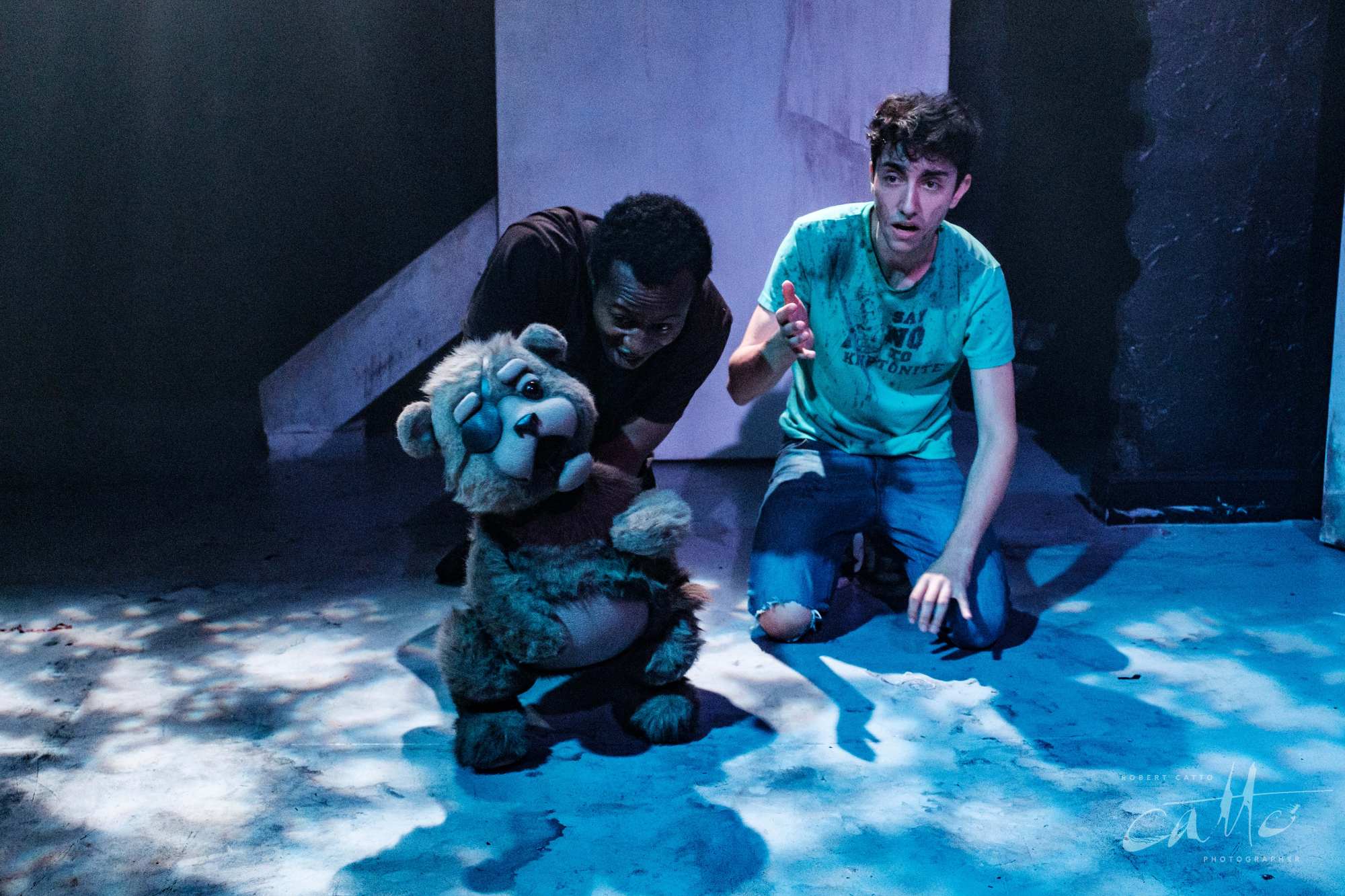
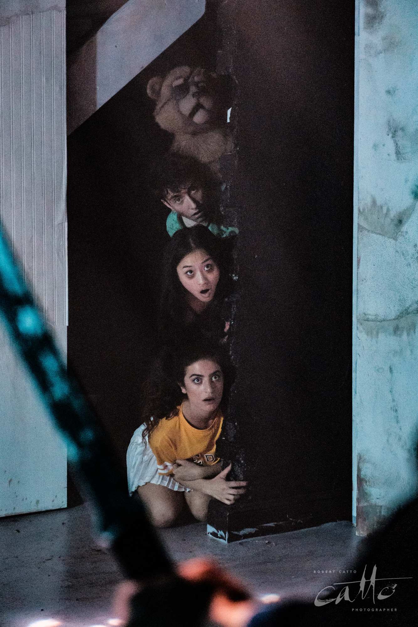
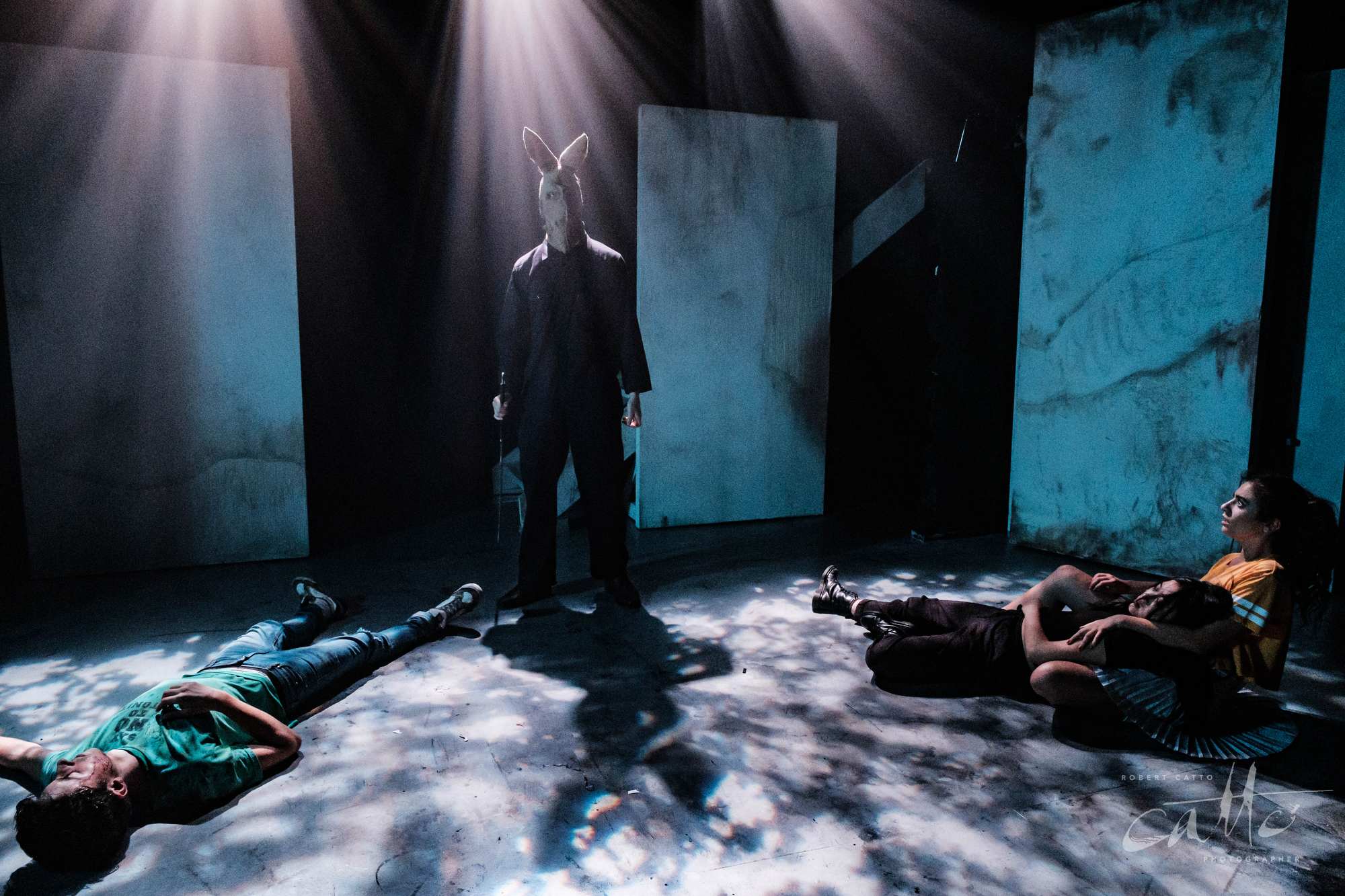
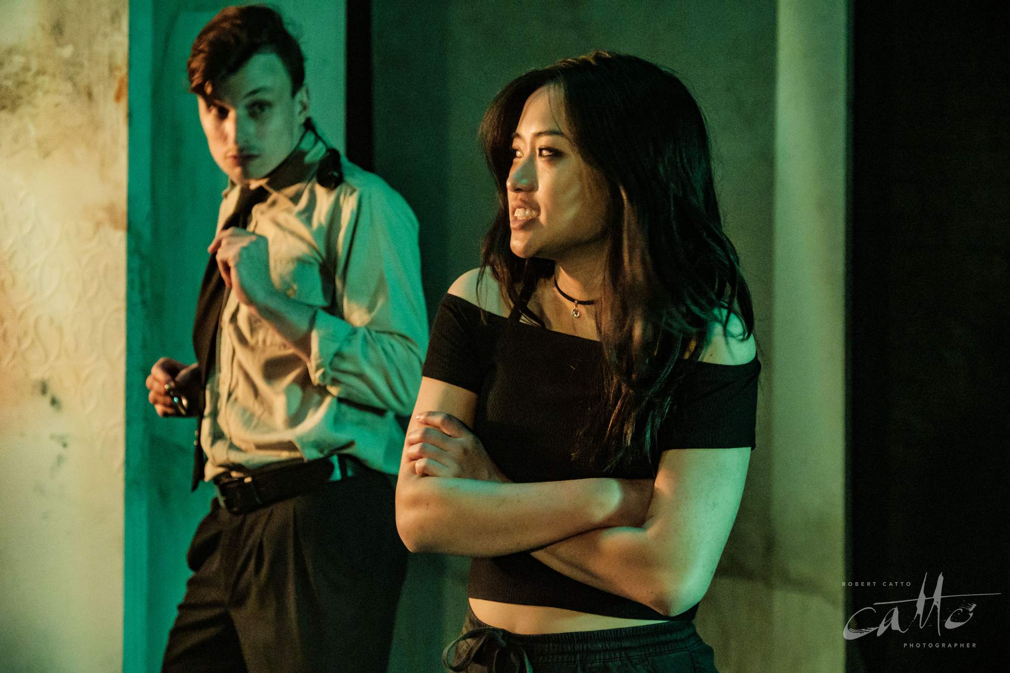
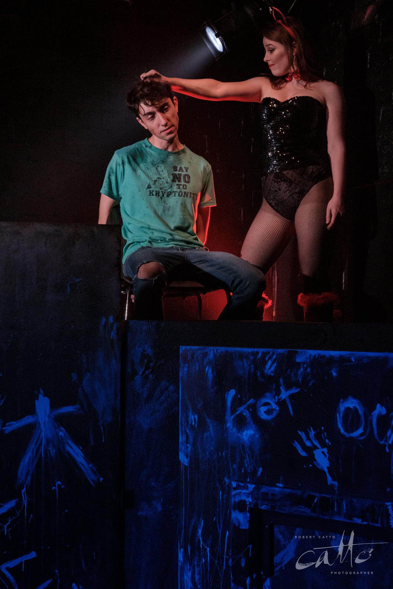
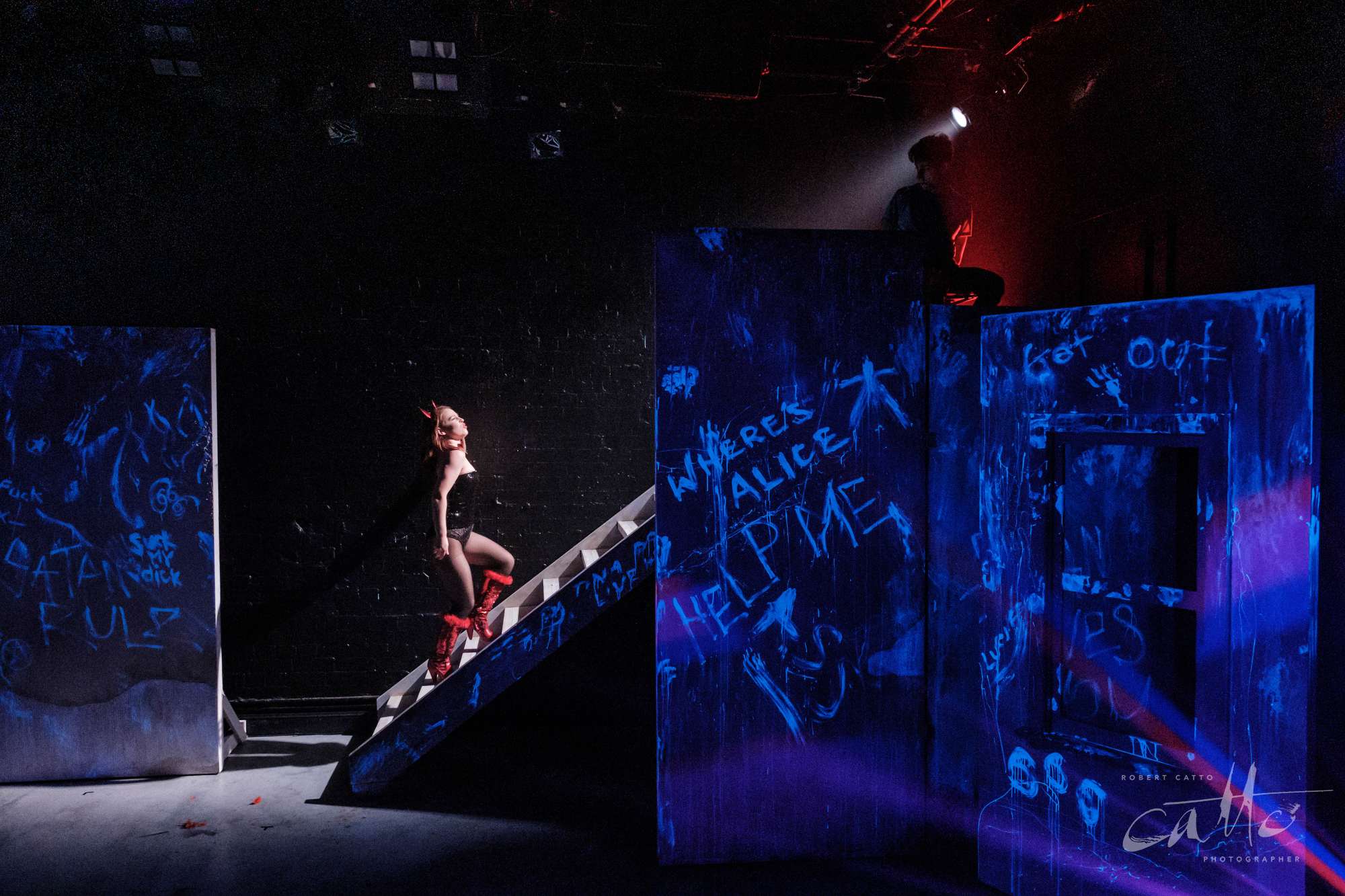
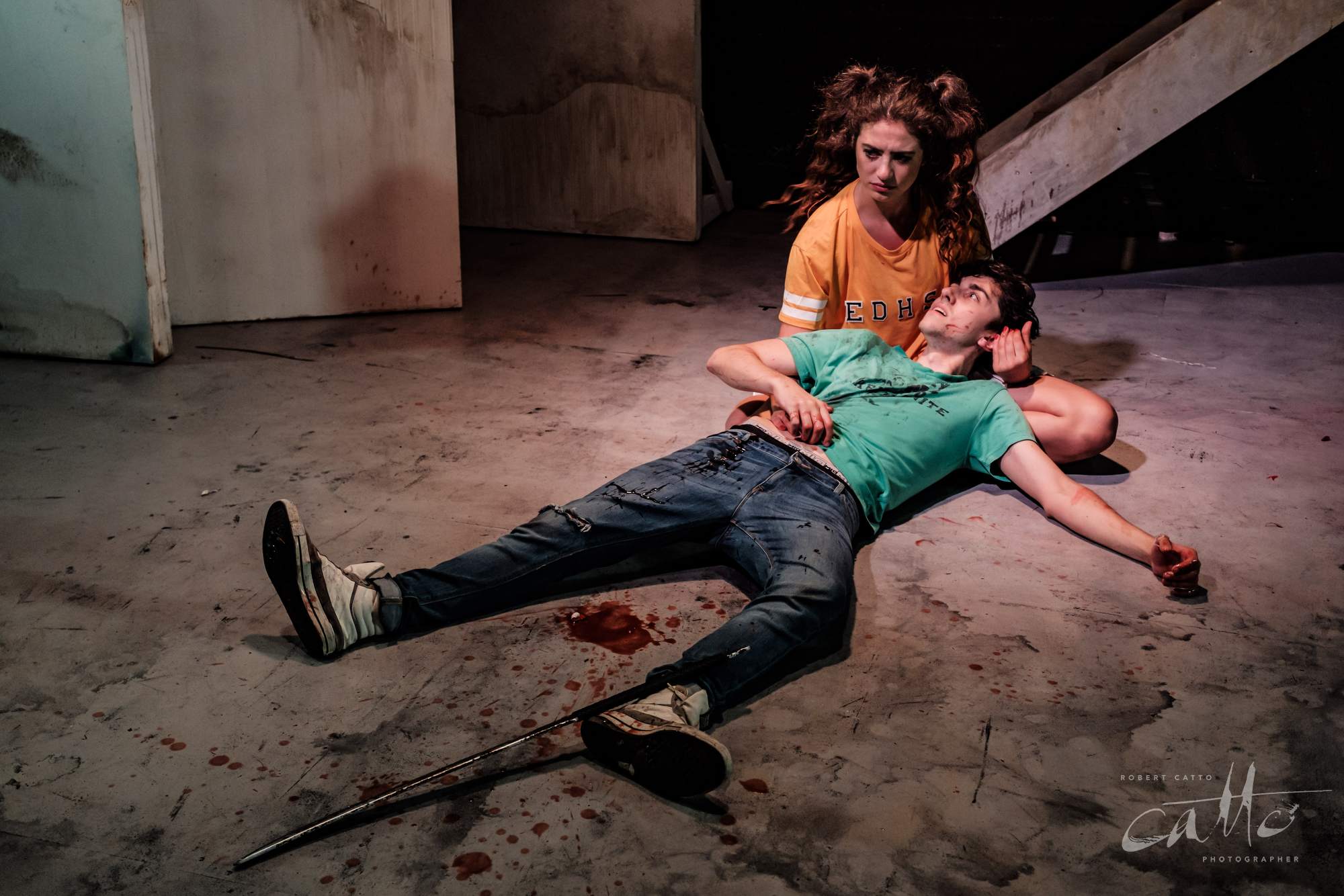
Fortunately, it works really well on stage. Great slashes of colour (with a bit of haze in the air) propel the supernatural action, while dark creatures roam the shadowy underworld of Lauren Peters’ stage design.
And off stage, back at my desk, I use my secret weapon - Fujifilm’s film simulation profiles for the cameras I have - to tone the intensity of the colours down in Adobe Camera Raw, then bring them back in appropriate doses where needed. Often I’ll also take a photo before a show starts, of my Colour Checker under a fairly neutral stage wash - that can give me a good starting point in terms of the colour balance of the lights for the show, though in this case there were a lot of different shades to work with…!
But overall, that’s the key - having strategies and tools to control and modify the saturation, light, shadow, and noise levels after the fact gives me so much more control over the images than if I was just to accept what the camera decided at the time. I can work towards images that show the intent of the production designers - rather than the limitations of current camera technology - and finish with something that looks like it did on stage, to the audience; if not better.
It takes time - often much longer than the shoot did, and more than the budget covers - to work through each & every image this way; but could I really consider myself a professional photographer if I didn’t try to do my best work, every time?
★★★★½ "A HIGH ENERGY HIT" - ArtsHub
★★★★ "FEELS FRESH AND FIERY AS HELL" - Time Out Sydney
"A FRIVOLOUS FRIGHT NIGHT" - Sydney Arts Guide
"WILL HAVE YOU LAUGHING" - BroadwayWorld Australia
Alice In Slasherland continues until 11 May 2019, at the Old Fitz Theatre.
CAST: Justin Amankwah, Jack Angwin, Josh McElroy, Bardiya McKinnon, Mia Morrissey, Laura Murphy, Stella Ye
CREATIVE TEAM:
Playwright: Qui Nguyen
Director: Rachel Kerry
Producer: Last One Standing Theatre Company in association with Red Line Productions
Combat & Movement Director: Nigel Poulton
Combat & Movement Assistants: Tim Dashwood & Jack Crumlin
Set Design: Lauren Peters
Lighting Design: Ben Brockman
Costume Design: Kate Beere
Make-Up: Georgia Moroney
Puppet Design & Construction: Indi Redding
