Photographing the arts: how do I support design decisions through production images?
Six characters in search of a voice, Small Mouth Sounds is a near-silent play featuring a group of individuals sharing a silent retreat, the quiet broken only by the pronouncements of the self-declared guru they’ve come to learn from. But will they learn anything from him, or each other?
The play is as much about the baggage the characters bring with them to the retreat, and how each of them handles their own failures and weaknesses - or, completely fails to - over the course of a few days together. In silence.
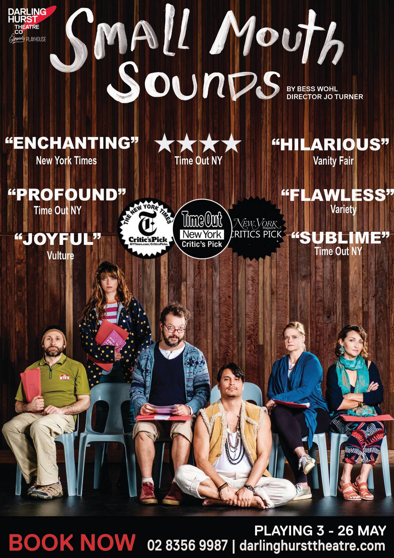
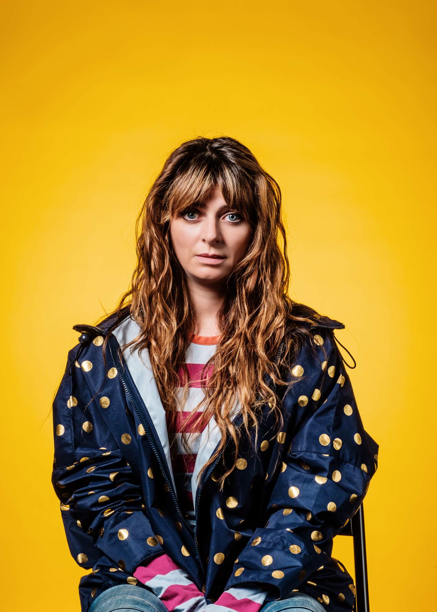
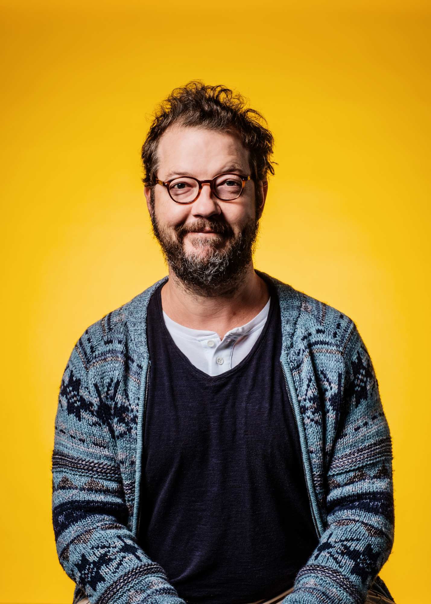
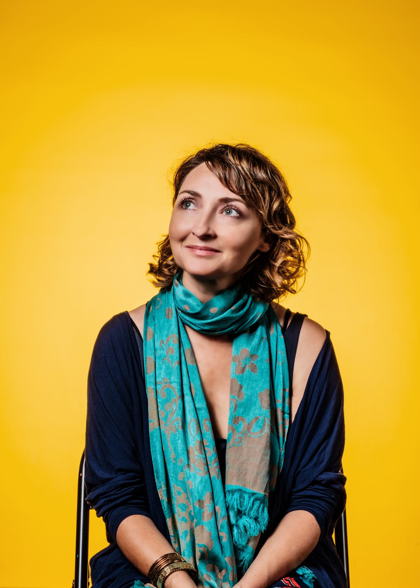
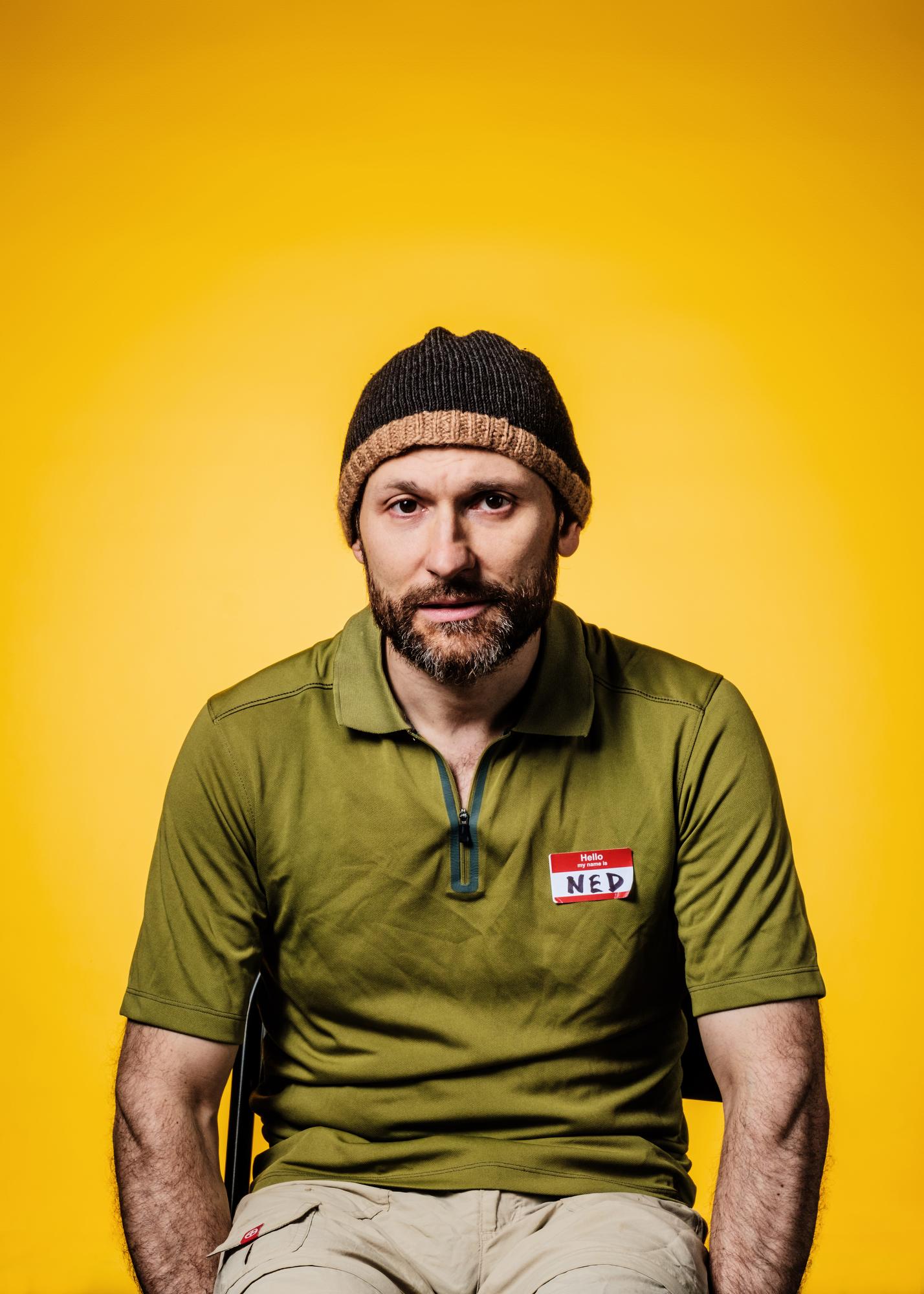
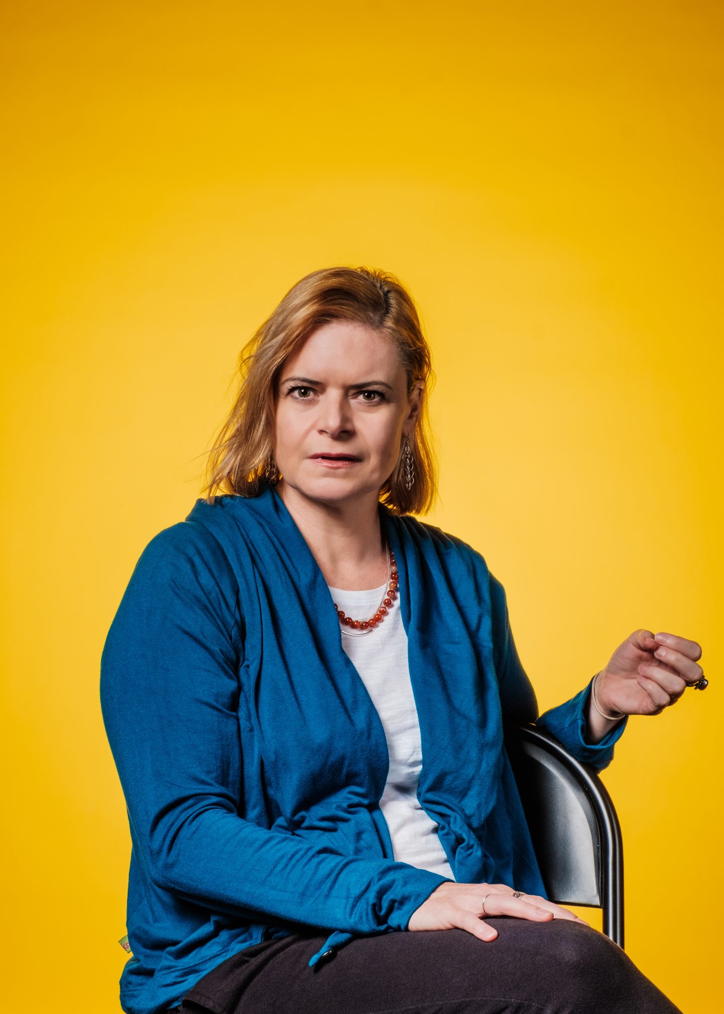
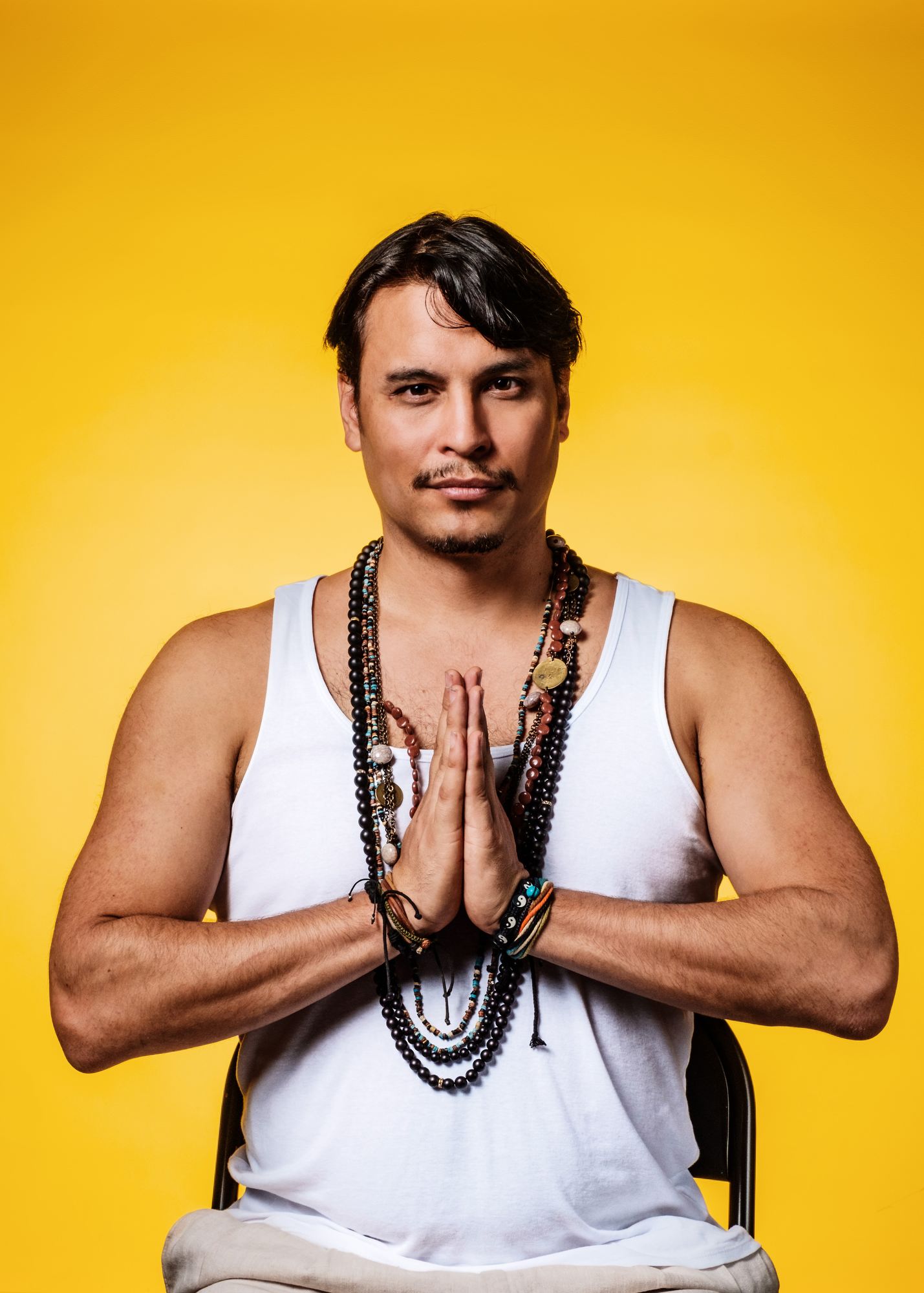
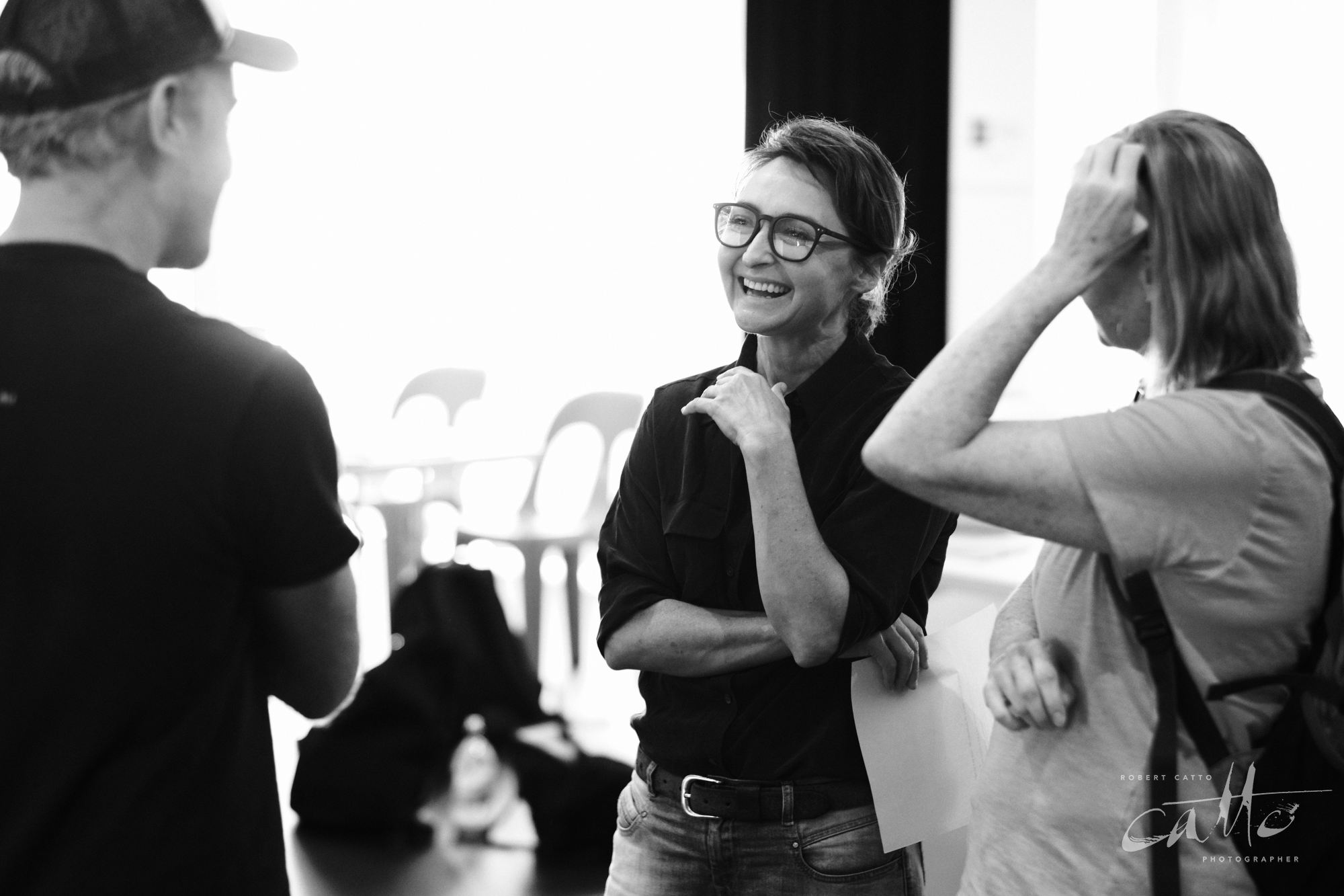
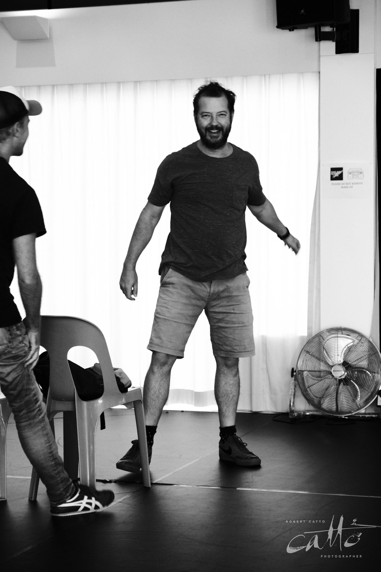
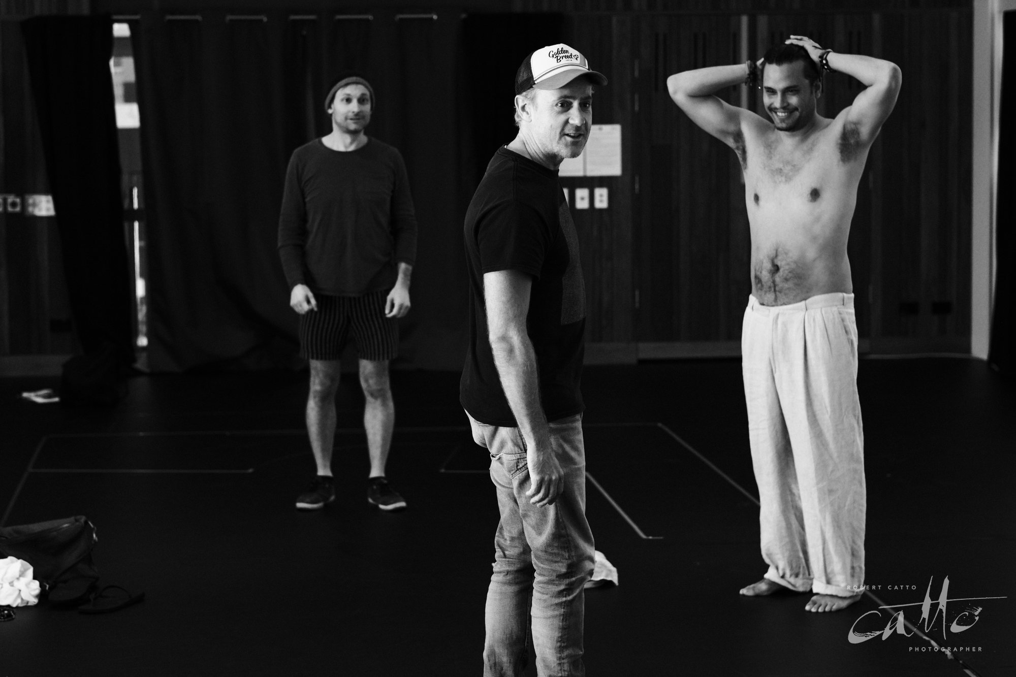
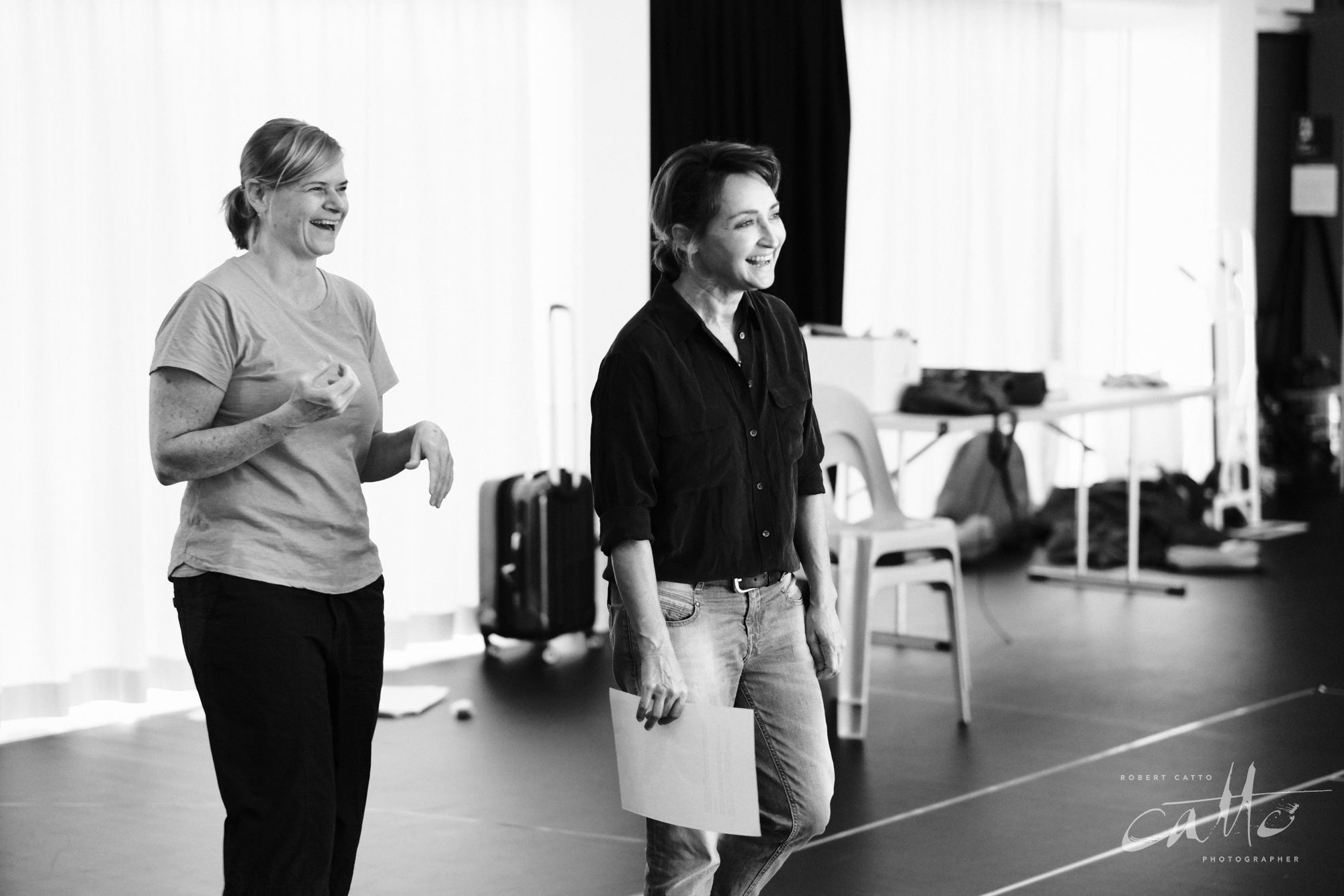
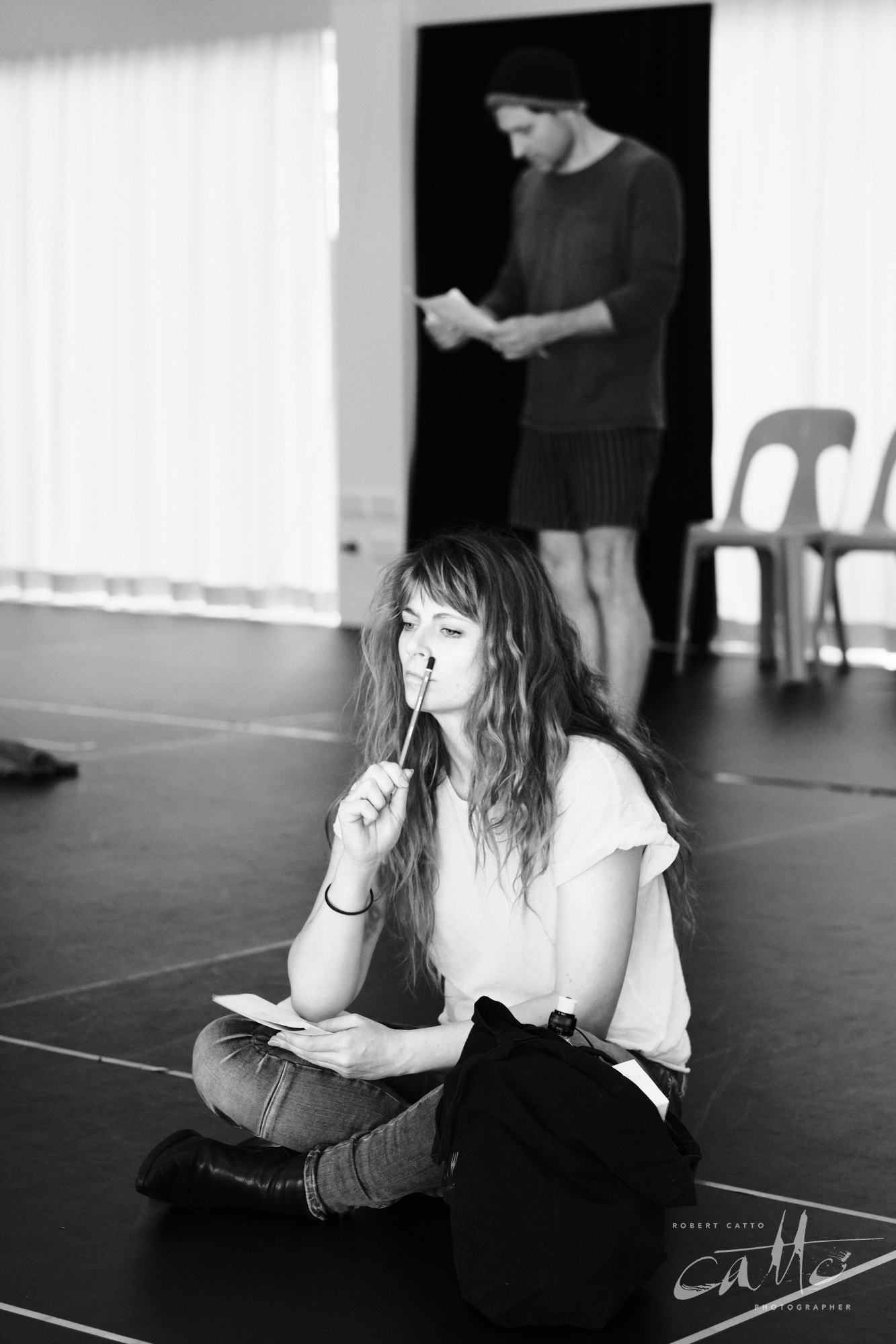
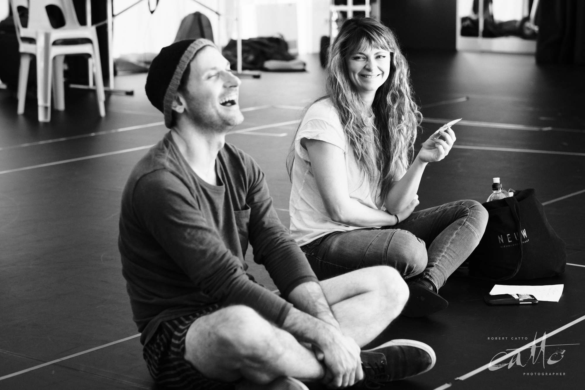
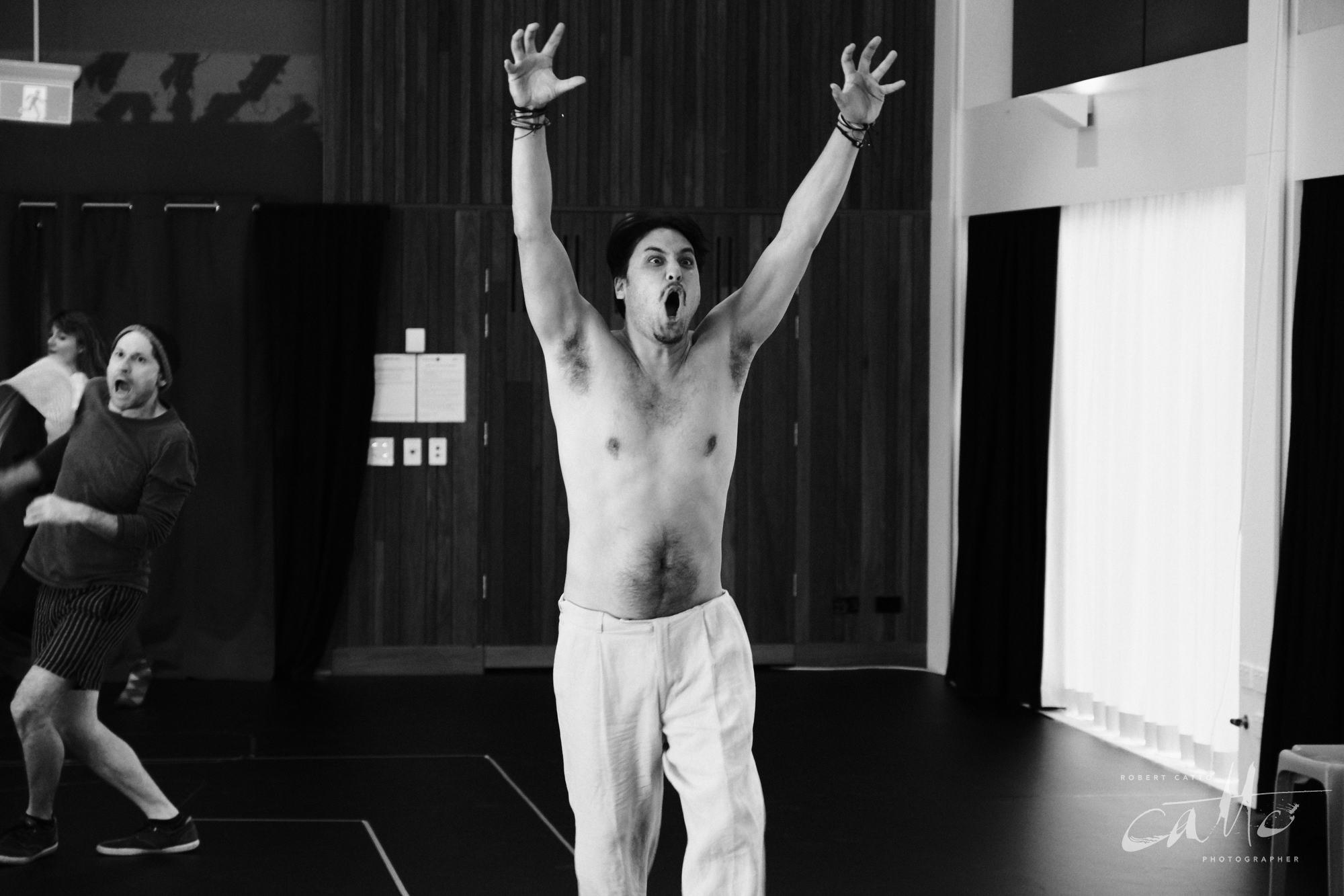
As part of my ongoing work with Darlinghurst Theatre Company for their 2019 season, I was back at the rehearsal room in March to create a poster image for Small Mouth Sounds, as well as character portraits for the cast of the show.
It’s an interesting piece - because the script has hardly any text (at least, not spoken by the people on stage), it helps immensely that playwright Bess Wohl starts off with extensive descriptions of the characters. Having read it ahead of time, I could see how the show worked, and how a moment out of the first scene of the play made perfect sense for the hero image.
When we meet the characters for the first time, they’re not quite silent; they arrive (some earlier than others), they sort themselves out, and it begins; but not without the kind of awkwardness and tripping over each other that comes from a group of people who don’t know each other, trying to share a space (and accommodation) - and to work out exactly what’s going to happen from here on…without words.
I was talking recently, on an episode of the Closing Night: Theatre Therapy podcast (which is up now, check it out!), about finding ways for the imagery that accompanies a show to support the underlying essence of the script, and the production. We were talking initially about whether theatre photographers have their own specific style or signature that you can see in their work, that makes them instantly recognisable; but to me, coming from a background of lighting design for theatre, I’m not sure that imposing my own personal style on an image is necessarily the best way to serve the script, or the production.
For example - and this is just one of many considerations - I sometimes think of plays as being either settled in their design, or chaotic.
What I mean by that is that some shows are more architectural, naturalistic, or representational; what unfolds over the course of the play happens in a realistic, recognisable universe - so it makes sense for the photography to remain inside that world, to not show the edges of the set where that reality runs out.
Other times, the production makes a point of saying “THIS IS A PLAY YOU ARE WATCHING” - deliberately making a statement about the artificiality of the experience of being watched by an audience, in a theatre, on a stage, with lights and sound and makeup and all. In those situations, it also makes sense to underline that with the photography: to show the production elements, to break the illusion, to admit it’s not real and embrace that in the framing of the images. (Alice In Slasherland was more on the chaotic spectrum, for example!)
I’ve talked before about creating depth in production images, and that’s still important here - this is more about the decision of what to include in the images, where the edges of the frame should land, though it also impacts decisions about colour balance, which again comes back to how real or natural the production should feel in the images.
To me, Small Mouth Sounds is a more naturalistic piece, and the design elements of the production underscored that. The audience is part of the journey with the cast, and immersed in the world they’re in - especially through designer Tegan Nicholls’ use of sound, in which the disembodied voice of the guru is above, around, and within us all.
Of course, the sound design isn’t visible in the images - that’s always a problem with photography! You’ll have to visit the theatre to get the full experience…
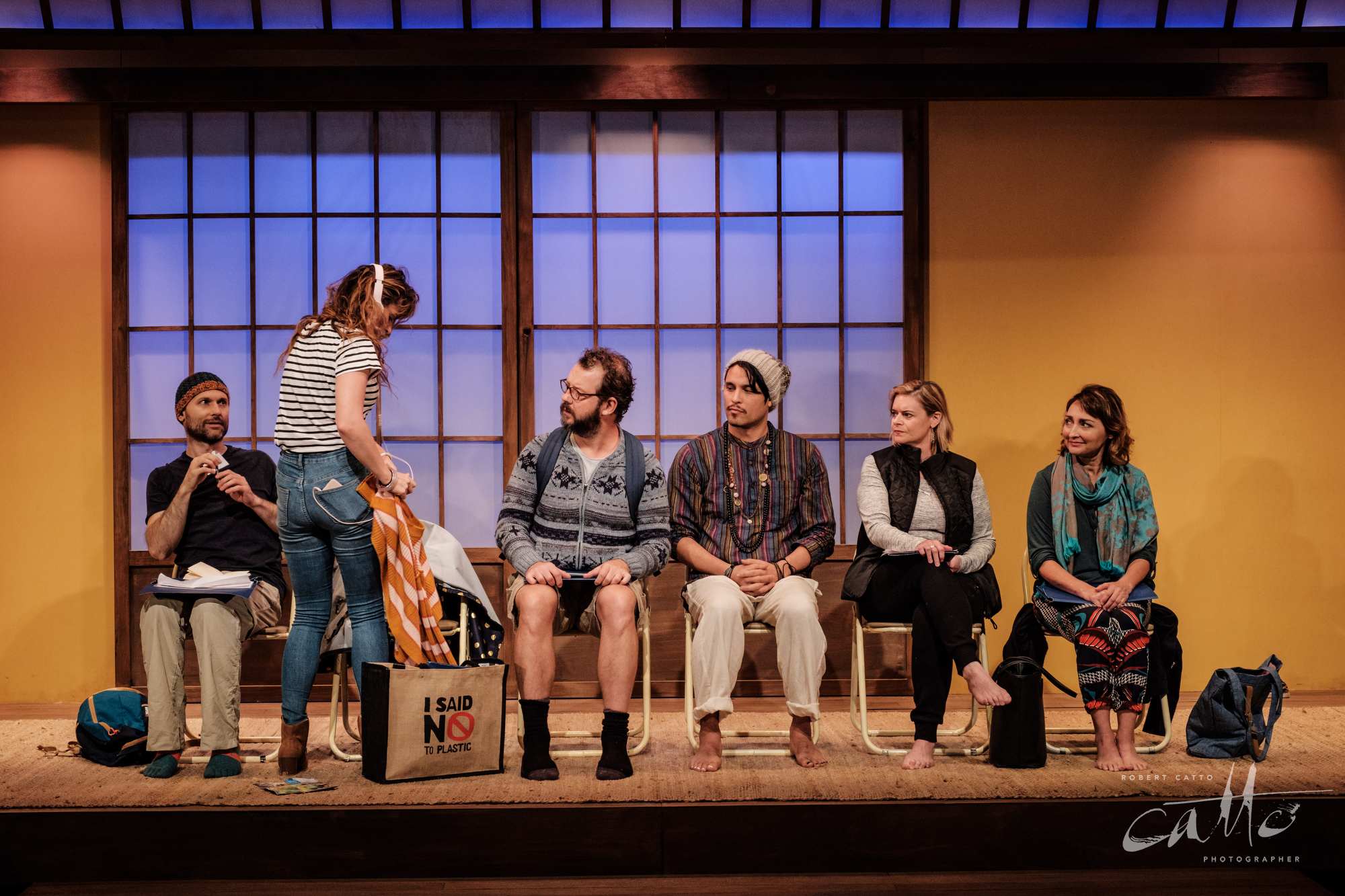
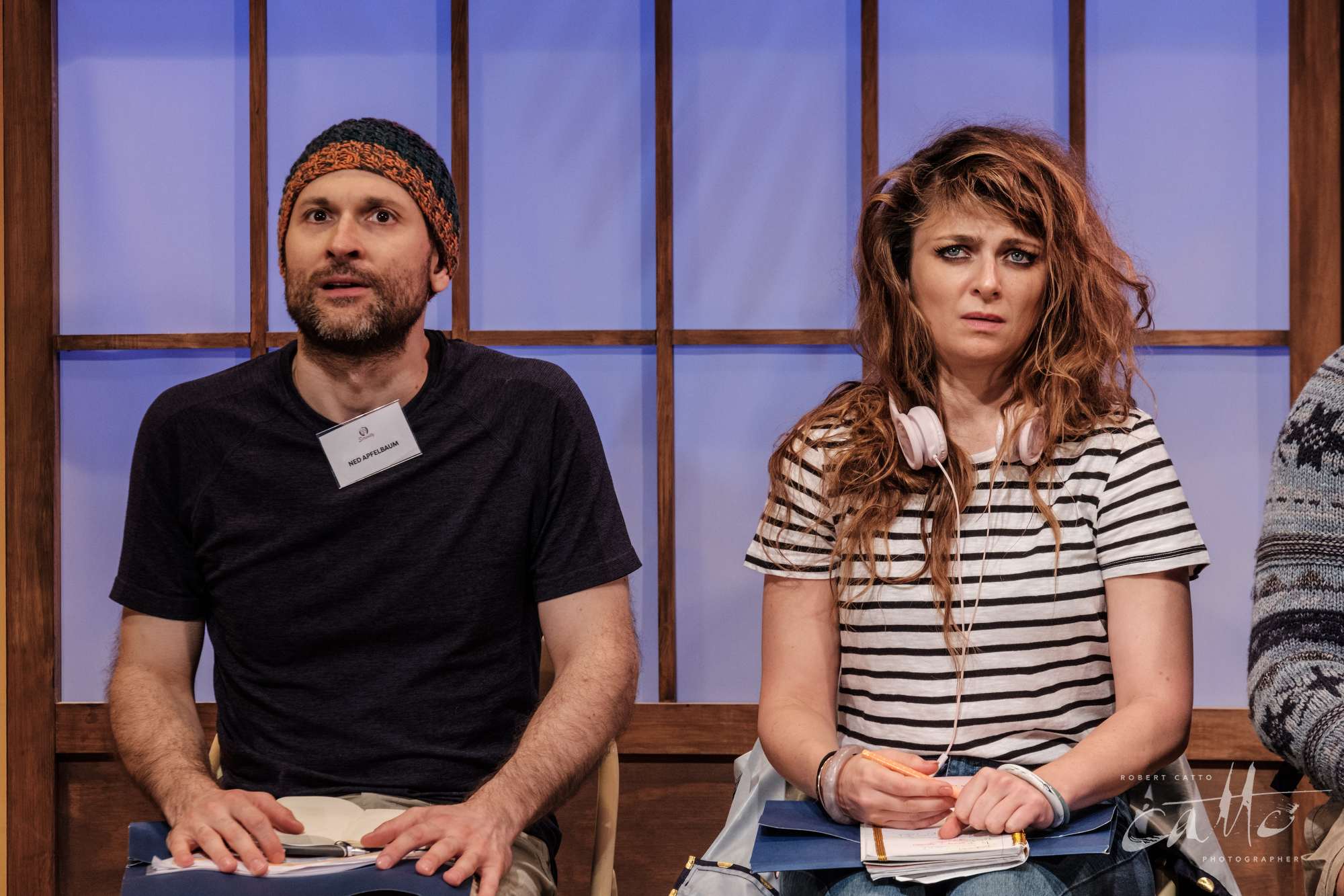
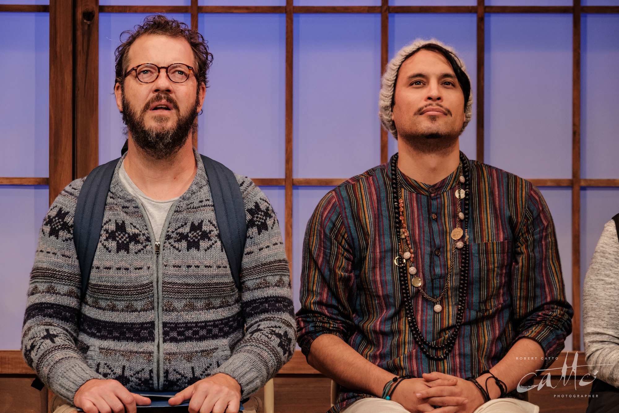
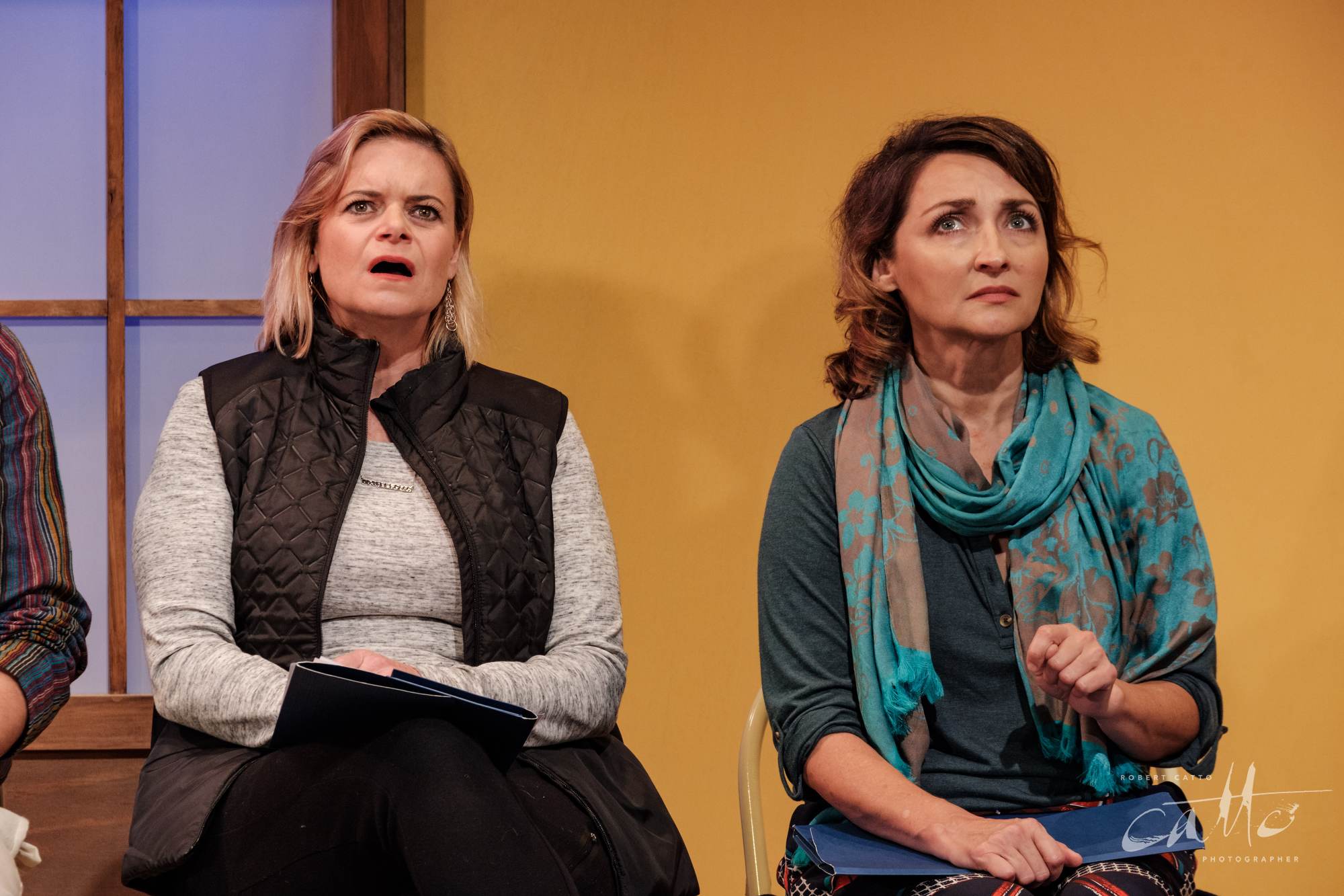
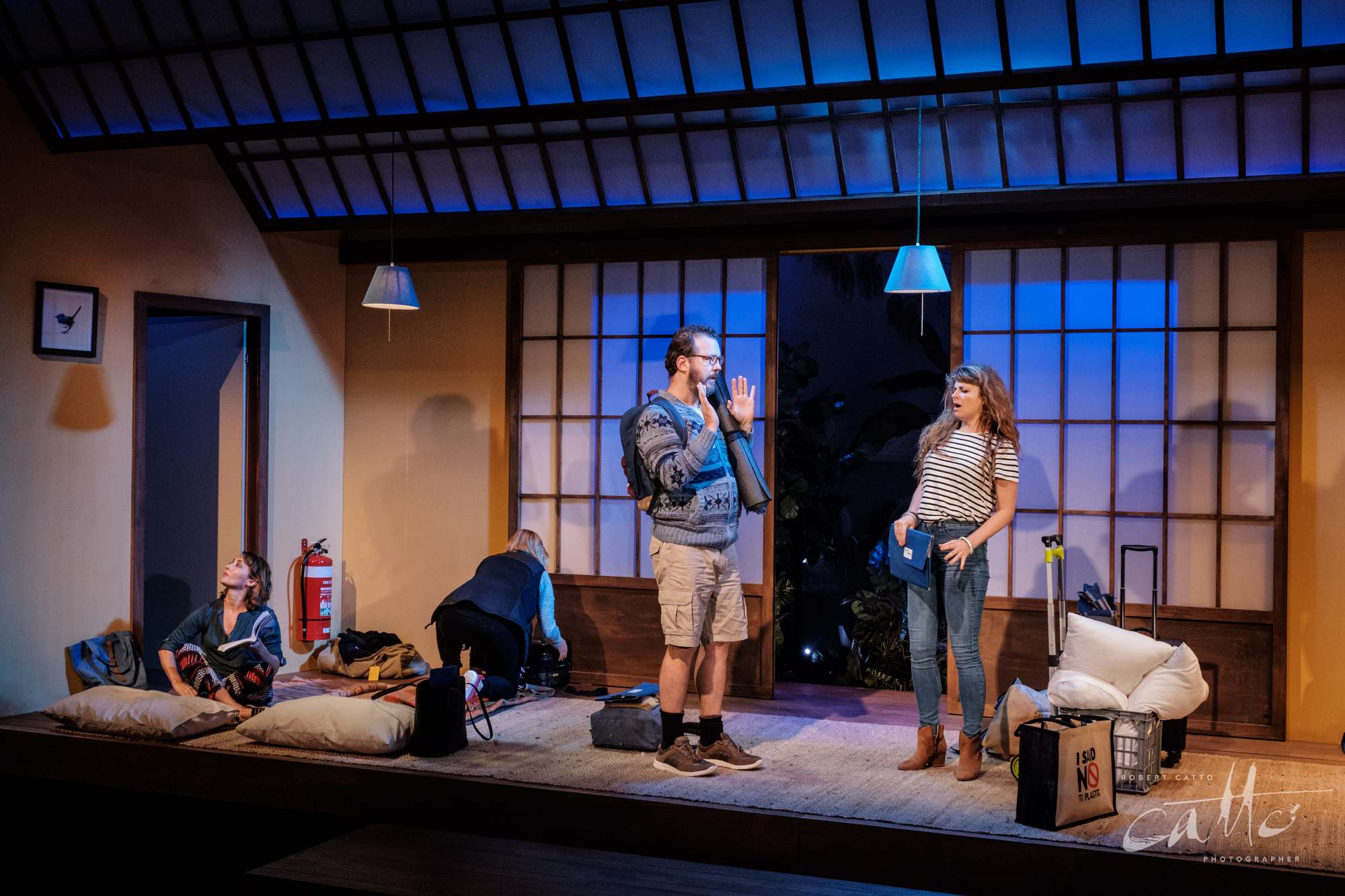
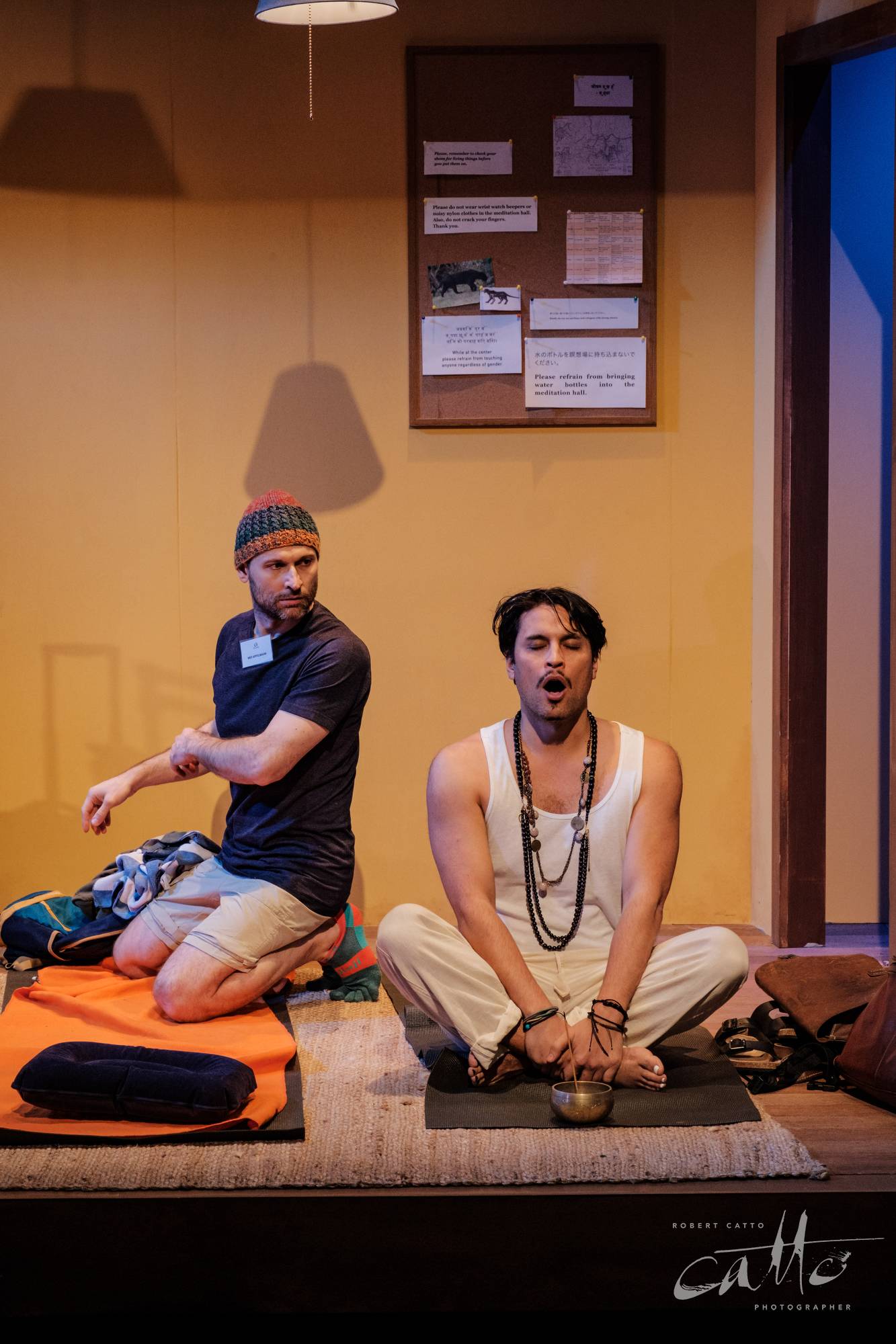
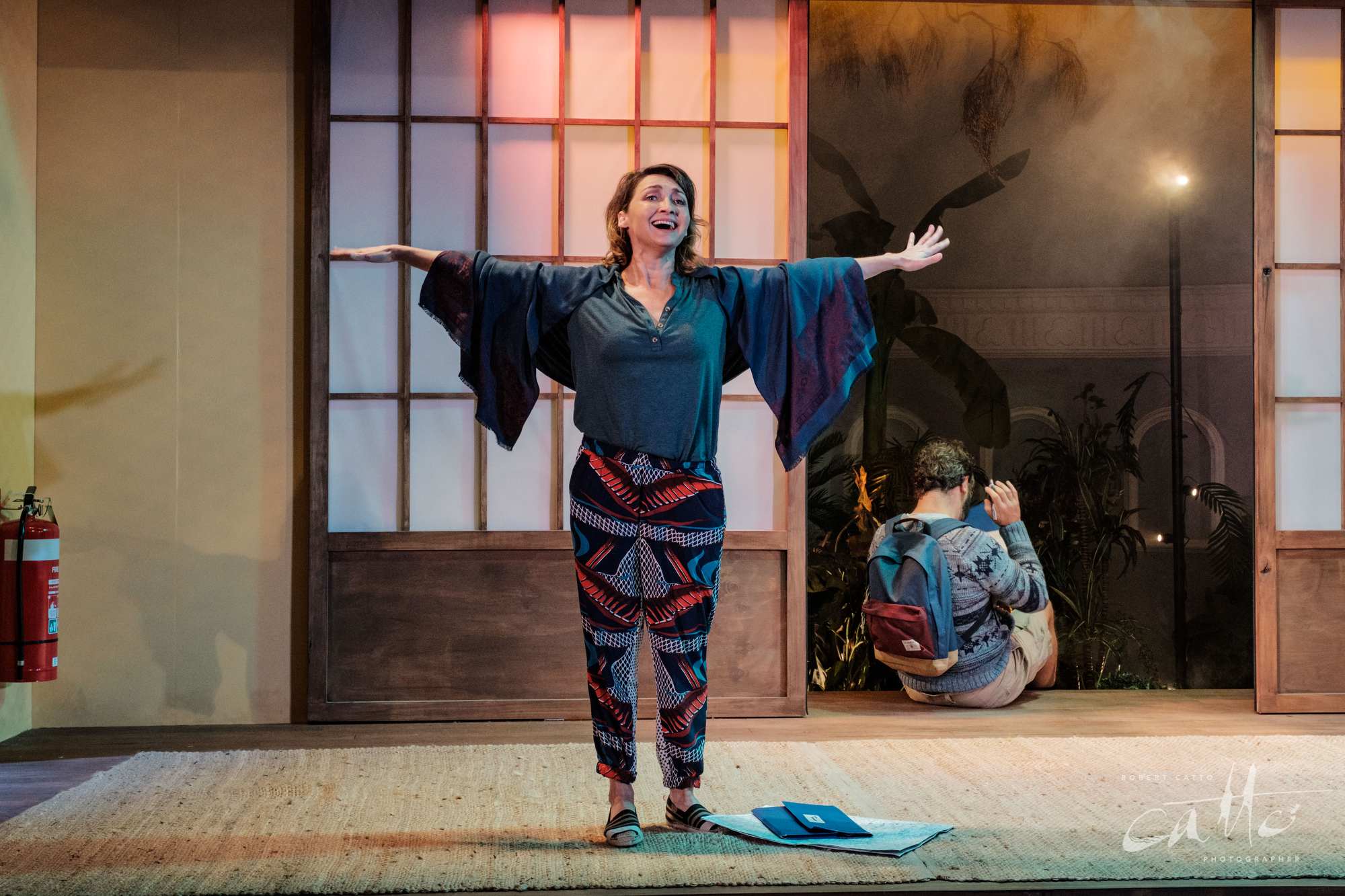
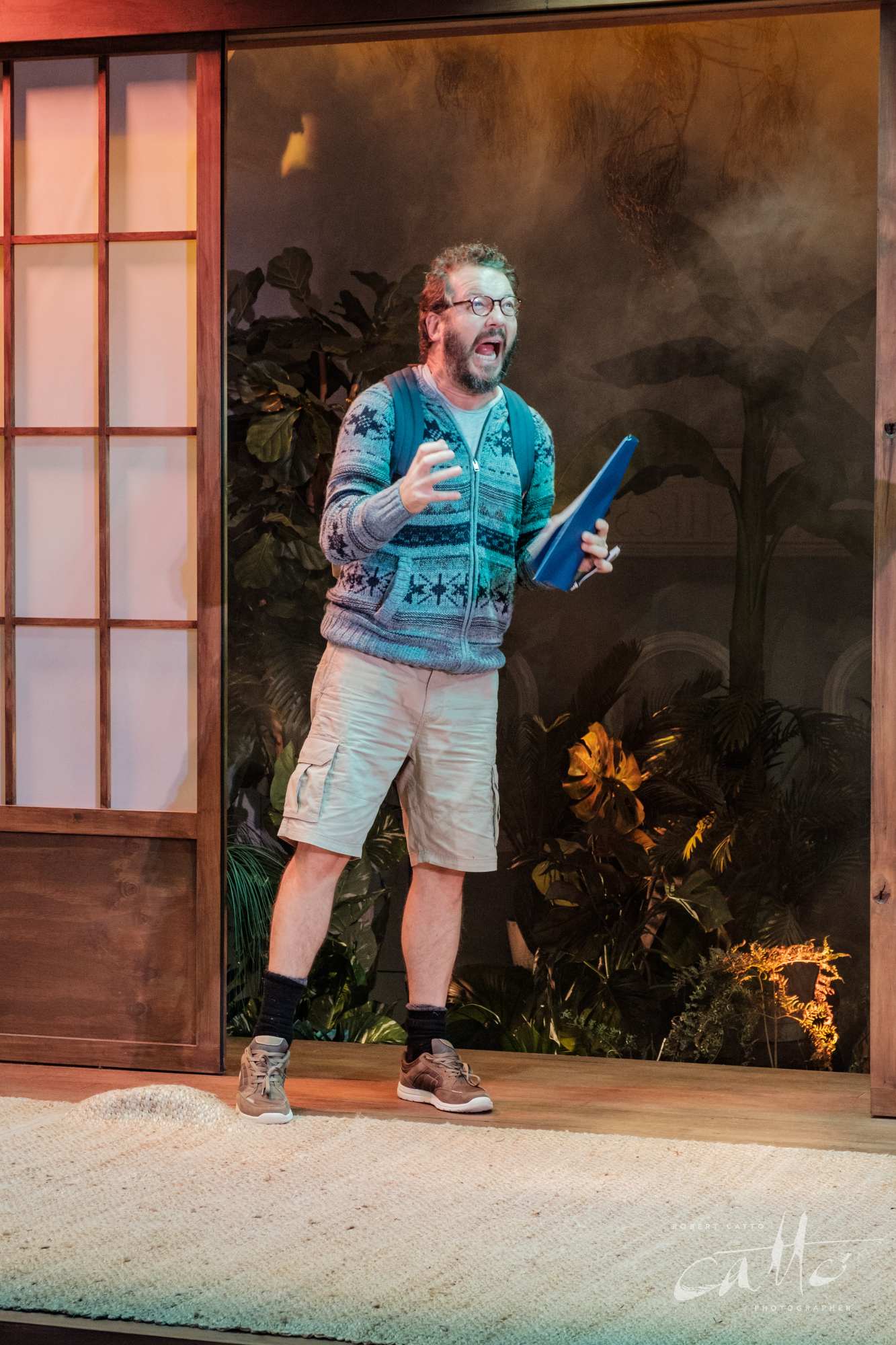
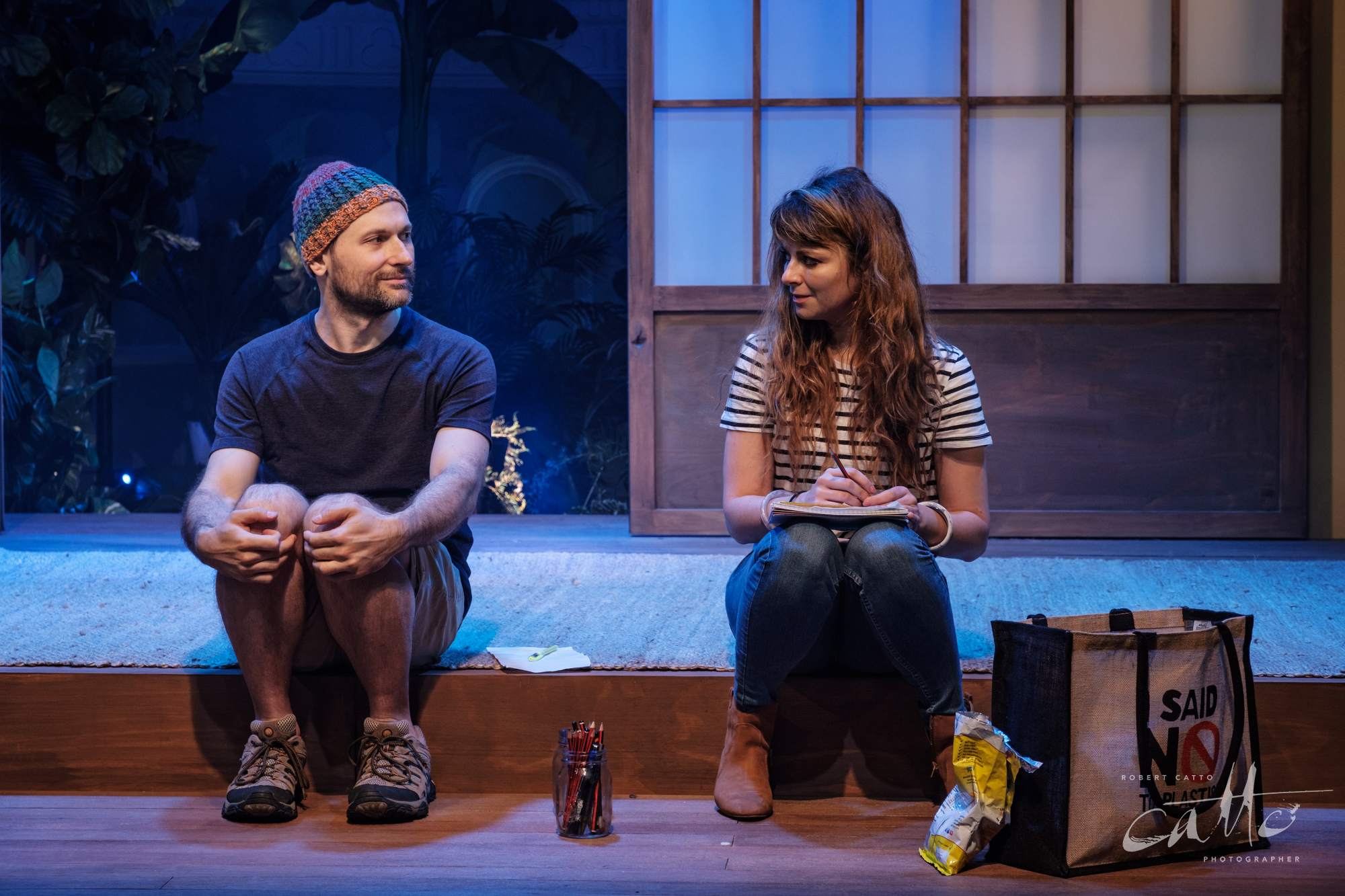
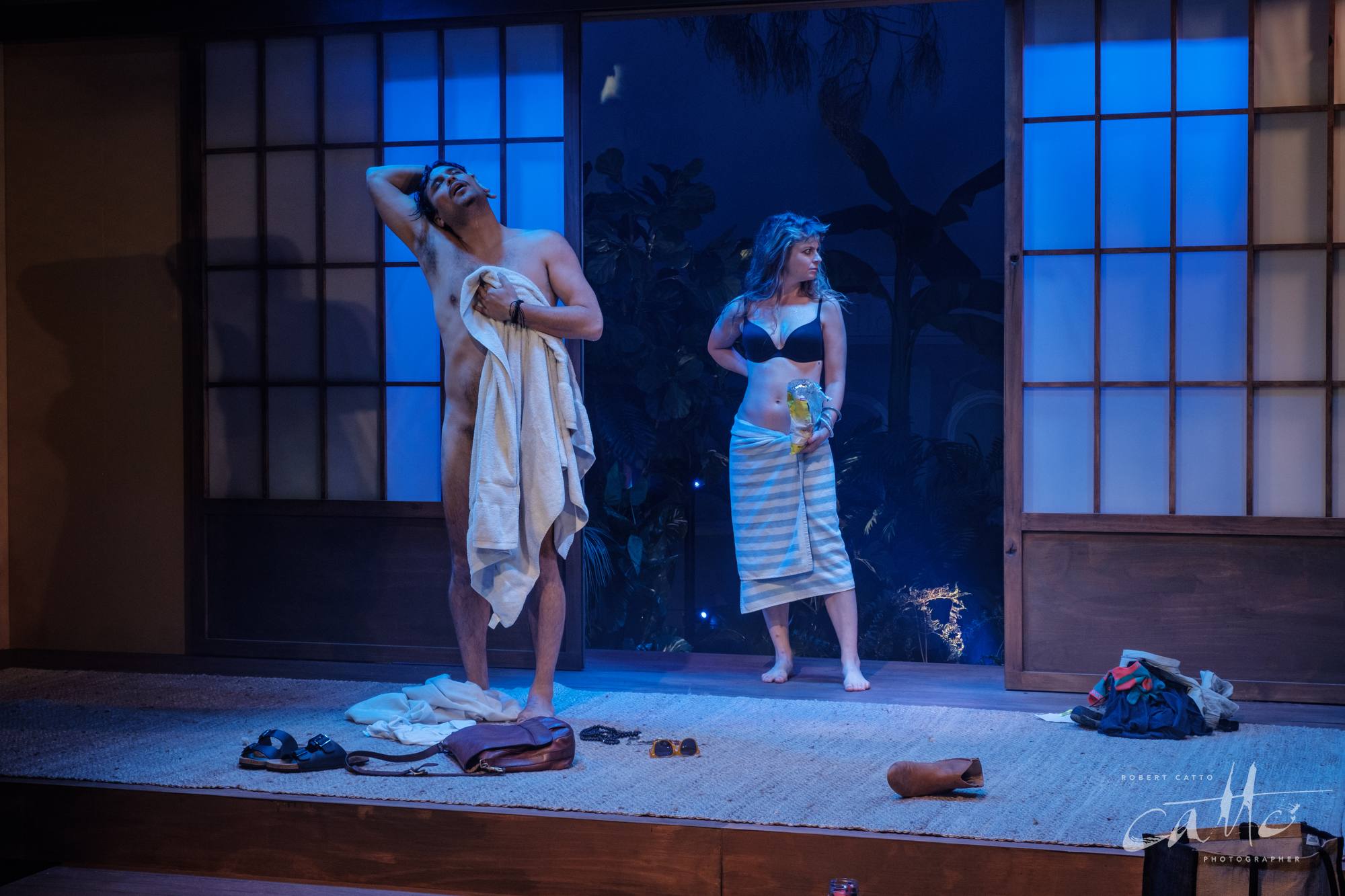
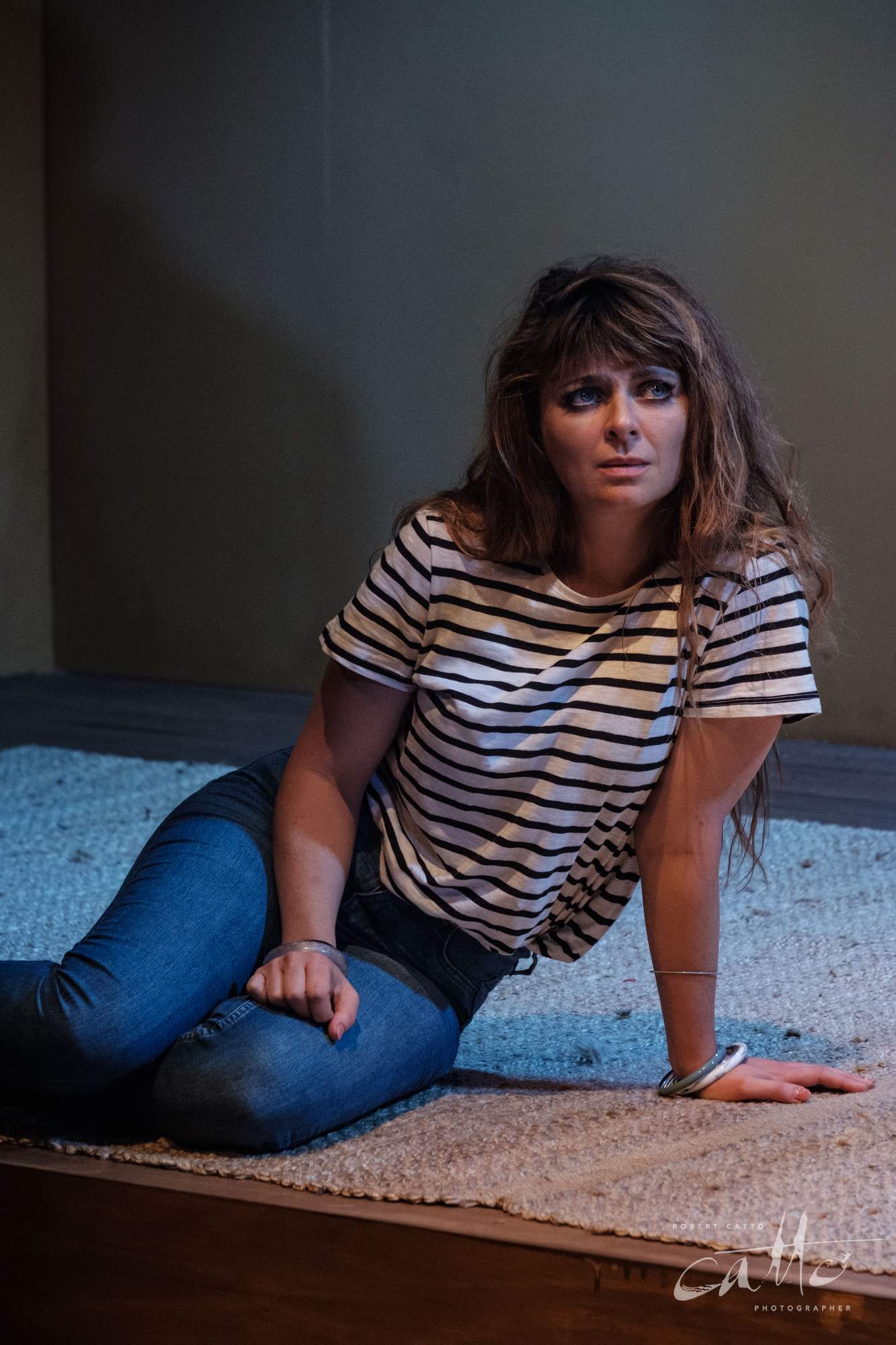
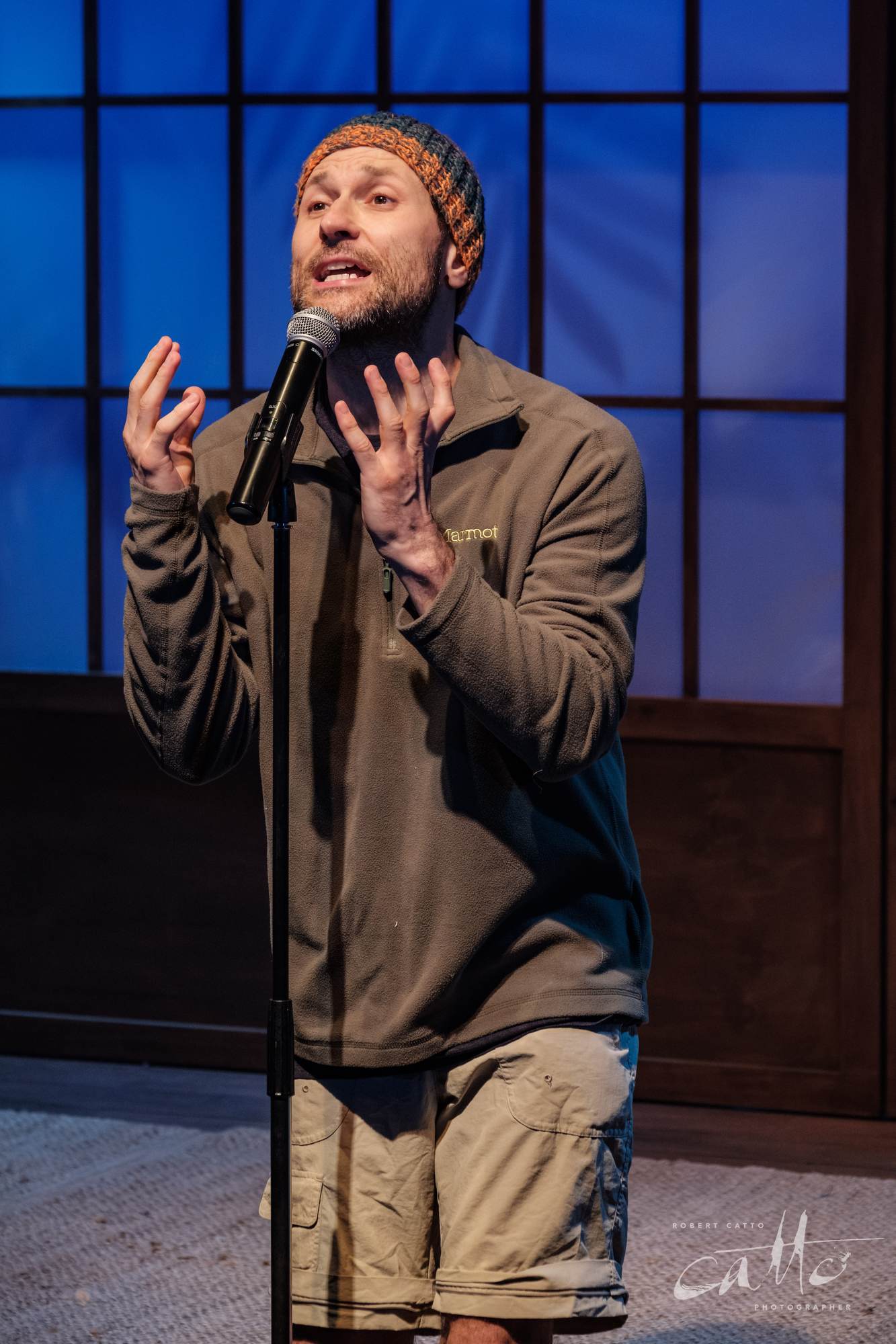
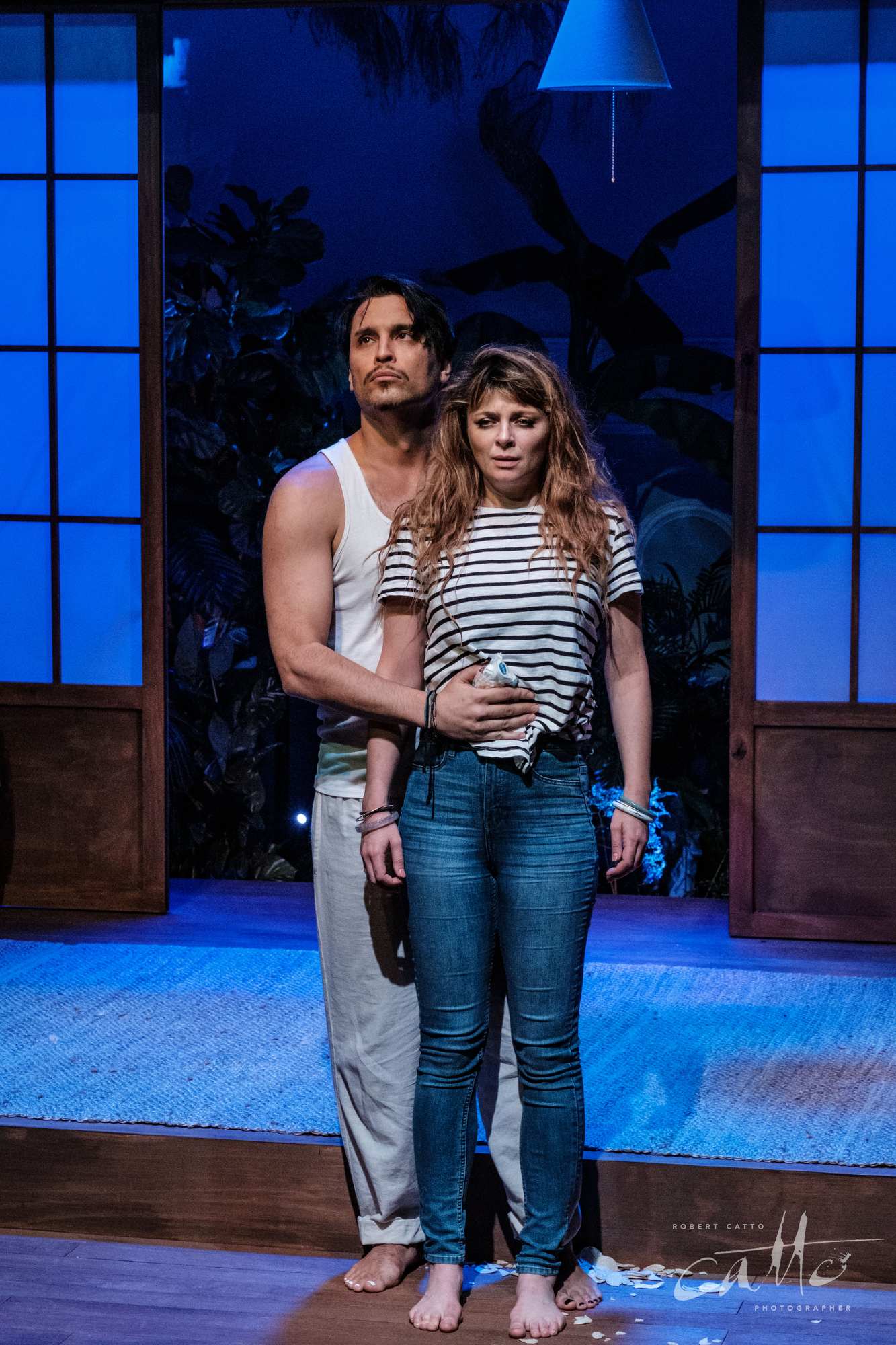
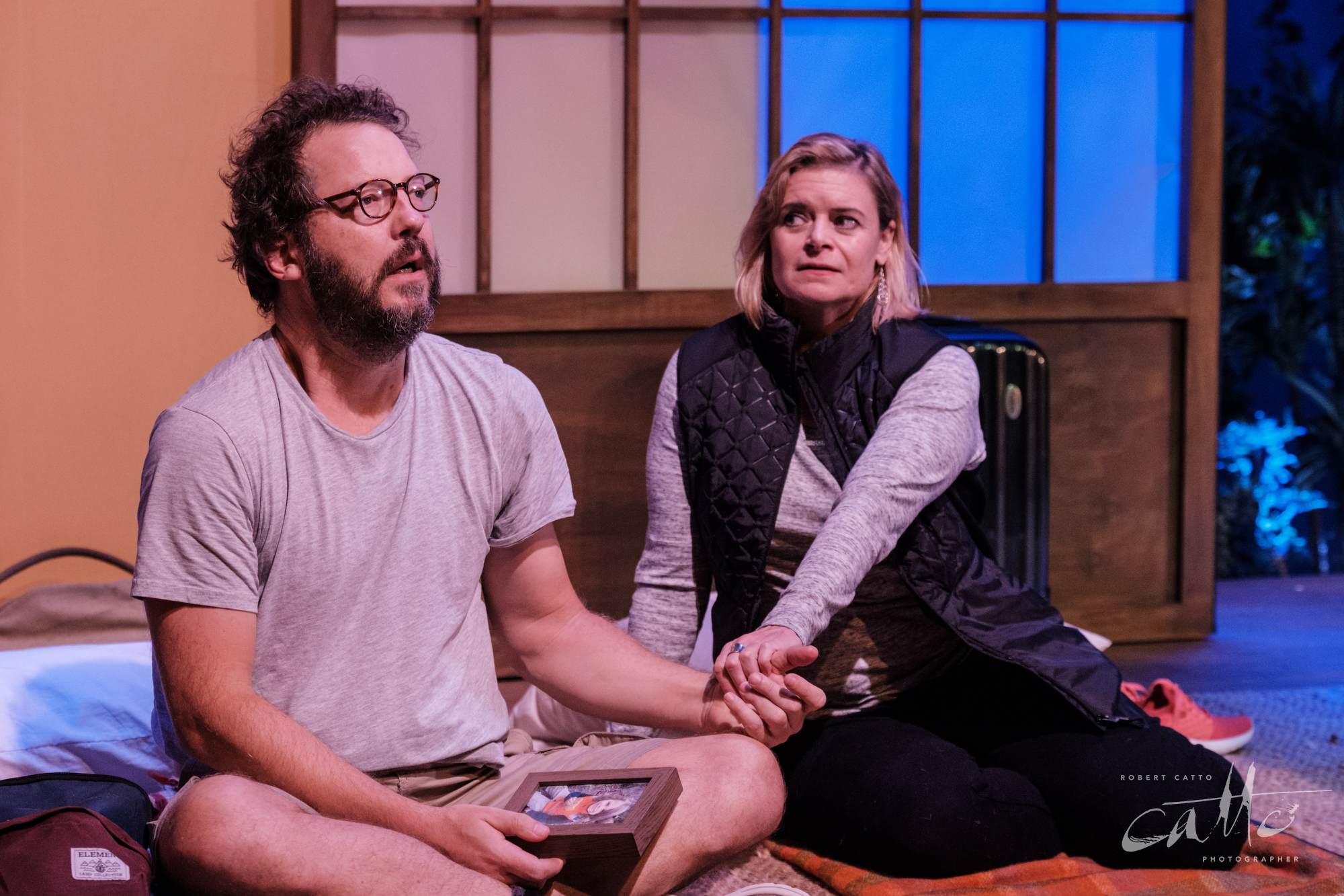
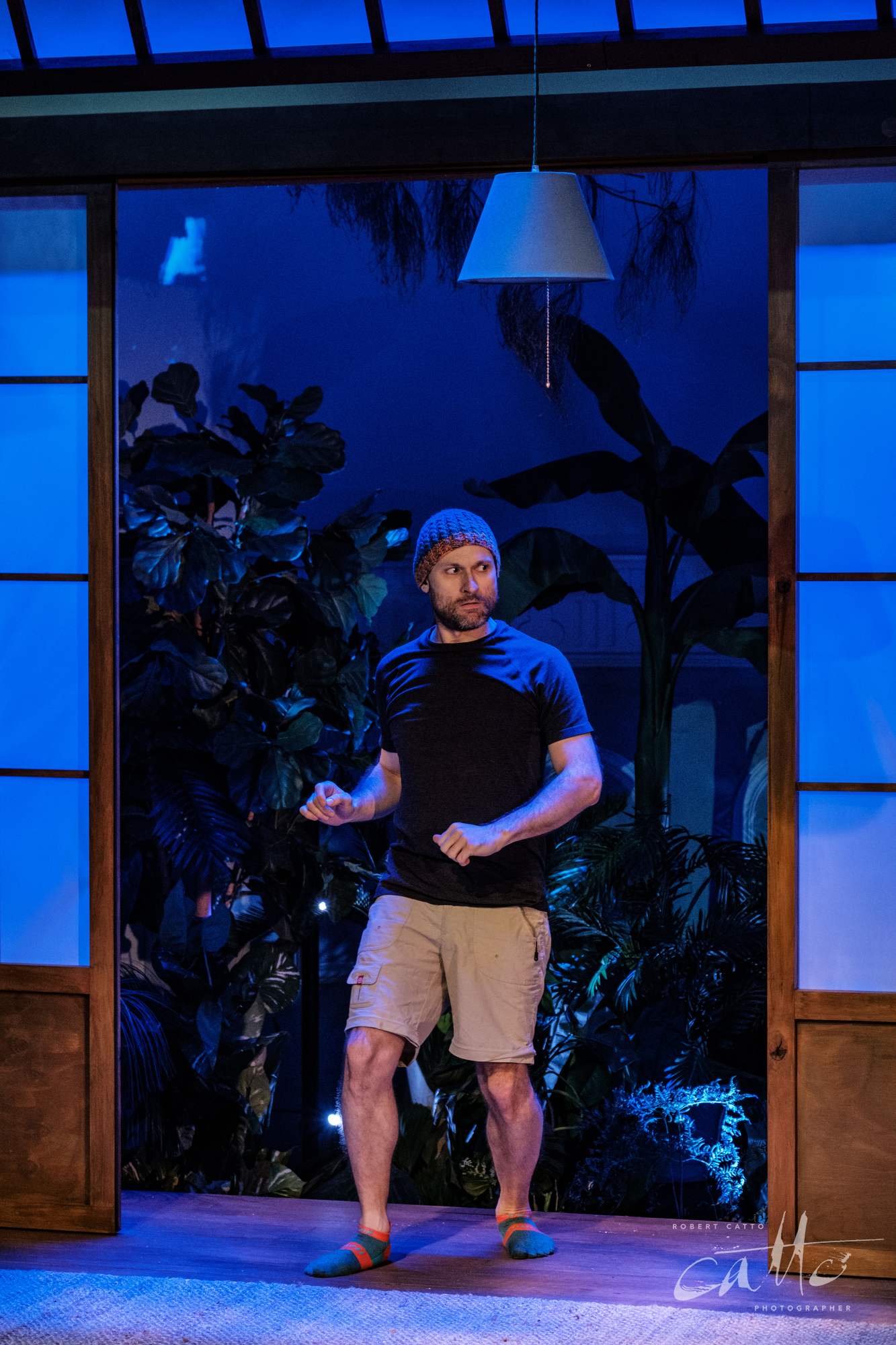
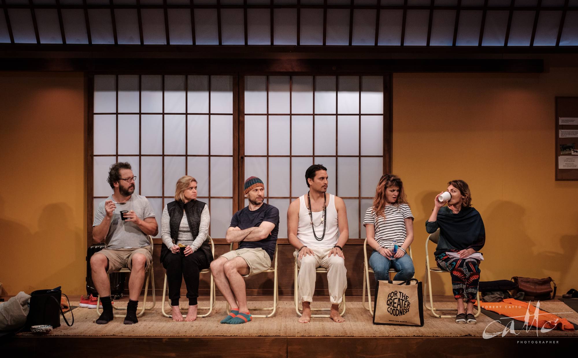
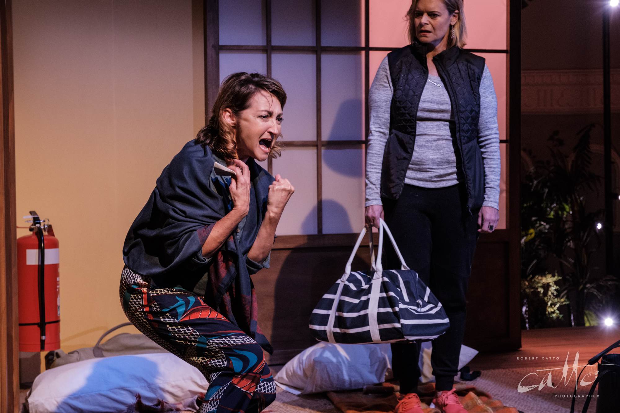
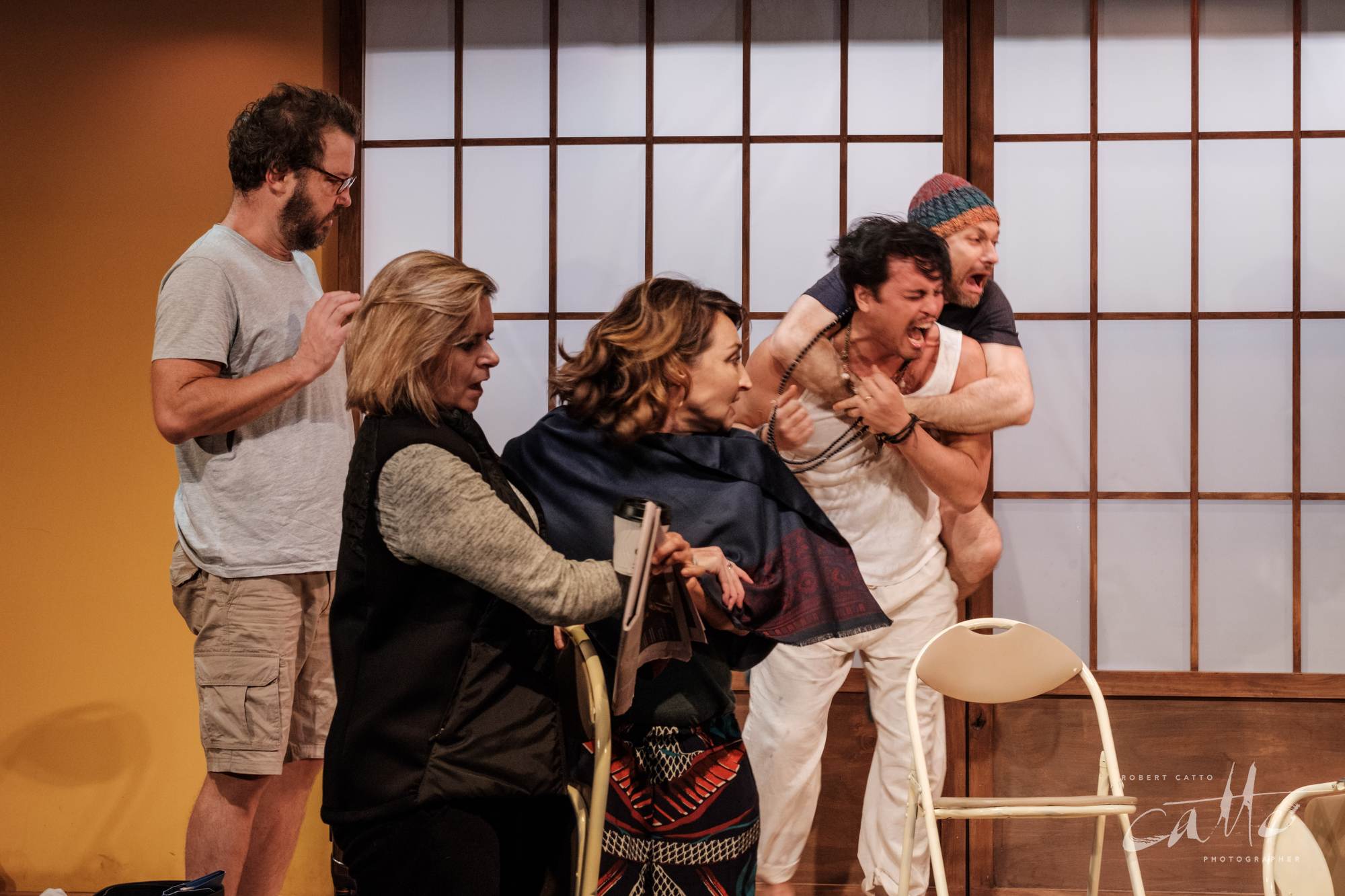
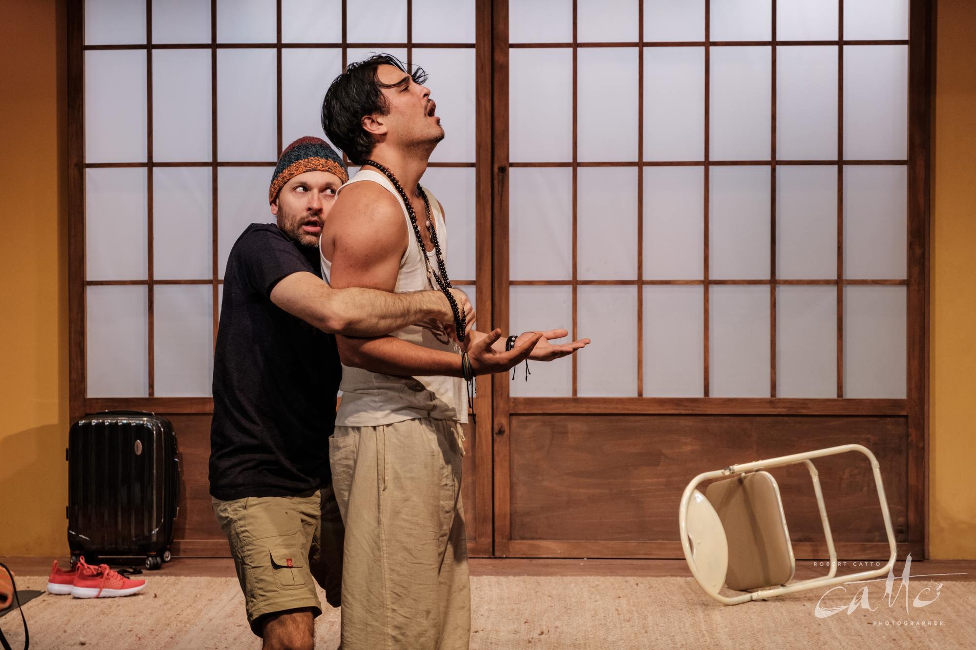
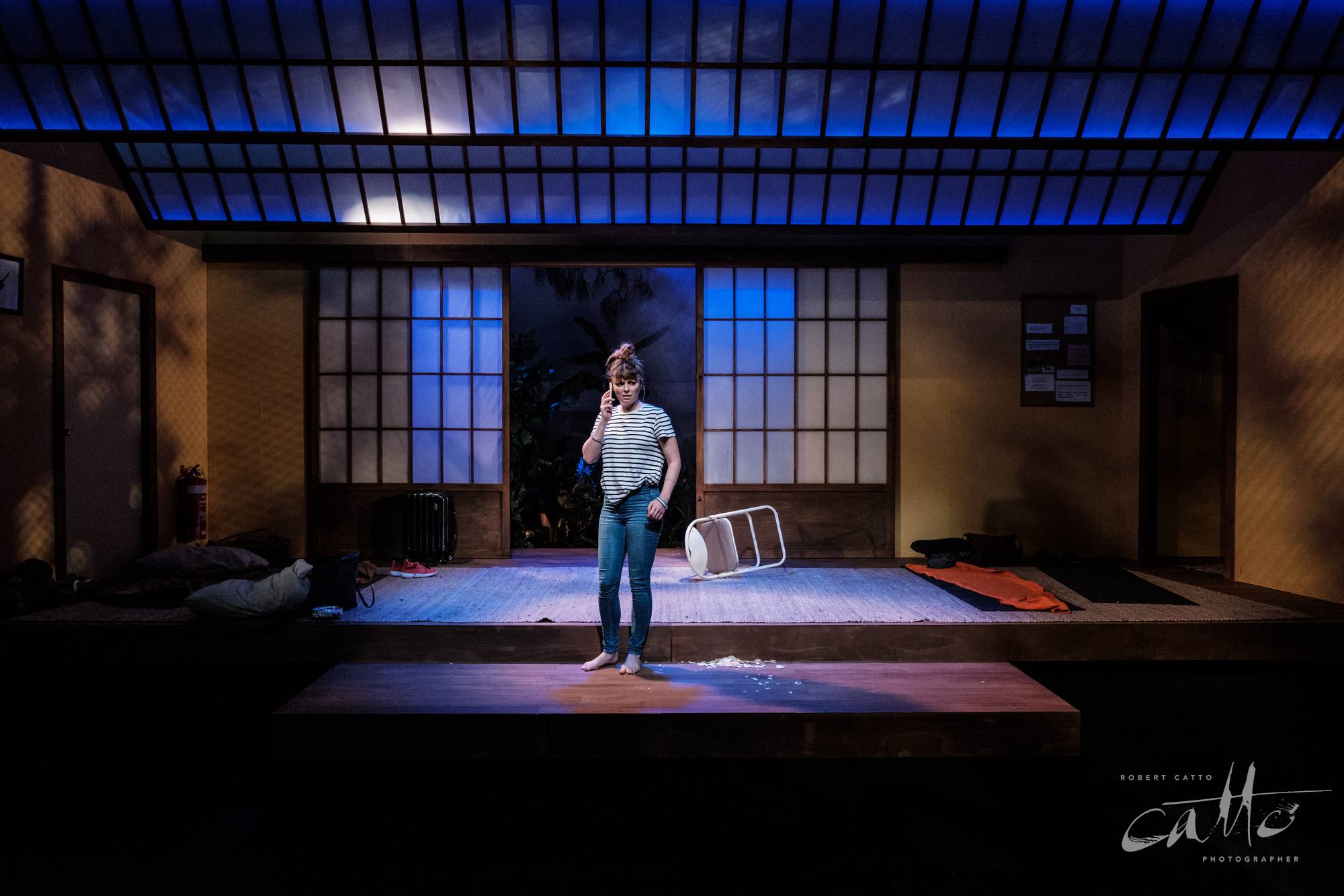
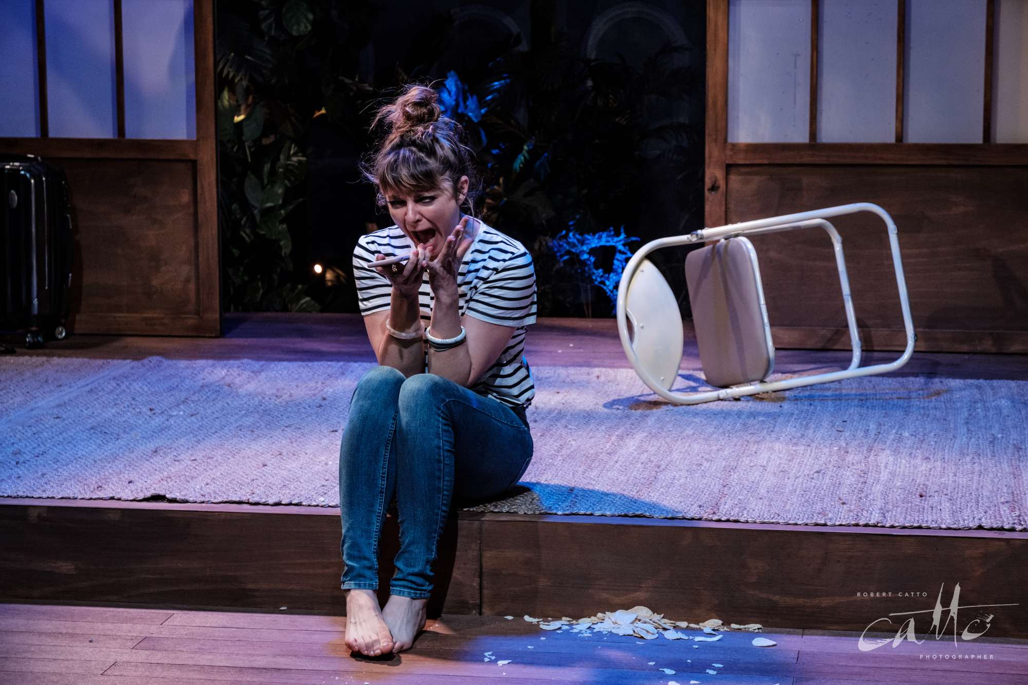
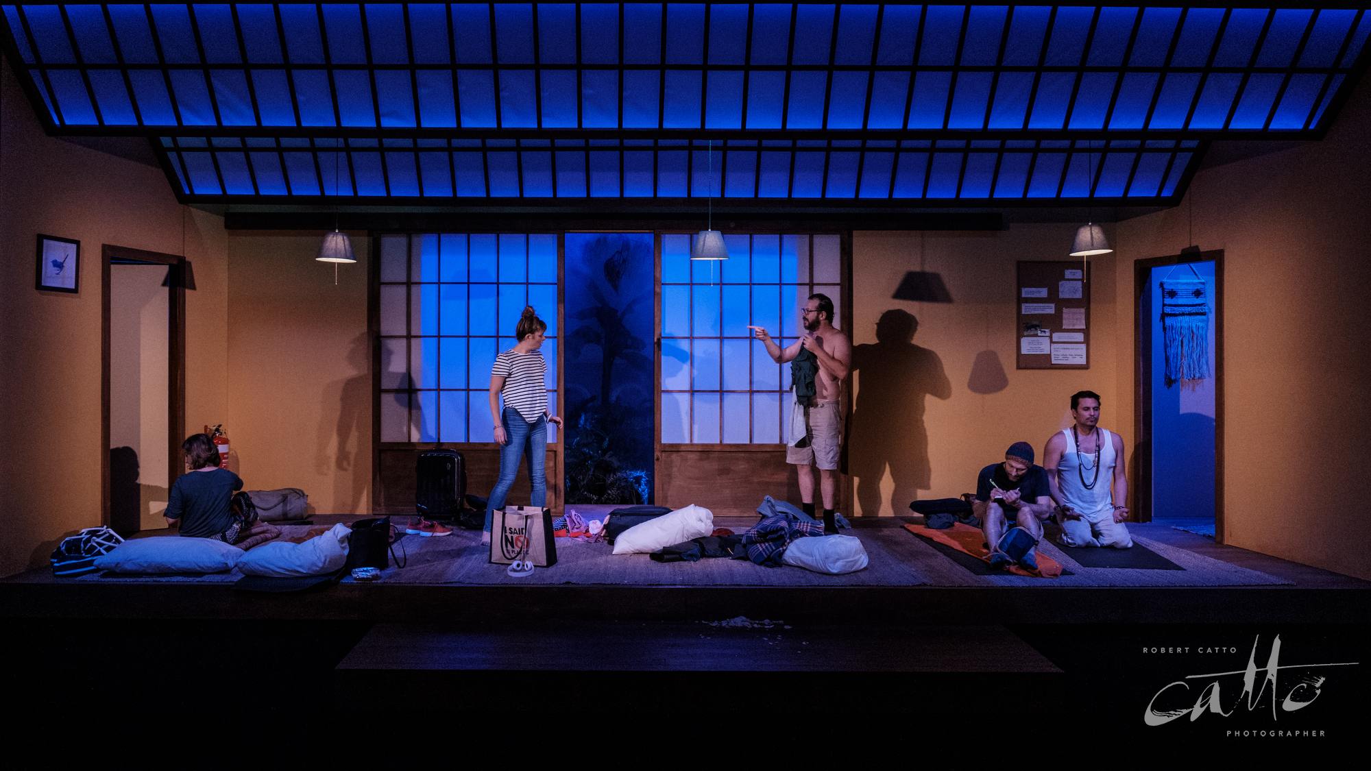
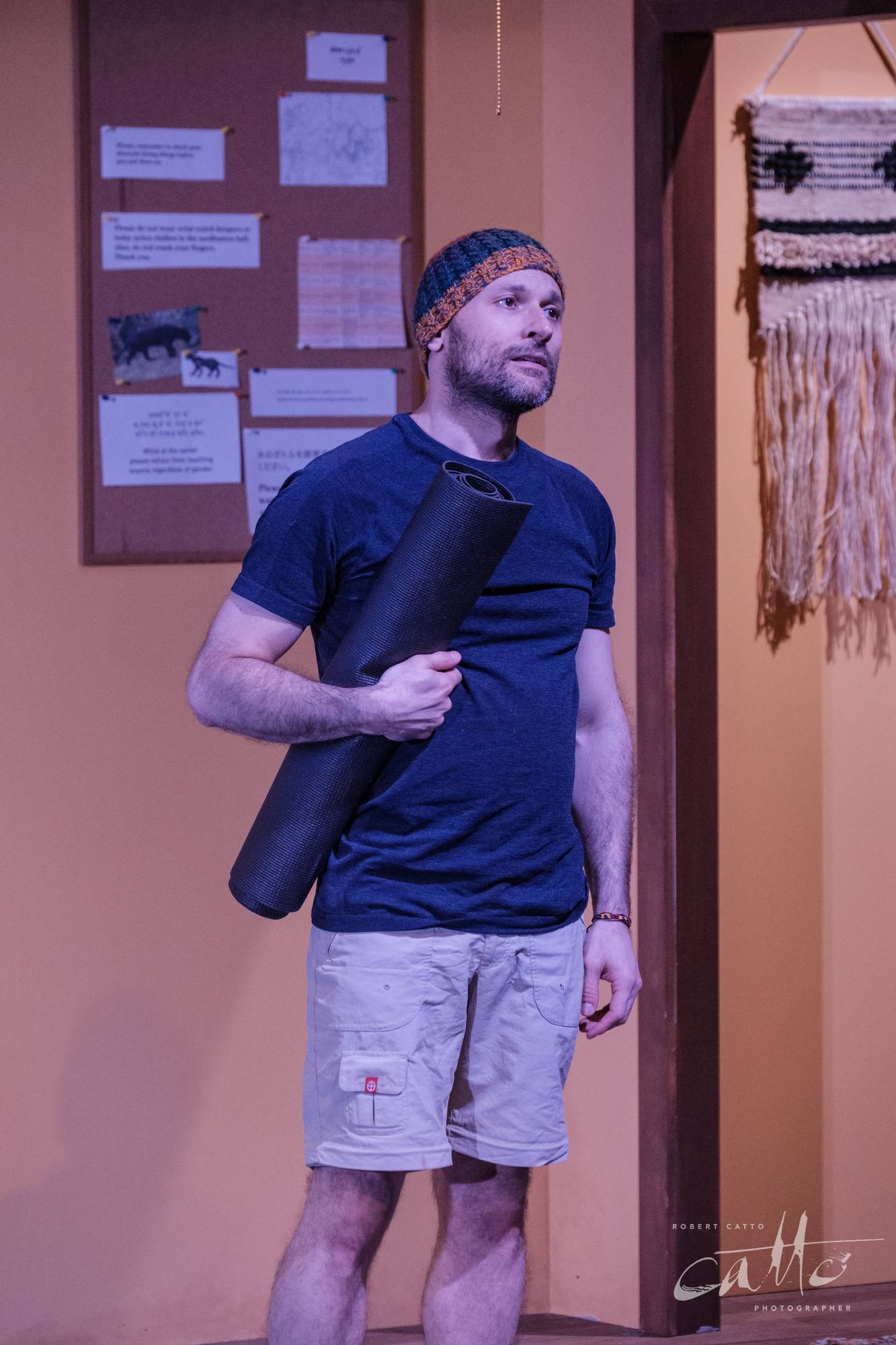
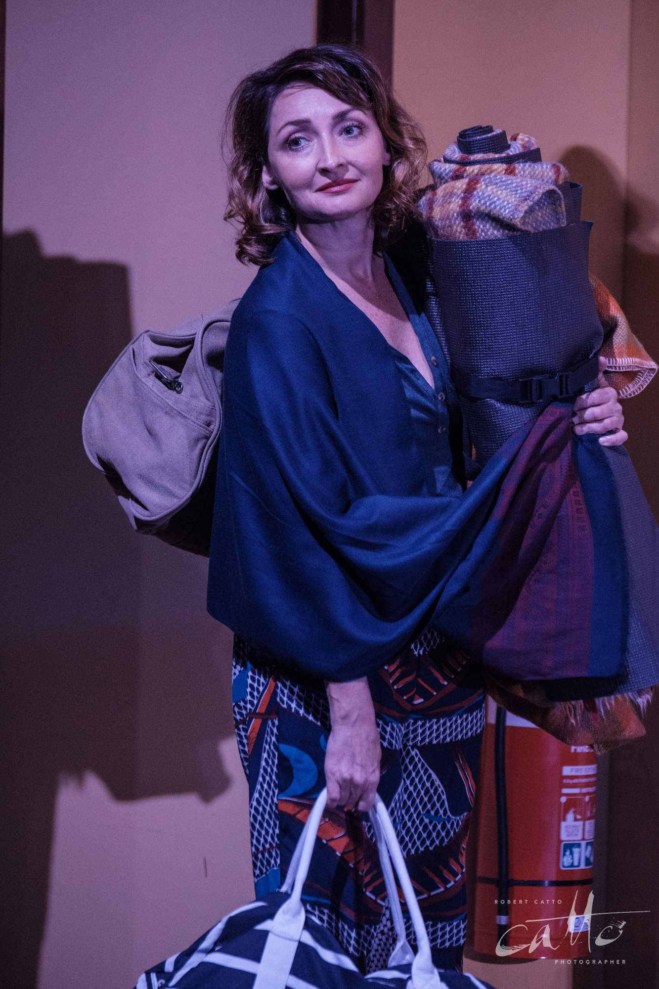
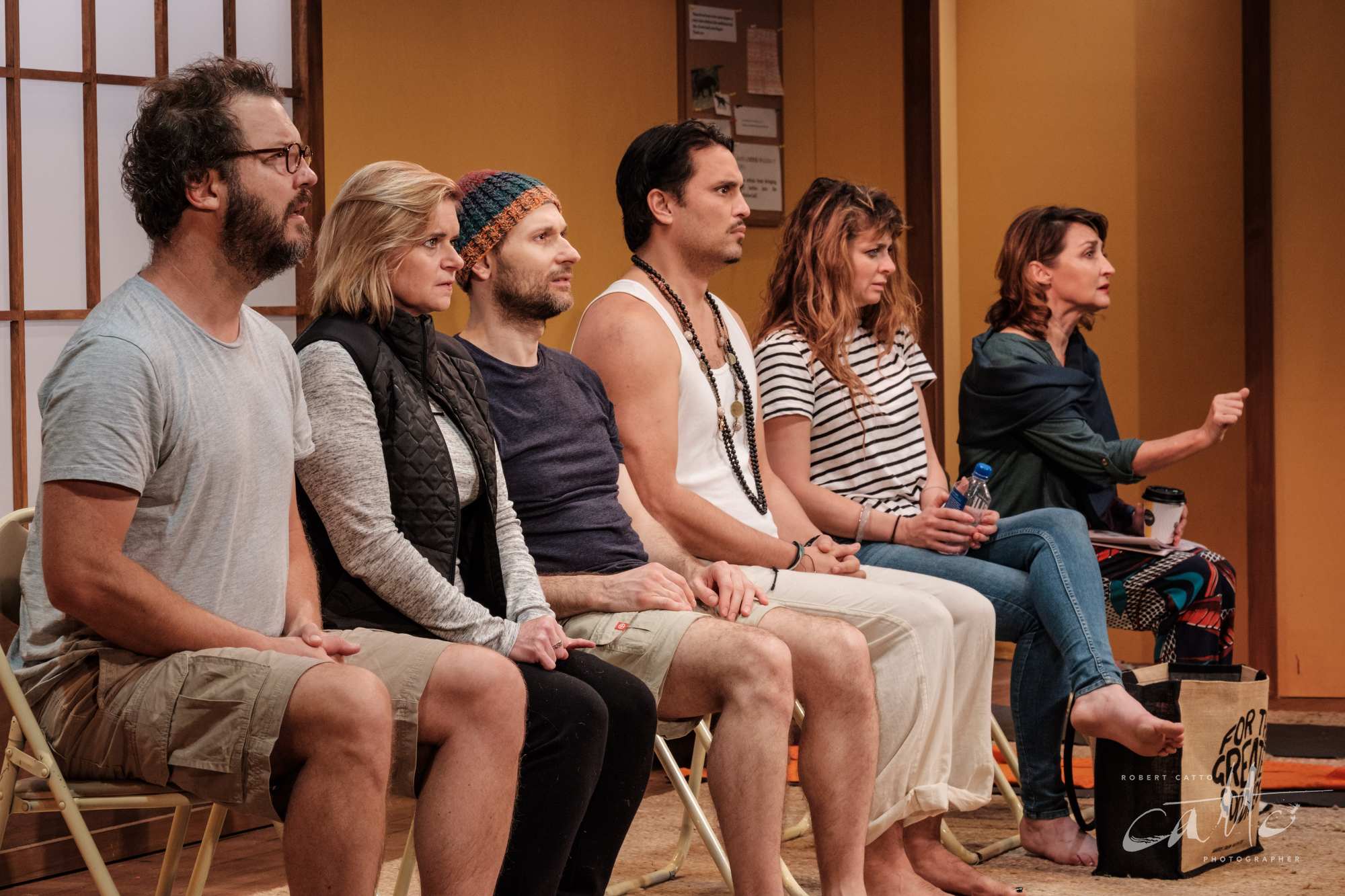
A production like this means I tend to work from an angle that puts me close to eye level with the performers - which also means that the set is fairly level, and I’m likely a bit further back from the stage rather than being down in the first few rows.
In terms of the images, this also means that - as I’m not on a very wide lens most of the time, being further away - the images can be corrected so that lens distortions are minimised, and the lines of the set are straight and architectural, which again contributes to the settled feeling of the piece. I’ll also tend towards balanced framing of the images, rather than placing them towards the edges of the frame - and tending to leave some space and context around them, so they feel like they have room to breathe.
From a colour perspective, the lighting in the production is on the warmer side of naturalistic, so I tended to keep a bit of that in the white balance I chose. There are scenes at night as well, and these tend to be more blue overall on the stage; but the characters within them are usually near an apparent source (like a lamp casting a warm glow towards them), so they still appear naturally lit most of the time.
That’s not to say that the characters themselves aren’t in a chaotic state, personally - but we recognise their surroundings as realistic location, even as they may be having a breakdown in front of us.
Ultimately, it’s about looking at the production’s intent, at what decisions the designers and director have come to about the work, and finding ways to use the tools of photography to amplify and underscore those choices - to embed their overall design message into the structure of the image itself.
It’s a subtle thing, but I think it has an effect on the viewer; I can picture a number of different ways I could have framed the images that would have given them a different sense, a different style.
A tight framing of some of the characters could have made them seem more isolated, alone, closed in, or trapped - which some of them are no doubt feeling at moments of the show - but I feel like that would be a misdirect, would be giving someone viewing the image a much different impression of the show they were coming to see.
So I could have captured this in a very different style; but, would that have served the production…?
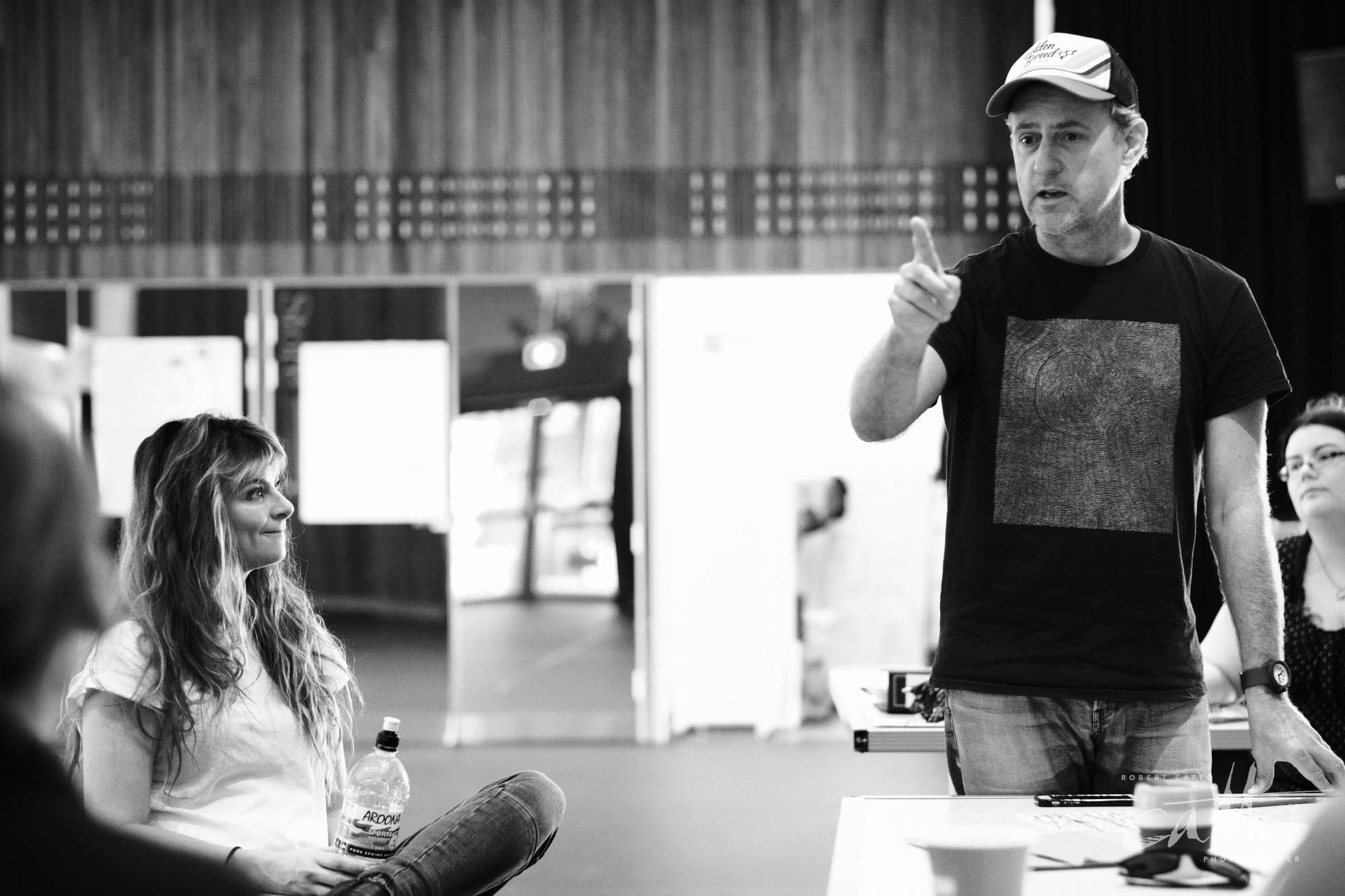
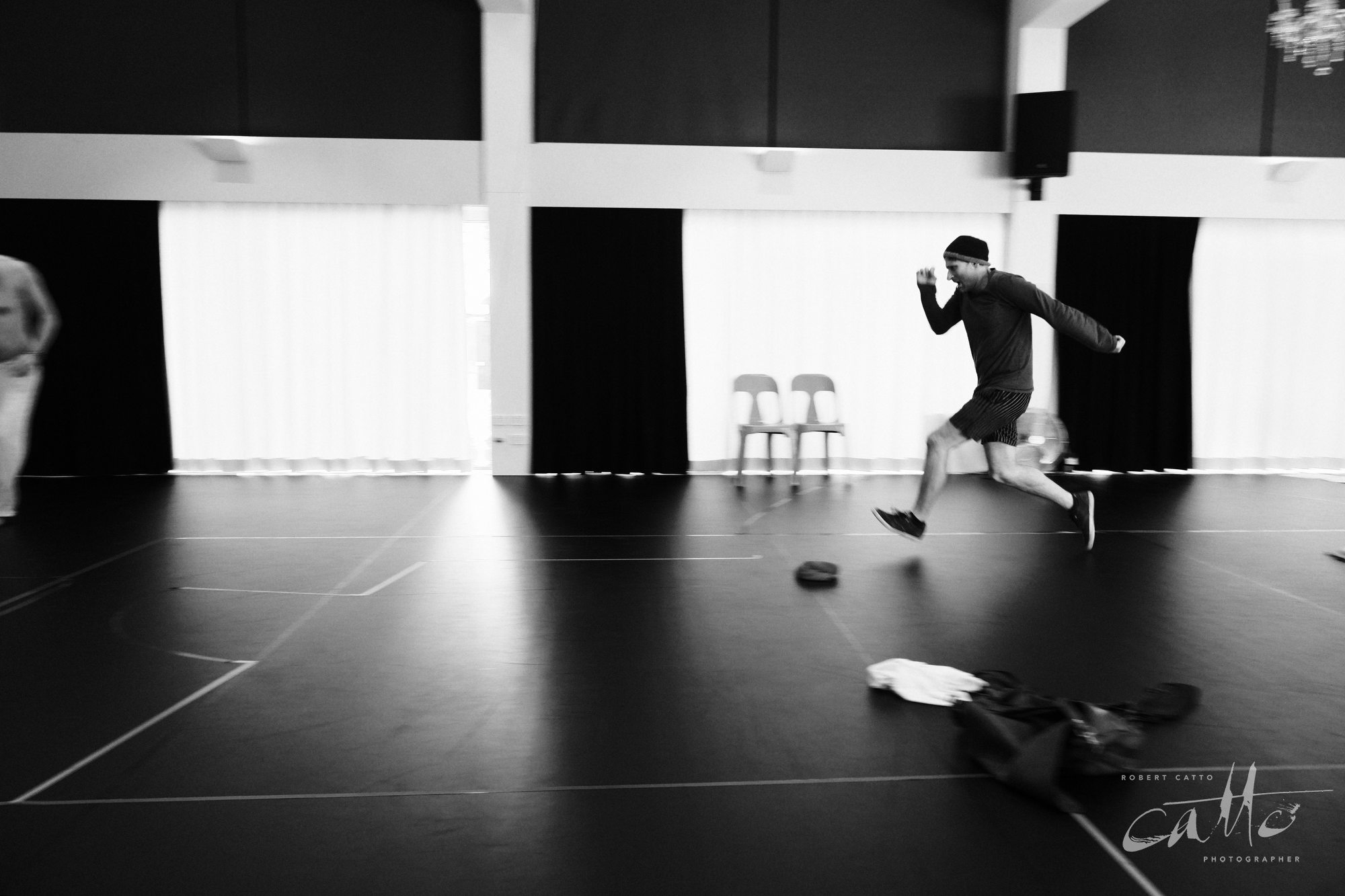
As an unexpected bonus (to me, at least!), videographer Yure Covich made a behind-the-scenes video while we were making the poster image in the rehearsal room - so here’s a few clips of me at work! (Running dramatically in slow-motion…)
"Excellently directed by Jo Turner, this production – which is the Australian premiere – has a tremendous cast who give it their all... Over the course of the play, we see the characters and relationships emerge through a wonderful range of facial expressions and body language. We see secrets, sadness, rivalries and desire bubbling away." - ArtsHub
"Populate the stage with actors of this calibre and an audience simply doesn’t know where to look. [Director Jo] Turner, and the elegantly replete text from playwright Bess Wohl, has superb command of needle sharp intricacies which provide the group an individualised immersion in the silence. A revisiting might be required for full illumination!" - Judith Greenaway
"Director Jo Turner expertly delivers the lines of the retreat's guru (a disembodied voice-over, who seems to have stalled on the spiritual ladder many rungs shy of transcendentalism)...Small Mouth Sounds exudes an undeniable charm." - The Sydney Morning Herald
"The show is often funny, always intriguing with its creative renderings of a unique theatrical concept. A clever cast works exhaustively for our entertainment, offering up personalities that are endearing, familiar and believable." - Suzy Goes See
Small Mouth Sounds continues at Darlinghurst Theatre Company until 26 May 2019.
Cast: Amber McMahon, Sharon Millerchip, Yalin Ozucelik, Jane Phegan, Justin Smith and Dorje Swallow.
Playwright Bess Wohl
Director Jo Turner
Production Designer Jeremy Allen
Sound Designer & Composer Tegan Nicholls
Lighting Designer Jasmine Rizk
Assistant Director Emma Diaz
Stage Manager Kirsty Walker

